Case · Hospitality

BlueBird Cafe: three ways to visit, easy to book.

BlueBird is a specialty roastery in Budapest that turned into a community: roasting workshops, brunch sessions with a DJ, and an open stage. Most hospitality sites would bury two of the three bookable things; this one gives each its own path from the first screen, in English and Hungarian. Webflow.

  • Hospitality
  • Café
  • Webflow
  • EN · HU
  • Budapest, Hungary
bluebird-djcafe.comBlueBird Cafe website preview
2 languages

English and Hungarian, separate pages switched from the header. checked on the live site · Sep 2026

Built on Webflow

Events and menu edited by the client. checked on the live site · Sep 2026

Three things to book

A table, a roasting session, a DJ slot, each with its own path.

The project

Task, approach and delivery

The task

BlueBird is a specialty roastery in Budapest that turned into a community: roasting workshops, brunch sessions with a DJ, an open stage. The person coming to learn about coffee and the person coming to play a set are not the same visitor.

The structural problem was that there are three completely different things to book here, and most hospitality sites would bury two of them under the menu.

The approach

We gave each of the three bookable experiences its own visible path from the first screen, and let atmosphere carry the design while keeping practical details one tap away.

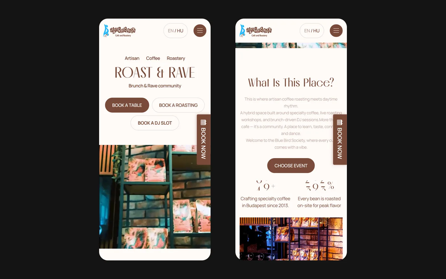
The website has a responsive layout and English and Hungarian versions for guests who prefer either language.

What we delivered

A Webflow site in two languages that holds a roastery, a workshop and a music venue together without turning any of them into a second-class section. Domain and hosting in the client’s name.

Three reasons to visit, three clear starting points

BlueBird combines coffee, participation and music in one place. That combination is the reason to make the website distinctive, but it also creates a navigation problem: a guest choosing a table, someone interested in roasting and a DJ looking for a slot arrive with different questions. The design makes those intentions visible before asking anyone to explore the full programme.

Typography brings the activities together

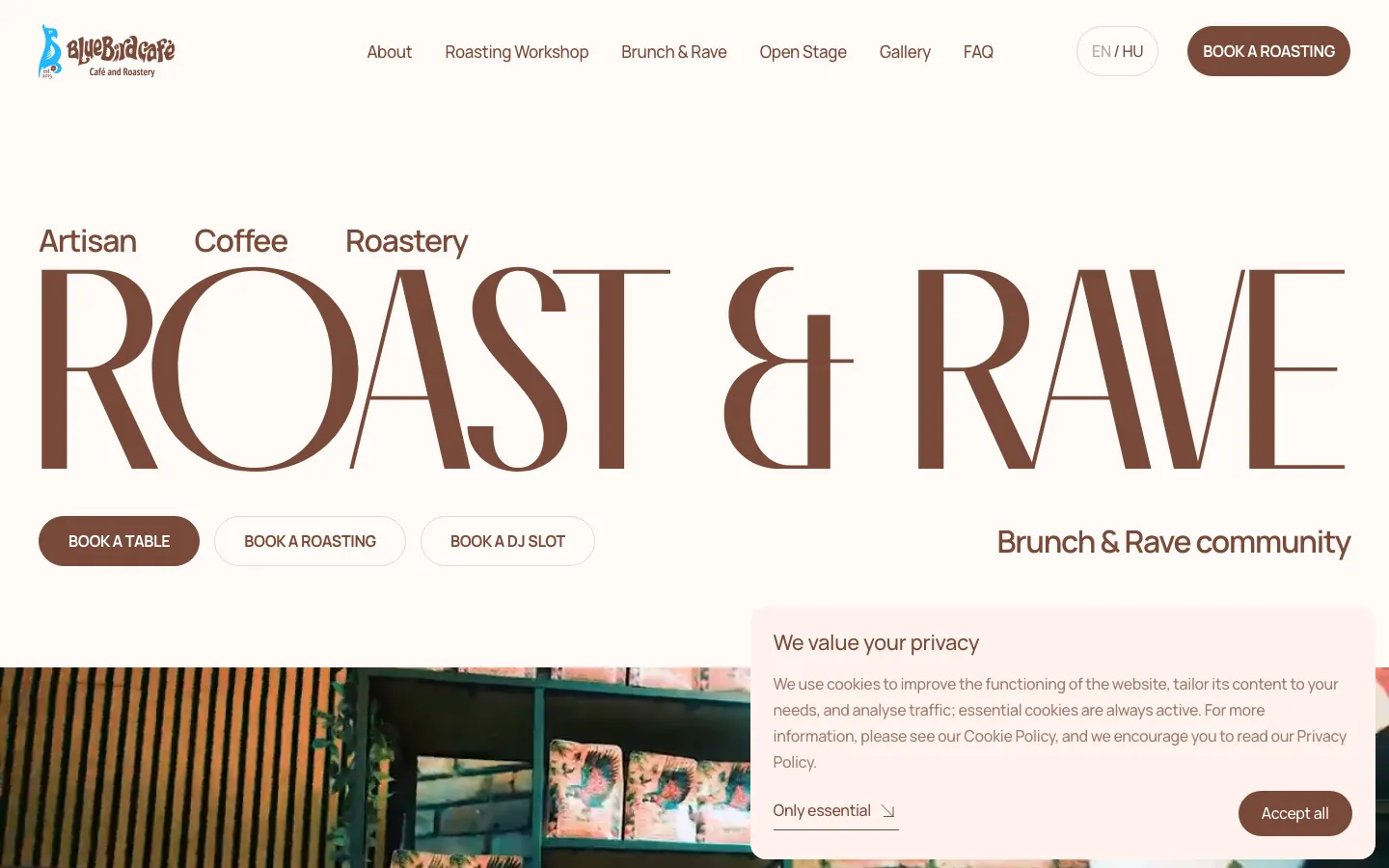
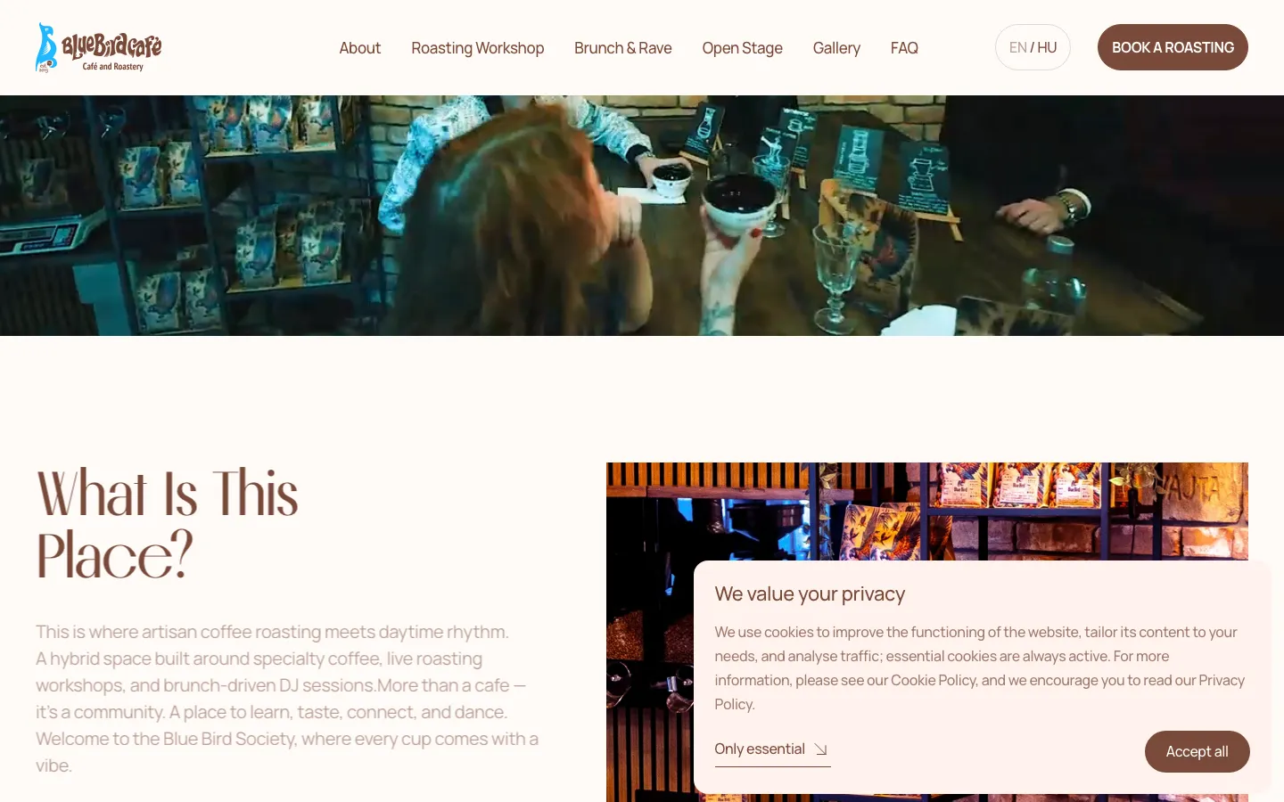
The saved opening uses an oversized serif headline across a warm, pale background. The brown lettering and small coffee descriptor create a recognisable café atmosphere, while the reference to music prevents the place from reading as a conventional roastery alone. It is a typographic composition with substantial open space. The character comes from scale and letterforms rather than a row of competing promotional banners.

Below that statement, three pill-shaped actions name the possible visits. The table action is filled, and the roasting and DJ actions are outlined. All remain in the same group, so the hierarchy does not hide the alternatives. The header also gives the roasting workshop a direct entry. A visitor can therefore recognise the wider programme while still taking a specific route. The practical lesson is to make the choices explicit before introducing a long narrative about the venue.

Each visit has its own information needs

A table
A guest considering a visit needs the ordinary practical context of a venue: when to come, how to find it and what kind of occasion to expect. In a comparable project, those details should be kept close to the table action. An attractive event identity cannot compensate for making a person search several sections for the information needed to plan a visit.
A roasting session
A workshop visitor is considering participation, not simply a seat. Before designing this route, we would ask the venue what a session includes, who can attend and how availability is communicated. The content should distinguish an introduction for curious guests from any professional training offer. The website must not imply a qualification or a level of instruction that the venue has not agreed to provide.
A DJ slot
A person interested in playing needs a different conversation from a person attending the event. The visible DJ action gives that intention its own starting point. For a similar brief, we would clarify whether the next step is an application, a conversation with the organiser or a confirmed booking. Those outcomes should not share an ambiguous button simply because they concern the same evening.

A programme must stay readable as it changes

The original project records describe a Webflow website whose events, menu and photographs can be maintained by the client. This is especially relevant when a venue’s identity includes a changing programme. A beautiful launch page can become misleading if an expired event still appears to be the next opportunity to attend. The design needs an editing routine as well as a visual direction.

For a similar venue, we would separate the enduring description of an activity from the information attached to a particular session. The explanation of what roasting involves can remain useful for months, while a date, host or availability status may change more often. Keeping these roles distinct helps the team update the programme without rewriting the whole page. It also reduces the temptation to leave an old promotional image online because changing it feels like a redesign.

A sensible handover exercise would be to update one real event and preview it in both languages. The editor should know which fields are shared, where the translated text belongs and what happens to an event that is no longer current. This is an acceptance approach for a comparable commission. The portfolio evidence does not establish an automatic ticketing platform or a connection to a venue management system, so we do not present those as part of this delivery.

A route that respects the guest’s intention

  1. Choose why to come

    The visitor starts with a named action rather than an undifferentiated contact button. This helps a café with several activities explain its offer in a compact first screen. The same structure would be unnecessary for a venue with only one bookable experience; the decision follows BlueBird’s programme, not a rule that every hospitality website needs three buttons.

  2. Read the relevant detail

    Once a person chooses an activity, the page should answer the questions that belong to it. A similar implementation should preserve a simple route back to the other activities without forcing every guest to read all of them. This allows the coffee and music programmes to share one identity while retaining useful differences in their descriptions.

  3. Understand the next step

    The final action needs to explain whether it sends a request or completes a booking. For a new project, we would agree the confirmation wording with the venue and check what the team receives. A successful form submission is a communication event; it is not proof that a table, workshop place or performance slot has been allocated.

English and Hungarian without two competing programmes

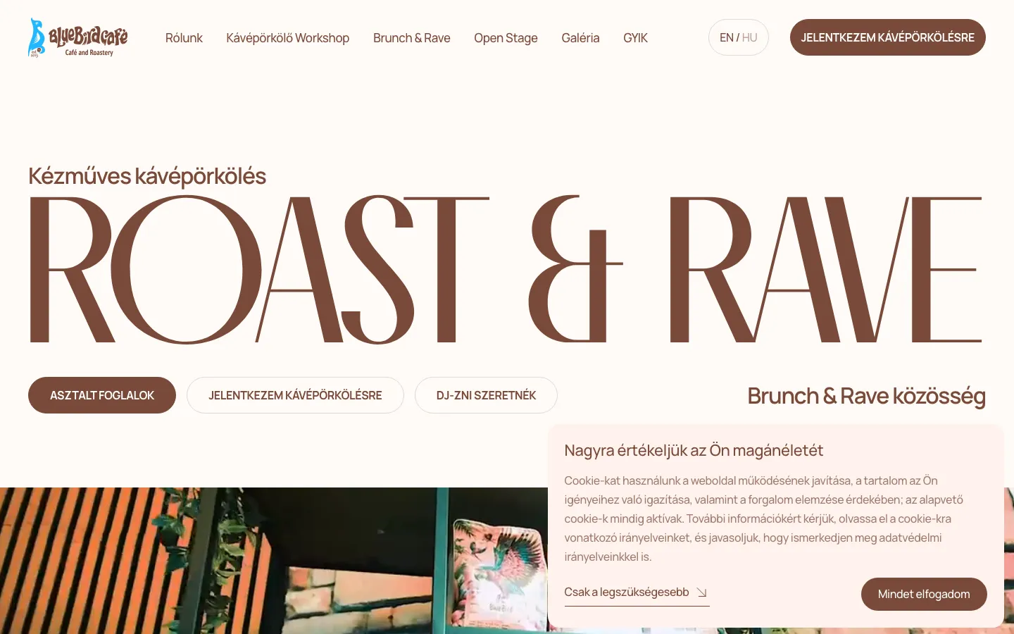
The two language versions serve visitors who prefer different ways of reading the same venue information. The saved header makes the language choice visible, and the project records identify English and Hungarian pages. We do not need to invent a proportion of tourists and local guests to explain that decision. The benefit is that the venue can present its programme coherently to both language groups.

For a comparable bilingual site, we would decide how an event name, artist name and date appear across versions. Names may stay unchanged while the explanation needs translation. The practical details should agree even when a sentence is rephrased naturally. A language switch also deserves testing from a specific activity, rather than only from the homepage: the guest should not lose the topic they were reading merely to change the language.

What this case helps a venue owner decide

This project is relevant when a hospitality business has several genuine reasons to visit and wants to present them under one recognisable identity. The starting materials are the activity list, approved photographs, current practical information and the way staff handle each type of request. It also helps to identify who owns the programme after launch. The website cannot remain accurate if every activity is updated by a different person without an agreed process.

BlueBird’s documented scope is a custom Webflow website in two languages, with separate entry points for its activities and editable content. The case shows how typography, navigation and programme structure can work together. It does not report a measured increase in attendance or claim that every visible action creates a confirmed reservation. For a similar commission, the useful outcome is a site that expresses the venue’s character and lets a guest understand what to do next without asking staff to explain the entire offer first.

What the site does

Project features

  • Three paths from the first screen

    A table, a roasting session, a DJ slot.

  • English and Hungarian

    Separate pages per language, switched from the header.

  • Events and sessions

    What is on, edited by the client as the programme changes.

  • Atmosphere first

    Photography carries the mood; practical details are one tap away.

  • One hand on a phone

    Built for the way guests actually look it up.

  • Edited by the client

    Menu, events and photos without a developer.

“They built the site for our DJ-café and it came out great. They always help with changes and never go quiet on you. A real pleasure to work with. Thank you!”
BlueBird Cafe · DJ-café · translated from the original

OriginalДелали сайт для нашего dj-cafe. Получилось классно, и с правками всегда помогают, не пропадают. Приятно иметь дело, спасибо!

Questions

About BlueBird Cafe

Which languages does the BlueBird Cafe site have?

English and Hungarian, as separate pages switched from the header, checked on the live site in September 2026.

What is the BlueBird Cafe site built on?

Webflow, with a custom design. The client edits events, the menu and photos themselves.

How does the BlueBird site handle three different bookings?

A table, a roasting session and a DJ slot each have their own visible path from the first screen, so none of them is buried under the menu.

Start a similar project.

Tell us what your site has to do. A short call, then a fixed price in writing.