Case · Healthcare

Esthemind: a medical tourism website in three languages.

A Webflow website presenting procedures, destinations and the organisation of treatment abroad. We connected Czech, Ukrainian and English content with consultation requests and a direct phone contact.

  • Healthcare
  • Medical tourism
  • Webflow
  • CS · UK · EN
  • Czech Republic
esthemind.czEsthemind website preview
3 languages

Czech, Ukrainian and English, each its own pages; patients come from different countries. project record and saved page

Built on Webflow

The team edits clinics, procedures and reviews without a developer. project record and saved page

Destinations as tabs

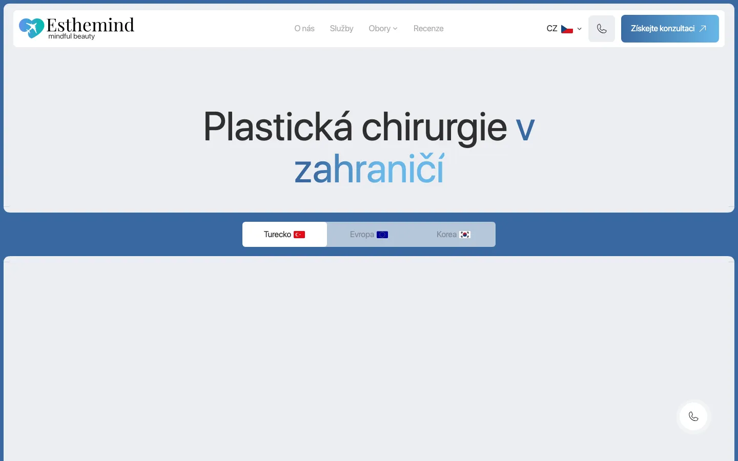
Turkey, Europe and Korea side by side on a procedure page, so a patient compares before asking. project record and saved page

The project

Task, approach and delivery

The task

Esthemind needed to explain its role in organising treatment abroad and help visitors navigate procedures and destinations. The brief combined a considered visual presentation with practical information before consultation.

The structure needed to distinguish the organiser’s service from clinical information and make the next step understandable for someone researching an unfamiliar destination.

The approach

We arranged the presentation around the company, procedures and practical questions, with destination tabs on procedure pages.

Consultation and phone actions give visitors a direct route to the team while leaving the explanations available to read.

What we delivered

A Webflow site in Czech, Ukrainian and English with clinics, procedures, reviews, a consultation form and a phone button, edited by the client’s team. Domain and hosting in the client’s name.

Helping a visitor understand treatment abroad before making contact

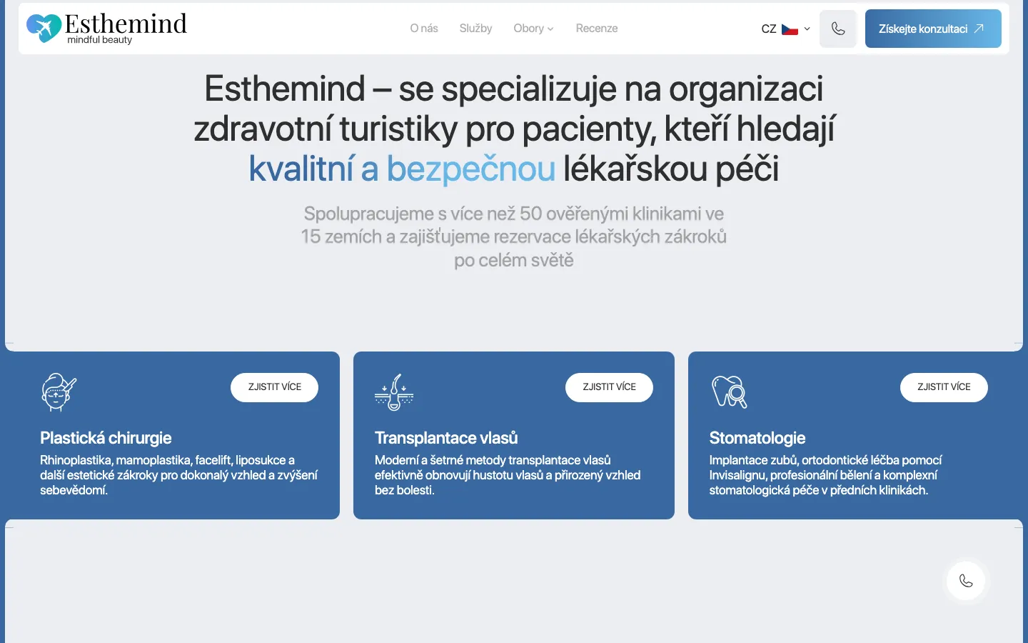
Esthemind brings several kinds of information into one website: procedures, destinations, clinics and the organisation of a trip. Our recorded scope was a Webflow presentation in Czech, Ukrainian and English. The design task was to make these layers understandable and keep a consultation accessible. The website presents the organiser’s service; its appearance is not evidence of clinical quality or a promise about treatment outcomes.

A calm opening with an identifiable next step

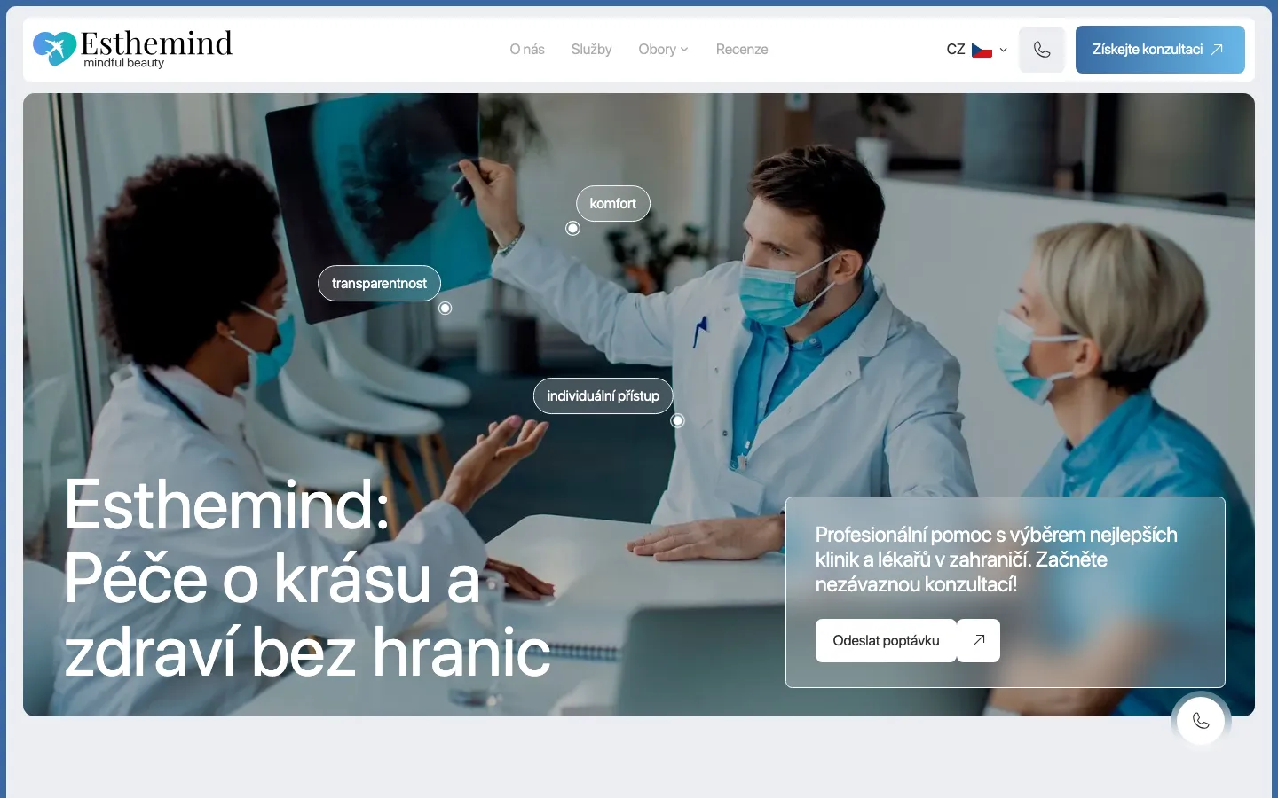
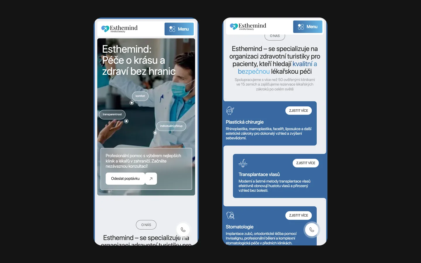
The saved opening uses a large photograph of a consultation, surrounded by a light frame. The company name sits in the header, while a broad white heading occupies the lower part of the image. Blue and turquoise accents connect the logo with the consultation button. Small labels describe the service’s intended qualities. These elements create a recognisable composition without turning every sentence into another competing action.

The consultation card is placed over the image in a translucent panel. This allows the photograph to remain part of the composition while providing a distinct area for an explanation and button. The phone action is also visible. A visitor can read further or choose to speak with the team. For this type of website, that choice matters: someone researching an unfamiliar destination may need a conversation before being ready to describe a particular request.

The information has several different owners

The organiser’s service
Explain what the company coordinates and how the visitor can ask for clarification. Travel arrangements, communication and consultation requests should be described according to the actual service agreement. In a comparable brief, the organiser must approve this information; a designer should not fill missing operational details with plausible sounding promises.
The clinical information
Descriptions of procedures and clinics need review by the responsible client specialists. A website team can organise headings, navigation and reading order, but it cannot establish medical suitability through interface design. The case concerns the presentation of supplied information, not independent accreditation of clinics or the provision of medical advice.
The visitor’s enquiry
A request for contact starts a conversation. It should not look like a confirmed treatment booking or an immediate assessment. For a similar project, we would agree what basic information is needed at this stage and which sensitive details belong in a separately arranged conversation rather than an ordinary public contact form.

Keeping a procedure and its destinations connected

The project records describe destination tabs within a procedure page. Their useful property is continuity: a visitor can keep the procedure as the subject while changing the geographical context. That relationship is easier to explain when destination labels stay visible and the selected option is clear. The reader should understand both what remains the same and what has changed after selecting a tab.

This structure also creates an editorial obligation. Comparable destinations need comparable kinds of information. If one panel contains a long introduction and another contains only a photograph, the interface suggests a comparison that the content cannot support. In a new project, we would prepare a content outline for each procedure and destination before designing the final components. Missing information would remain a question for the client, rather than being concealed by decorative cards.

The same distinction applies to a clinic and a country. A country page supplies context; it does not establish that every clinic offers the same services or arrangements. Clear headings help prevent those layers from becoming interchangeable. The documented site brings clinics, procedures and destinations into a shared structure. It does not establish an automated recommendation engine or a clinical decision system, and neither is included in the scope described here.

Three languages require matched meaning

Czech, Ukrainian and English were included in the recorded delivery as separate language versions. For a medical tourism organiser, translation affects more than a welcome message. The names of procedures, the description of coordination and the meaning of the consultation action need to remain consistent. A shorter translation must not accidentally turn a request for information into a promise of a particular service.

A useful review follows one complete route in each language: open a procedure, choose a destination, read the practical explanation and reach contact. Navigation labels may differ in length, so the layout needs room for them. The comparison should concern equivalent information rather than identical line breaks. This is how we would structure acceptance for a similar multilingual commission; it is not a claim that the archived project has a current medical or legal certification.

A practical sequence for preparing the content

  1. Map the questions

    List the questions the organiser actually receives about destinations, communication and the sequence of arranging a consultation. Match each question to an existing page or a necessary section. This keeps a new site focused on useful explanations and exposes information that needs approval before design begins.

  2. Approve one complete route

    Prepare one procedure with its destination information and contact wording in the primary language. Review the distinction between the organiser’s role and the clinic’s role. Once that structure is clear, the remaining material can follow it without copying unverified claims between different services.

  3. Review translations together

    Check the corresponding pages as a set, including buttons, phone links and short interface messages. A translated heading alone does not complete a language version. The person responsible for the service needs to confirm that the practical meaning remains accurate from the opening explanation to the enquiry.

Editing after launch without losing the structure

Webflow was used for the site, with editable material for clinics, procedures and reviews according to the project records. A collection gives the team an organised place to update content, but it does not make every possible edit harmless. Long titles, a different image shape or a newly introduced destination can change the balance of the layout. A handover should distinguish everyday content updates from structural changes that deserve another review.

For a comparable site, we would also define who checks information when a clinic, destination or service arrangement changes. Keeping the visual template consistent cannot compensate for outdated details. A simple publication responsibility is more useful than assuming that a page remains correct because it still looks finished. The appropriate owner may differ for translation, service information and clinical descriptions.

What this case demonstrates

Esthemind demonstrates a multilingual website for presenting an organiser’s services and helping visitors reach a consultation. The saved design shows the visual hierarchy; the agency records describe the Webflow build and content structure. We do not publish a measured increase in patient enquiries, completed treatments or revenue for this case, because those results are not documented in the materials used here.

If you are commissioning a similar website, bring the approved service descriptions, destination structure, available photography and the names of the people who will review specialist information. We can then define the page system, language routes and contact experience around the actual service. This produces a clearer brief than asking the site merely to look reassuring: it identifies what the visitor must understand and who can confirm that each explanation is correct.

What the site does

Project features

  • Service explained

    The organiser, procedures and practical information have distinct places in the structure.

  • Destinations connected

    Tabs keep geographical options within the context of a procedure.

  • Three languages

    Separate Czech, Ukrainian and English content routes.

  • Direct contact

    Consultation request and a phone action for the next conversation.

“Our patients come from different countries, so the site had to work in several languages and feel trustworthy from the first screen. HeadPills built it that way: clear structure, calm design, every language in place. Enquiries now come through the site.”
Esthemind · Medical tourism, Czech Republic · approved by the client

Questions

About Esthemind

What languages is the Esthemind site in?

Czech, Ukrainian and English, each as a separate set of pages. Patients come from different countries, so the site could not be one language with a translator widget.

Why does the Esthemind site show destinations as tabs?

Because a patient compares before asking. Turkey, Europe and Korea sit side by side on a procedure page, so the comparison takes one click instead of three sites.

What platform is Esthemind built on?

Webflow, with editable content for clinics, procedures and reviews according to the project records. Structural changes still require layout review.

Start a similar project.

Tell us what your site has to do. A short call, then a fixed price in writing.