Case · Travel

Excursions Tenerife: a tour catalogue on Webflow.

An English catalogue of island activities, with category navigation, search, tour pages and booking routes. The saved design pairs photographs and concise offer information with orange controls on a light background.

  • Travel
  • Tours
  • Booking
  • Webflow
  • English
  • Tenerife, Spain
excursionstenerife.esExcursions Tenerife website preview
Activity categories

Sea activities, land adventures, parks, transfers and private arrangements. project records and saved screens

Offer cards

Photographs, titles, type labels and starting prices in the saved catalogue. project records and saved screens

Booking route

Booking is part of the recorded scope; current methods and availability require confirmation with the operator. project records and saved screens

The project

Task, approach and delivery

The task

Organise a varied offer into understandable activity categories.

Help visitors compare options and proceed from the catalogue to tour details and booking.

The approach

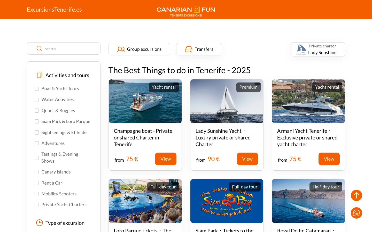
We placed category filters beside the tour grid and search above the catalogue. Saved cards combine photographs, names, tour-type labels, starting prices and a view action.

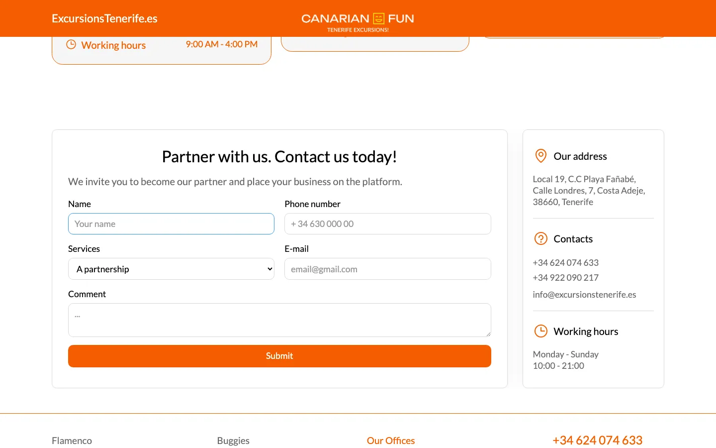
Group excursions, transfers and private charters have recognisable entries. Tour, partner and contact pages support the path from browsing to an enquiry or booking.

What we delivered

A Webflow catalogue-and-booking site in English with filters, tour pages, booking, partner and contact pages, run by the operator. Domain and hosting in the client’s name.

A tour catalogue organised around the visitor’s choice of activity

Excursions Tenerife’s recorded scope is an English Webflow catalogue with filters, tour pages, booking routes, partner information and contact. The offer spans several types of island activities, so the central task was to make a large selection understandable before a visitor opened individual entries. This case examines that catalogue structure and the transition into booking, using project records and saved screens rather than claiming current availability or prices.

Start with the kind of experience

The saved catalogue places activity categories in a left column, a search field above them and the tour grid alongside. The categories include sea activities, land adventures, parks and other ways to spend time on the island. The structure begins with what the visitor wants to do, rather than requiring them to know the name of a supplier before they can browse. This gives an unfamiliar catalogue an accessible first level.

A separate row gives group excursions, transfers and a private charter recognisable entries. These are different intentions from browsing all activities without a fixed plan. A transfer request is concerned with a journey; a charter enquiry concerns a particular type of service. Keeping the labels distinct helps the visitor choose an appropriate starting point without pretending that every tourism product has the same booking details.

Cards provide enough information to decide what to open

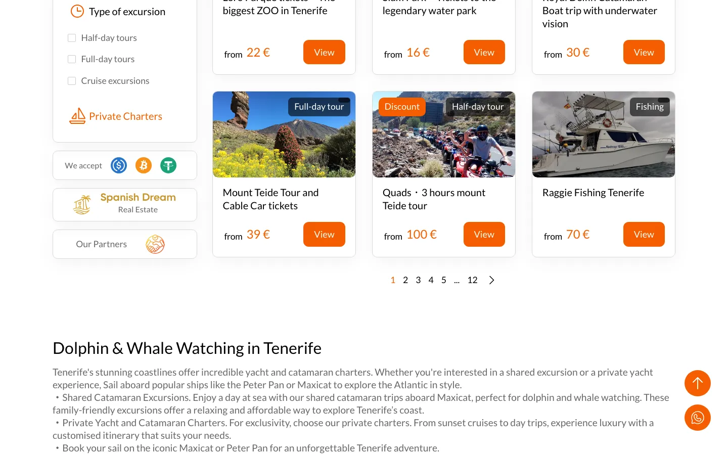
The saved tour cards combine an image, a descriptive title, a tour-type label, a starting price and a view action. Orange is used for the price and button, while the surrounding page remains light. This creates a clear distinction between the content that identifies an option and the control that opens it. A person can compare the general character of several entries without loading every detail page first.

The starting-price label is significant. It introduces an entry point for the offer, not necessarily the final amount for every group, date or configuration. For a comparable catalogue, the detailed page should explain what determines the actual selection and total. The design should preserve that meaning rather than let a large price create an impression of a universal fixed ticket. The figures visible in the archived screenshots are historical examples, not a current quotation.

Tour-type labels also need careful interpretation. A short label can distinguish a day trip, a premium offer or a rental category, but it cannot replace a full explanation of duration, meeting arrangements or inclusions. The catalogue card’s job is to help select the next page. The detail page then needs to answer the questions that matter before the visitor proceeds further.

Three layers between browsing and booking

The catalogue
Helps narrow a broad choice using categories, search and concise cards. For a new project, the category names should reflect meaningful differences in the operator’s offer. Too many overlapping labels can make filtering harder, even when the technical controls work correctly. Each filter needs a clear reason to exist.
The tour page
Gives the specific offer enough context for a decision. Approved images, inclusions, practical conditions and the booking action belong together. The website team should work from operator-provided information rather than inventing a meeting point, age condition or cancellation rule to make the page feel complete.
The booking stage
Collects the information required for the selected option and explains its status. A request, a payment and a confirmed reservation are different events. For a comparable integration, we would agree which system owns availability and confirmation before using language that suggests a booking is guaranteed.

Search and filters need consistent catalogue data

The project records describe filters and search as part of the catalogue. Their usefulness depends on the underlying entries being classified consistently. An activity should not appear in a category merely because a keyword occurs somewhere in a long description. A visitor expects a selected filter to represent a meaningful property of the offer, so the editing rules must explain how those categories are assigned.

For a similar commission, we would review representative entries from different activity types before importing the complete catalogue. This reveals whether the same fields make sense for a park ticket, a guided excursion and a private charter. Some information can share a common structure; other details need their own treatment. The aim is a coherent catalogue, not a form that forces every product into identical wording.

Empty or narrow result sets also need understandable behaviour. A person who combines filters should be able to recognise why few options remain and how to broaden the selection. This is a useful acceptance question for a new catalogue. It is not a claim that a particular empty-result treatment or measured search improvement was delivered in this archived project unless documented separately.

Booking information should remain connected to the chosen tour

The recorded delivery includes booking, and the original materials mention payment options. This case does not perform a live purchase or certify that those methods remain available today. The website design issue is continuity: the visitor needs to understand which offer they are booking, what their selected values mean and which organisation will confirm the arrangement. A handoff to another service should not erase that context.

For a comparable build, payment and availability would be reviewed as an integration scope of their own. The operator must define the booking conditions and the source of confirmation. The website can present them clearly, but an attractive button cannot establish inventory or settle a mismatch between two systems. Acceptance should check the agreed flow and wording, including unsuccessful or incomplete attempts, using an authorised test process.

A practical way to prepare a tour catalogue

  1. Organise the actual offer

    Group activities by visitor intention and identify the special routes, such as transfers or private arrangements. Keep supplier details where they are useful without making them the only navigation system. For a new brief, the starting point is the operator’s real catalogue and the questions visitors repeatedly ask.

  2. Prepare complete examples

    Build a few representative entries with approved descriptions, imagery, prices and practical conditions. Check whether a list card introduces the same offer as the detailed page. This exposes missing information before the whole catalogue is populated and reduces the risk of inconsistent product descriptions across categories.

  3. Follow the booking transition

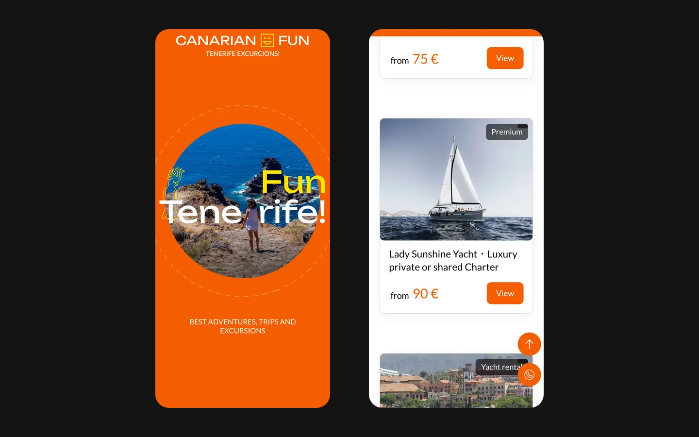
    Move from a filtered result to its detail and into the agreed booking route. Review what the visitor knows at each stage, especially on a phone. The important outcome is continuity of the selected offer and clear status, rather than simply making every button open another screen.

What this delivery demonstrates

Excursions Tenerife demonstrates a catalogue approach for a varied tourism offer, with activity navigation, concise product cards and routes into booking. The saved design uses a light layout and orange accents to support scanning. The recorded platform is Webflow. Mobile performance requires measurement on the implementation. A visible booking action is part of the interface; a completed reservation also depends on accurate conditions and the connected services.

The case does not publish a measured increase in tour sales or conversion. For your own operator website, bring an approved catalogue, the conditions that must be visible before booking and a clear description of the system that handles confirmation. Those inputs allow a design team to make a large offer easier to navigate and help visitors progress from a broad holiday idea to a specific, understandable selection.

What the site does

Project features

  • Choose an activity

    Categories help narrow the offer.

  • Compare options

    Cards introduce each offer before opening details.

  • Continue to booking

    The selected tour connects with a booking route.

  • Learn about the operator

    Partner information and contact have their own pages.

“Tourists book from their phones on the beach, so the booking had to be simple. HeadPills built a site where you pick a tour, see the date and book in a minute. Bookings come in without a single call.”
Excursions Tenerife · Tours, Canary Islands · approved by the client

Questions

About Excursions Tenerife

How is the Excursions Tenerife catalogue organised?

The catalogue uses activity categories, search and filters, with separate entries for group excursions, transfers and private charters.

Can visitors book and pay on the Excursions Tenerife site?

Booking is included in the recorded delivery. Confirm current availability, payment methods and conditions with the operator.

What platform is Excursions Tenerife built on?

Webflow, with tour collections and an English presentation.

Start a similar project.

Tell us what your site has to do. A short call, then a fixed price in writing.