Case · Wellness

Mood Board: a Webflow website for an immersive spa product.

An English product presentation connecting the visual experience with offer details, a calculator and a business consultation. The recorded scope concerns the website, separately from the engineering of the equipment.

  • Wellness
  • Spa technology
  • Webflow
  • English
  • B2B
mood-board.euMood Board website preview
Explained effects

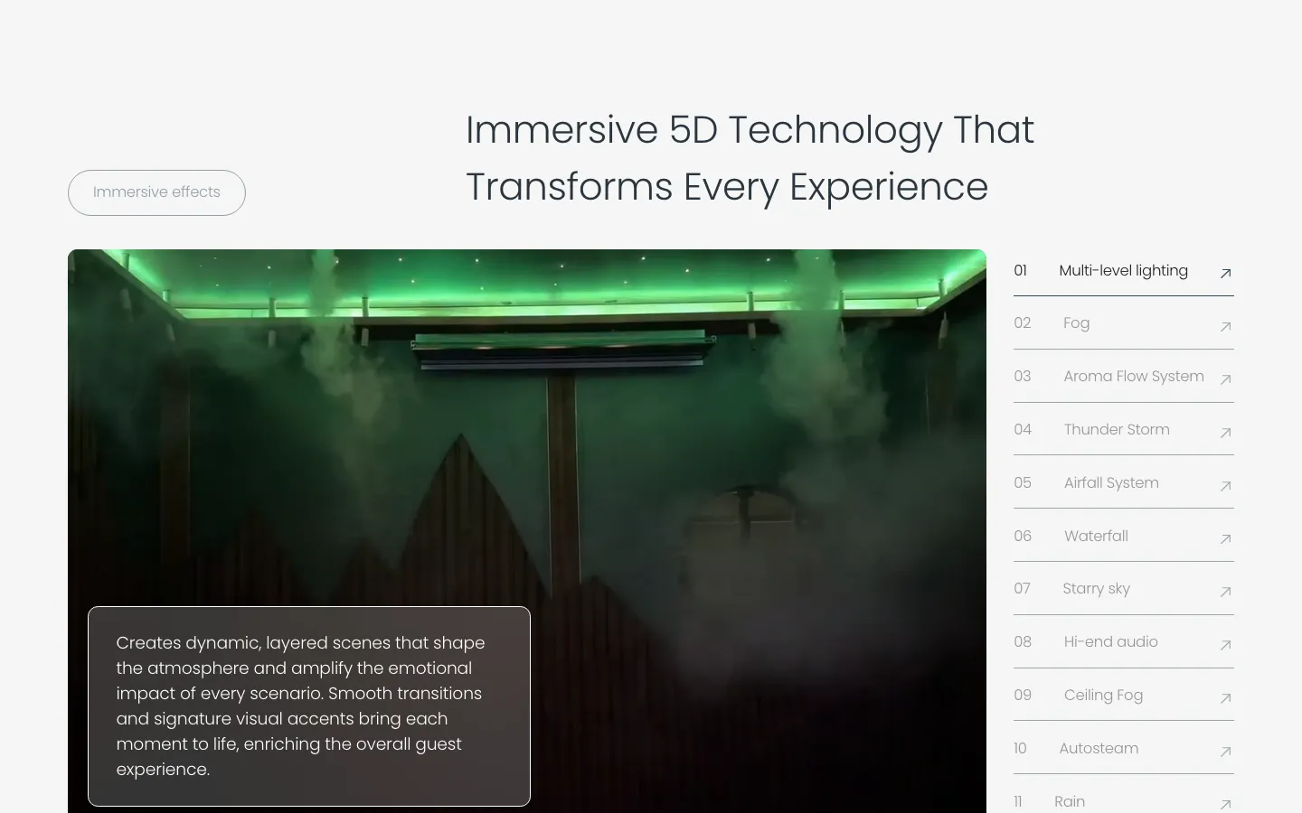
The project records describe a list of eleven effects. project record and saved screen

Calculator

A scenario based on visitor inputs; not a guaranteed return. project record and saved screen

Webflow

Offers and case material editable by the client. project record and saved screen

The project

Task, approach and delivery

The task

Mood Board needed to explain its multisensory spaces to businesses and private customers.

The presentation had to connect demonstration material with practical product information and an enquiry.

The approach

We used the space as the visual opening, with consultation available in the header.

Component explanations, offers and the calculator give visitors different ways to explore the proposal before contact.

What we delivered

A Webflow site in English with offers, cases, a profit calculator and a consultation booking, edited by the client. Domain and hosting in the client’s name.

Explaining an immersive spa product to a business buyer

Mood Board presents multisensory wellness spaces to hotels, resorts, clubs and private customers. The recorded website scope was an English Webflow presentation with offers, project material, a calculator and a business consultation route. The central design challenge was to connect an experience that is easier to show with information that a potential operator can discuss. The website supports that conversation; it does not establish the profitability of a future installation.

The first screen puts the space in view

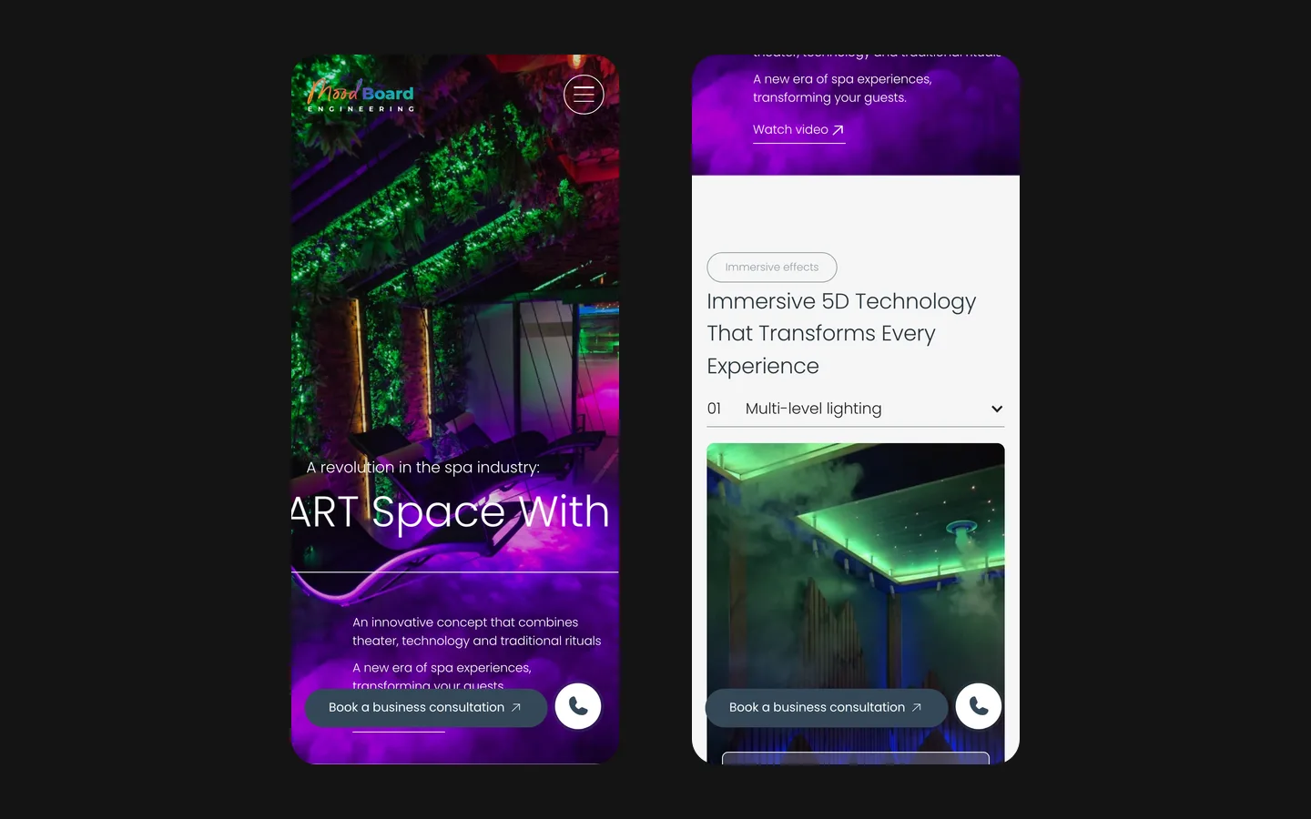
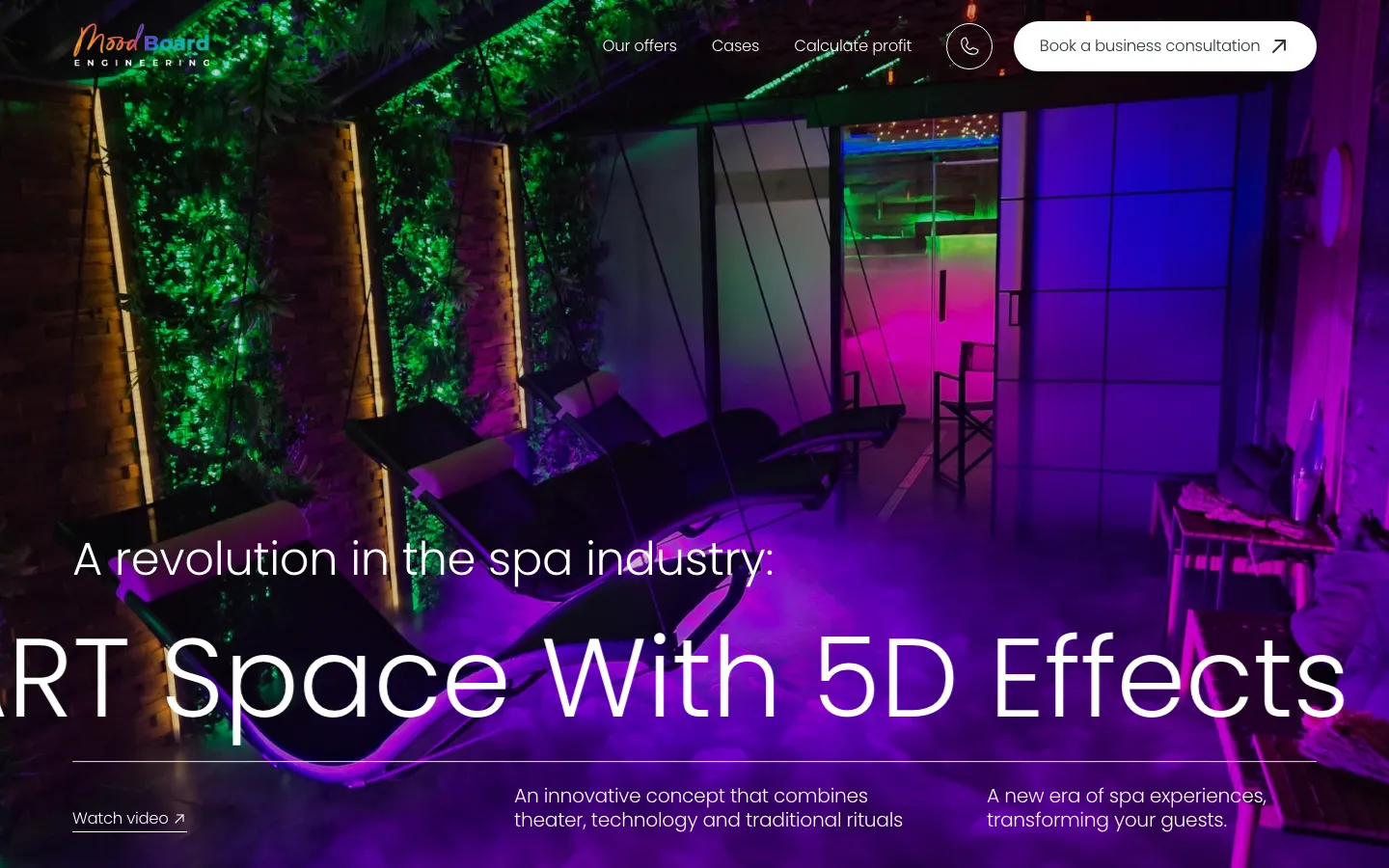
The saved opening uses a large interior image with green, purple and warm light. Seating, planting and reflective surfaces give the visitor a sense of a physical environment. White type sits over the photograph, while the navigation names the offers, cases and calculator. A prominent consultation button is already present in the header. The page therefore combines atmosphere with a practical next step from the beginning.

This is useful because an unfamiliar product needs a recognisable setting. A list of effects on its own would not show how they belong to a room. Equally, the image cannot explain every technical or operational question. The opening establishes what kind of experience is being discussed, then the following content needs to explain its components. A website should not require the visitor to infer the whole offer from an attractive interior photograph.

Turn the experience into understandable components

The project records describe a list of eleven effects, including lighting and environmental effects. Organising them separately gives the visitor a way to move from a broad impression to a specific question. Instead of treating the product as one mysterious feature, the page can explain what each element contributes to the presentation of the space. This is a content structure, not an independent technical verification of the equipment.

For a comparable product site, each component should have an explanation that serves the buyer rather than merely repeating its name. The reader may need to know what they will see, what material demonstrates it and what should be clarified in a consultation. Claims about installation requirements, maintenance or compatibility should come from the responsible product team. Those details should not be guessed from the appearance of a render or a photograph.

The terminology also needs a stable relationship with the imagery. If several effects are visible together, captions can distinguish an overall scene from an individual function. A short video may demonstrate sequence better than a static image, but it still needs an intelligible label and a way to continue reading. The saved site provides a video action; the role of that action is to offer more context, not to hide the basic explanation behind playback.
Three kinds of material, three different purposes

An experience image
Establishes the character of the space and helps someone understand the product category. It should be identified appropriately if it is a concept or visualisation. Its purpose is different from a documented installed project. For a new brief, we would agree those labels before combining concept imagery and completed work in one portfolio.
An explained offer
Gives the reader a practical description of the product and the points to discuss. The site’s offer area connects the visual introduction with the business enquiry. A useful explanation states the scope clearly enough that a visitor can ask an informed question without assuming that every possible room or configuration is included.
A calculation scenario
Lets the visitor consider selected assumptions in a structured way. The project records describe an occupancy and price input. Such a result depends on the model and the values entered. It should lead to a discussion of assumptions, rather than being presented as a guaranteed financial outcome simply because the interface produces a precise number.

What a calculator needs beyond attractive controls

A calculator can make an otherwise abstract commercial conversation more concrete. Its usefulness depends on whether the visitor understands what they are changing and what the result represents. A percentage, a price and a time period require clear labels. For a comparable implementation, we would agree the calculation model with the client and make the scope of the estimate visible near the result, not leave the reader to guess it.

Revenue, profit and payback are different measures. A website should not use those words interchangeably when the underlying model includes different inputs. Before publishing a similar tool, the product owner should confirm which costs and assumptions are included, what values are illustrative and when a personal calculation is required. This case records the presence and role of the calculator; it does not claim an independent audit of its financial model.

The consultation following a scenario should preserve the distinction between interest and a finished commercial decision. A visitor may want to understand whether their space is suitable or which assumptions need adjustment. A clear transition tells them what to discuss next. It does not imply that entering values reserves equipment, confirms feasibility or creates an agreed installation price.

Preparing a similar product presentation

  1. Separate demonstration material

    Identify installed examples, concept visuals and explanatory media. Keep the source and intended meaning of each asset with the content. This helps the page show the experience convincingly while avoiding accidental claims about locations, ownership or implementation that the image itself cannot substantiate.

  2. Agree the explanatory structure

    Define the offers, components and questions that must be answered before a business consultation. Connect each point to a suitable visual or a concise explanation. A visitor should understand how the parts relate, even if they do not watch the video or use the calculator during their first visit.

  3. Review the enquiry route

    Check how someone moves from an offer or calculation to contact. Agree what information the team needs to continue the conversation and which details are better established later. For a new project, test the meaning of the result and the contact action together, because a clear calculation can still lead to an ambiguous request.

Keeping the presentation current in Webflow

Webflow is the recorded platform, with offers and case material that the client can edit. That is useful when the public presentation changes over time: an example can be replaced, an explanation improved or a new offer added within the prepared structure. The technical ability to publish does not remove the need to review whether the visual and the accompanying description still refer to the same configuration.

For a comparable handover, the editing instructions should distinguish content updates from changes to the calculator’s assumptions or behaviour. Replacing a photograph and changing a calculation model are different tasks. The latter needs deliberate review because it can alter the meaning of the result. The website’s presentation and the product team’s approved information should remain aligned after the original delivery.

What this project is useful for evaluating

Mood Board shows how a website can introduce an unusual physical product through atmosphere, component explanations and a route to a business discussion. Our documented work is the website presentation, not the engineering of the spa equipment or a promise of commercial return. No measured increase in installations, enquiries or sales is claimed here without supporting data.

For your own product, prepare clear demonstration material, the approved scope of the offer and the questions your sales team needs to resolve. If a calculator is useful, bring an agreed model and definitions for its outputs. Those inputs allow the design to connect curiosity with a specific conversation, while keeping the attractive first impression and the practical explanation part of the same experience.

What the site does

Project features

  • An atmospheric opening

    The interior sets the context, with a consultation action already available.

  • Components explained

    Individual effects help organise the product description.

  • A calculation scenario

    An input-based illustration for further discussion of assumptions.

  • Business contact

    A route from the offer to a consultation.

“We sell a product people have to feel, so the site had to be calm, clear and beautiful at the same time. HeadPills got the balance right: it explains what Mood Board is in a minute and looks premium doing it.”
Mood Board · Spa technology · approved by the client

Questions

About Mood Board

What does the Mood Board site do differently from a product brochure?

It connects a visual product introduction with component explanations, a calculator and a business consultation. Calculation results depend on their inputs and model.

Who is the Mood Board site for?

Hotels, resorts, clubs and private buyers considering multisensory spaces. The next step is a consultation.

What platform is the Mood Board site built on?

Webflow, with offers and case material editable by the client according to the project records.

Start a similar project.

Tell us what your site has to do. A short call, then a fixed price in writing.