Case · Interior design

Bellissimo Home: identity and website for a furniture showroom.

We developed the brand identity and a Polish Webflow website for the Wrocław showroom. The delivered version brings room categories, manufacturer catalogues and an architects’ section together with a request for contact.

  • Interior design
  • Premium furniture
  • Branding
  • Webflow
  • Polish
  • Wrocław, Poland
homebellissimo.comBellissimo Home website preview
Brand + site

Logo, palette, typography and a brandbook made together with the site, so both say the same thing. project record and saved version

Room by room

Living room, bedroom, dining, kitchen, bathroom, lighting, accessories: the whole house as a catalogue. project record and saved version

A path for architects

A separate section and a project conversation for architects, who buy differently from private clients. project record and saved version

The project

Task, approach and delivery

The task

The showroom needed a catalogue that could organise furniture and interior products by room, with enough space for photography and practical information.

Private visitors and architects needed useful starting points: room inspiration, manufacturer materials and a route to discuss a project.

The approach

We built the brand and the site as one project: logo, palette, typography and a brandbook, so the identity survives being handled by other people later.

The catalogue is structured by room, with categories, producers and downloadable catalogues; a separate section serves architects, with a request for a project conversation instead of a cart.

What we delivered

A brand identity and a Webflow site in Polish: a catalogue room by room, an architects’ section, catalogues and producers, client information and a contact request. Domain and hosting in the client’s name.

A furniture showroom organised around rooms and project conversations

Bellissimo Home combines the selection of Italian furniture with a showroom in Wrocław. Our project records describe a brand identity and a Polish Webflow website, with a catalogue arranged by room and a separate section for architects. This case examines that delivered version using its saved screens. The current destination of the original domain has changed, so later features of the live business website are not automatically part of the work described here.

The room is the first useful category

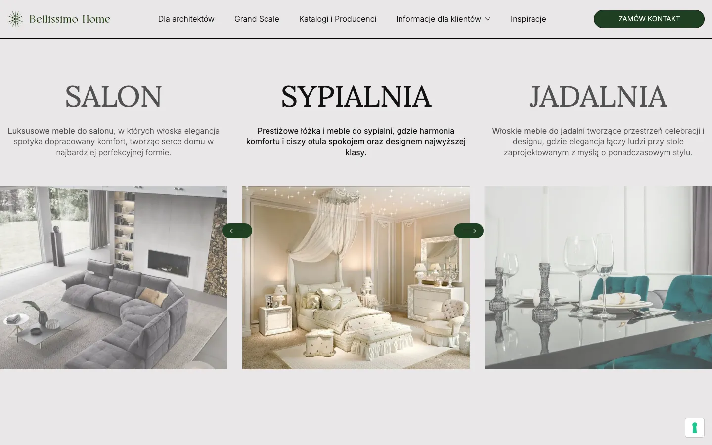
A visitor furnishing a home may begin with a room rather than a manufacturer’s name. The recorded catalogue brings together living areas, bedrooms, dining rooms, kitchens, bathrooms, lighting and accessories. This provides an understandable starting point for someone who knows what they are furnishing but has not yet chosen the exact object. Manufacturer information and downloadable catalogues then support a more specific conversation.

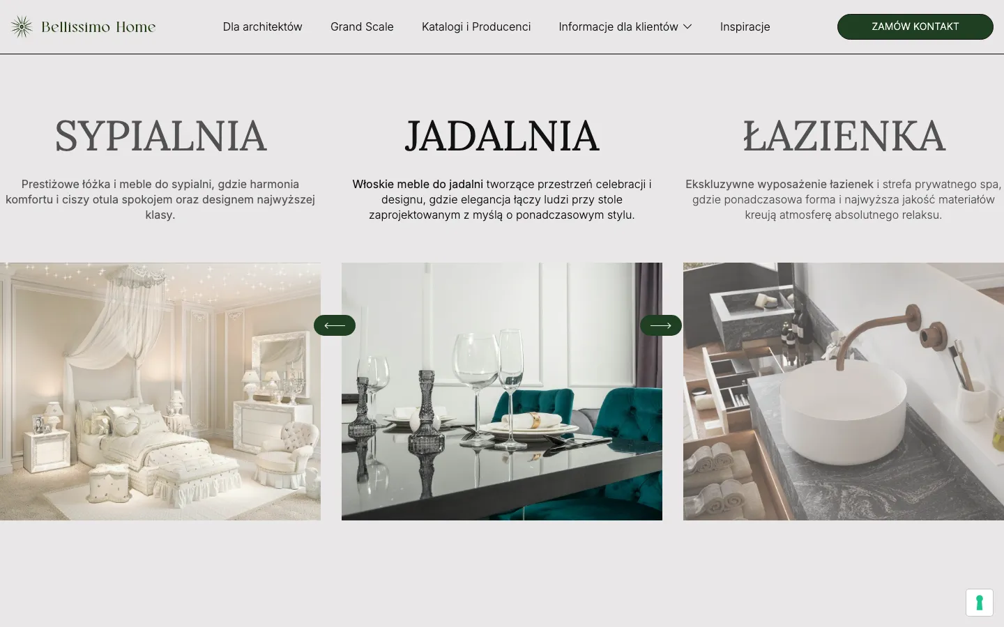
The saved screen shows bedroom, dining and bathroom categories as neighbouring compositions. Each has a large serif heading, a short explanation and a photograph that shows an interior context. The room labels provide orientation before the visitor needs to interpret the details of the furniture. It is an approach to organising the offer, not a claim that every item visible in a photograph can be bought as an identical ready-made set.

A visual identity that leaves room for the furniture

The documented brand work includes the logo, colour palette, typography and a brandbook. On the saved website, dark green appears in the mark, contact control and small navigation actions. A light neutral background gives the photographs a consistent setting. Large serif titles create a different level from the practical sans serif navigation and descriptions. The page has enough identity to belong to the showroom while allowing different interiors to retain their own colours and materials.

Developing identity and website together makes these decisions concrete. A colour is tested on a button as well as in a brand presentation. A typeface must work in a short category label and a longer information block. The brandbook records the principles so future material can remain related to the site. It does not mean every subsequent communication is automatically controlled by the original design team; the usefulness lies in having an explicit reference.

Three routes through the same offer

Furnishing a room
Start with the room category and an interior image that establishes the kind of selection. A private customer may need help understanding which pieces belong together or what to discuss in the showroom. The page should make a conversation possible before requiring a complete product specification from someone who is still choosing.
Working on an architectural project
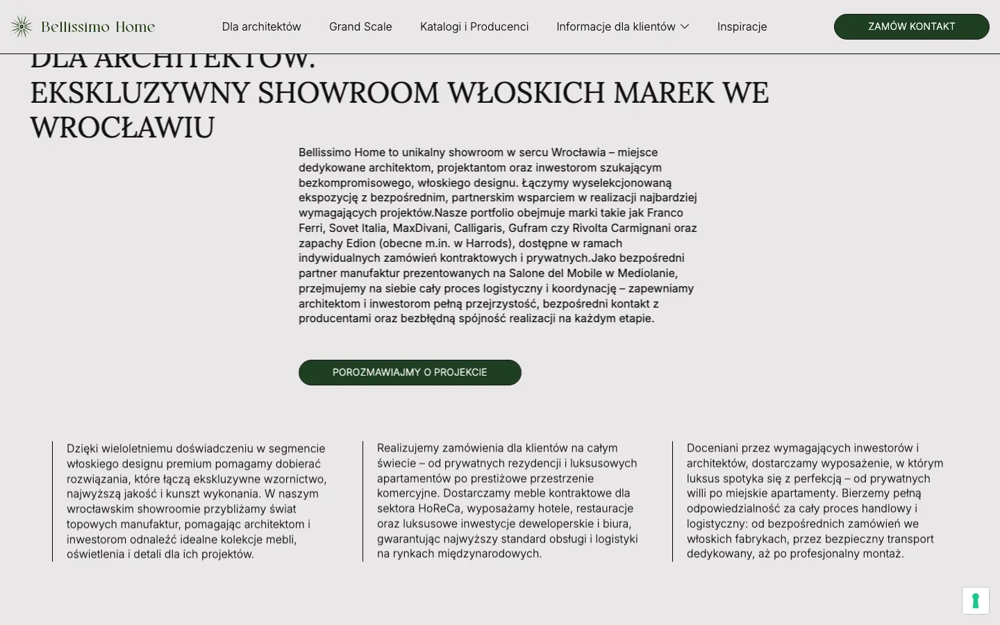
The separate architects’ section gives a place to discuss manufacturers, catalogues and a broader project. This is a different context from casual browsing. It can accommodate someone who already has a brief or layout and needs information for a client presentation. It does not imply that every professional arrives with identical requirements.
Finding practical conditions
Client information about ordering, delivery or payment supports the decision to make contact. It should remain easy to locate alongside the visual catalogue. In a comparable project, these explanations would come from the showroom’s approved terms, rather than being invented by the website team to make a category page appear complete.

Why the recorded site leads to a conversation

The project uses a request for contact instead of presenting the catalogue as a conventional cart journey. That fits a brief where the visitor may need to discuss a room, a manufacturer or a made-to-measure request. The saved navigation gives the contact action a distinct green shape. The offer and the next step can therefore remain visible together, without placing a purchase control on every interior photograph.

A consultation route still needs a clear promise about what the visitor is requesting. An enquiry is not a confirmed furniture order, a production slot or a final quotation. For a similar showroom site, we would agree which details help the team respond: the room, the stage of the project and the material the visitor already has. The form should not pretend to calculate information that still requires a specialist conversation.

Preparing a catalogue that can be maintained

  1. Set the category structure

    Agree the room categories and the relationship between manufacturers, images and downloadable material. A useful structure accommodates the actual offer instead of reproducing every heading from a supplier’s PDF. Before design, identify which information describes a room, which describes a manufacturer and which belongs to an individual enquiry.

  2. Prepare usable visual material

    Select photographs with enough resolution and a clear right to use them. Keep the context of each image available to the editor. A beautiful interior can illustrate a category, but it should not accidentally become a promise of the showroom’s authorship, current stock or an exact package price unless that information is confirmed.

  3. Connect material with contact

    Review the path from a category or catalogue to the request for a conversation. Check that the visitor can explain what attracted their attention and that the team understands the starting point. For a new commission, this is more useful than simply counting how many images or manufacturer names fit onto a page.

The role of Webflow and the handover

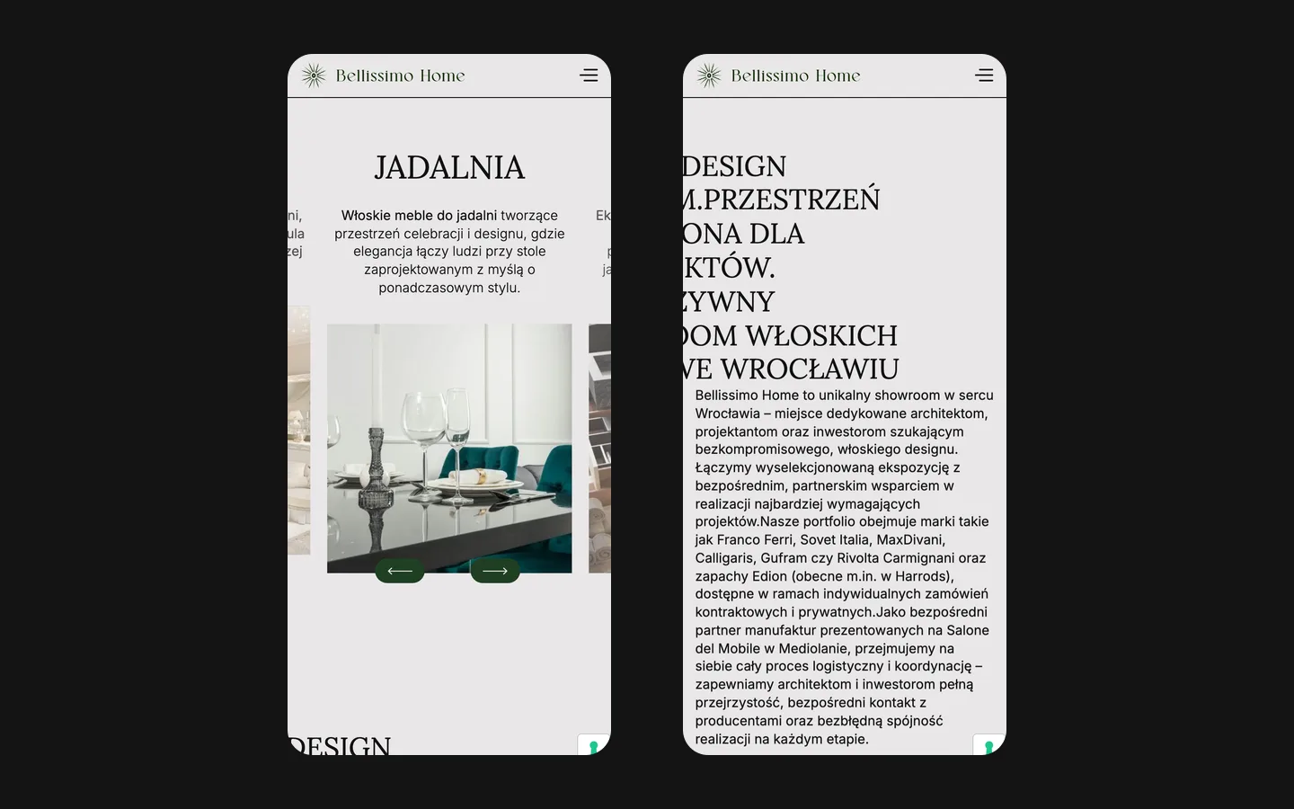
The recorded website was built on Webflow, with catalogue content the showroom could edit. This separates routine updates from the need to redesign a page every time a category image or description changes. The design still places practical limits on the material: very long labels, inconsistent crops and outdated files can weaken the experience even when the technical publishing process works correctly.

A comparable handover should explain how to replace a catalogue, review a changed room description and check a link to contact. It should also establish who owns the latest approved manufacturer materials. A publication system is useful when the team knows which version to publish. It cannot by itself resolve conflicting specifications or decide whether a pictured configuration is still available.

How to assess the result of a showroom website

This case documents identity work and a Polish catalogue website with routes for private visitors and architects. The saved screens are evidence of the visual treatment, while the project records establish the delivered scope. They do not establish a measured increase in furniture sales or a particular value of enquiries. Such a result would require the showroom’s own records and a way to distinguish website contacts from other sources.

For your own showroom project, start with representative rooms, the manufacturer material you are allowed to publish and the kinds of conversations your team wants to receive. Include the questions that currently require repeated explanation by phone. From there, the website can give each audience a useful starting point and preserve the character of the furniture. Bellissimo illustrates how brand decisions, a room-based structure and a clear consultation route can be designed as one coherent piece of work.

What the site does

Project features

  • A consistent visual setting

    Neutral backgrounds, interior photography and a restrained green accent connect the catalogue with the identity.

  • A whole house

    Kitchen, lighting, accessories, living room, bedroom, dining, bathroom: a buyer finds the room, then the piece.

  • Architects served separately

    Catalogues, producers, large-scale projects and a project conversation.

  • Contact in one tap

    A request for contact on every screen that matters, with delivery, payment and returns explained.

“We are happy with how it went. A lot of the guests at our opening said they really liked our site, and I passed your contact on to them.”
Bellissimo Home · Interior design · Premium furniture · translated from the original

OriginalДа,мы довольны сотрудничеством,многие гости на открытии говорили,что им очень нравится наш сайт и я им давала ваш контактик)

Questions

About Bellissimo Home

Did HeadPills make the Bellissimo Home brand as well as the site?

Yes. Logo, palette, typography and a brandbook were made together with the site, so the showroom, the catalogue and the pages say the same thing.

How is the Bellissimo Home catalogue organised?

By room: kitchen, lighting, accessories, living room, bedroom, dining, bathroom and more, with producers and downloadable catalogues. A buyer finds the room first, then the piece.

Why does Bellissimo Home have a separate section for architects?

Because architects buy differently: they need specifications, producers and a conversation about a project rather than a cart. The section gives them that path without mixing it with private clients.

Start a similar project.

Tell us what your site has to do. A short call, then a fixed price in writing.