Case · Interiors

ASKI Studio: interiors, a clear process and a consultation.

ASKI Studio designs interiors and delivers fit-out projects in Poland. We built a one-page Webflow portfolio around large images, selected work and a short explanation of the process. Consultation enquiries are sent to email and a Telegram bot prepared for the studio.

  • Interiors
  • Interior fit-out
  • One page
  • Webflow
  • Polish
  • Poland
askistudio.plASKI Studio website preview
One page

Selected projects, the studio, directions of work, the process, and a consultation request, on a single page. checked on the live site · Sep 2026

Email and Telegram notifications

Enquiries go to email and into a Telegram bot built for the studio. project record

Built on Webflow

Projects added by the studio without a developer. checked on the live site · Sep 2026

The project

Task, approach and delivery

The task

A fit-out studio is judged by photographs of finished spaces. Text competing with them would only lose.

The client wanted a build delivered in clear stages, with no guesswork about progress, and enquiries that do not wait in a mailbox.

The approach

We built a single page dominated by large photography, with the studio, directions of work and the process in short blocks between the images.

Enquiries are routed to email and a Telegram bot prepared for the studio. We kept this agreed route instead of adding another messaging channel with a separate handling process.

The build ran in stages the client could see: design first, then mobile, then release.

What we delivered

A one-page Webflow site in Polish with selected projects, process and a consultation request; enquiries to email and Telegram; domain and hosting set up in the client’s name.

From an interior image to a useful enquiry

ASKI presents interior design through large project photographs, a clear description of the studio’s work and a direct route to discussing a new commission. The Polish portfolio connects visual presentation with an enquiry form and content the client can maintain. Visitors can explore selected work before deciding whether to contact the studio.

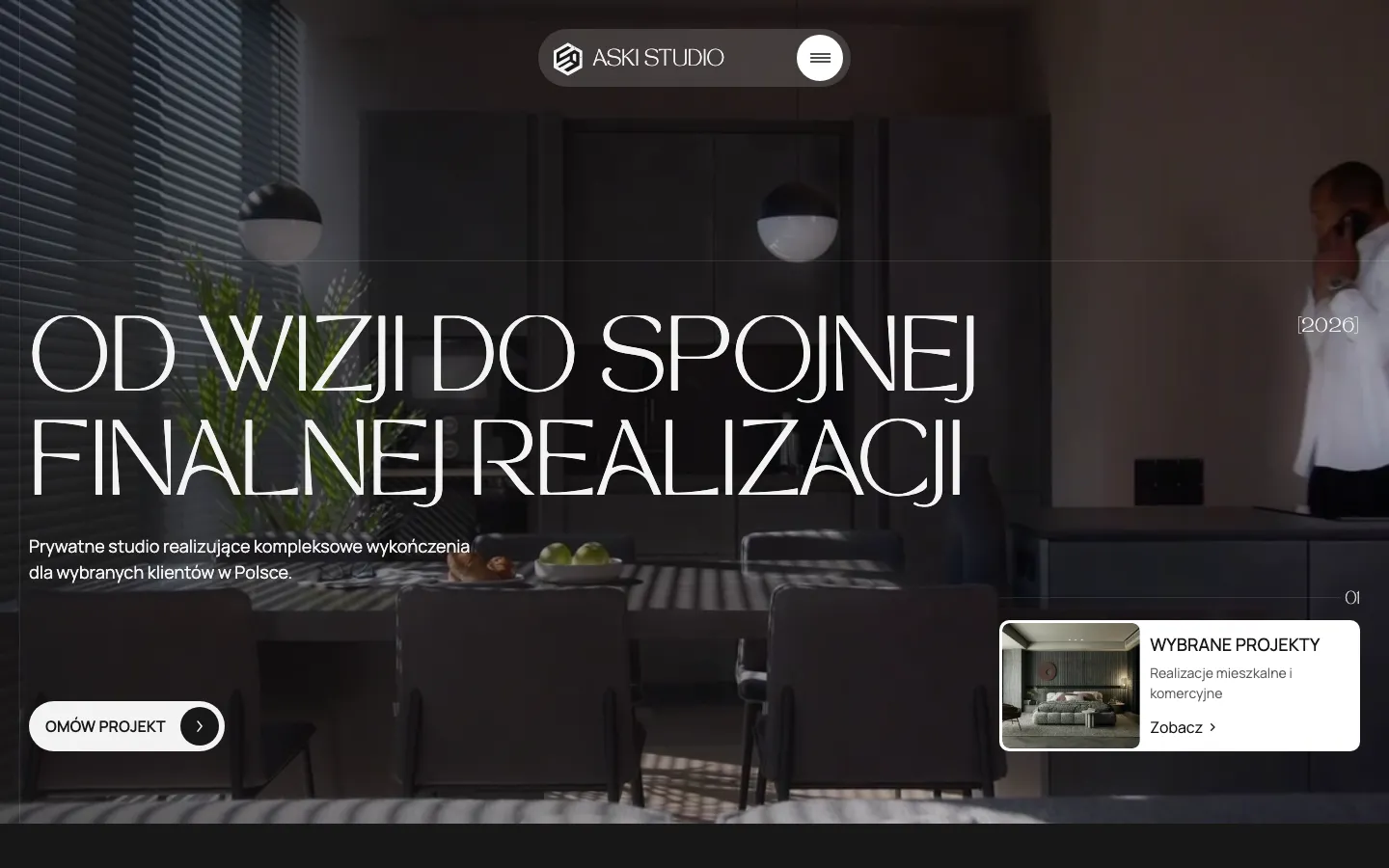
The first screen establishes the scale of the work

The opening composition gives almost the whole opening screen to an interior. The logo and menu sit together above the scene; large, fine lettering crosses it without becoming a separate billboard. A short service description and the project enquiry sit below. This is a deliberate hierarchy: the room supplies the visual detail, while the interface supplies orientation. Adding a row of competing service cards here would change the first impression from a studio presentation to a catalogue.

There are two visible ways forward. A visitor who already likes the work can discuss a project. Someone still evaluating the studio can open the selected work. These choices meet different levels of readiness without asking everyone to complete a form immediately. The useful distinction is between evidence and action, rather than between a primary and a forgotten secondary audience.

What each part must explain

Selected projects
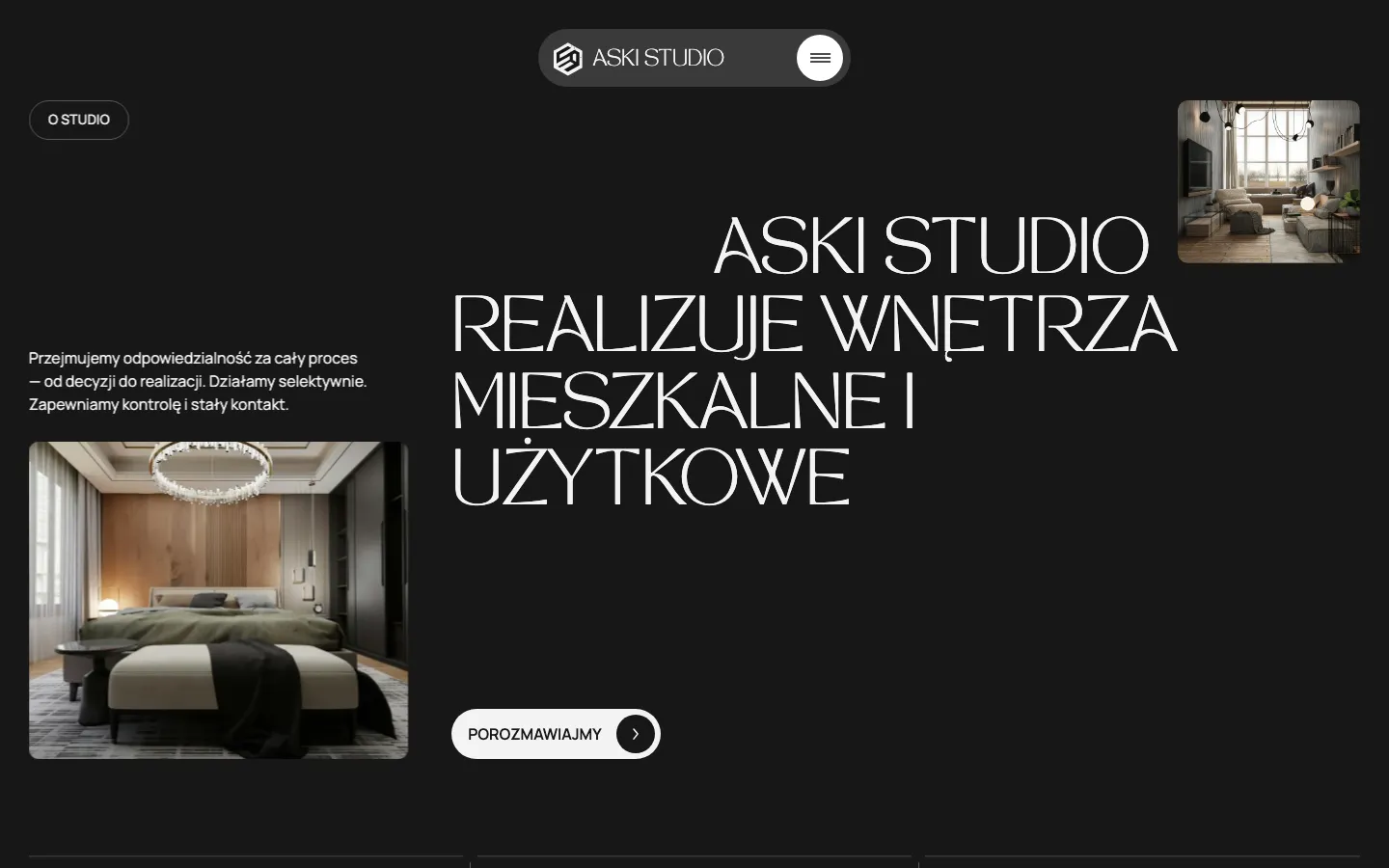
The images let a potential client judge spatial taste, materials and the kind of interiors on display. Their job is to provide something specific to react to in a consultation. A collection should stay selective: publishing every available photograph can make the strongest work harder to find.
Scope of the studio
Short descriptions between photographs tell the reader what they are commissioning. For a fit-out business, a beautiful room alone does not explain whether the team designs, coordinates or delivers the work. The service text gives the visual evidence a commercial meaning.
Working process
The sequence between an initial discussion and delivery makes the collaboration easier to understand before contact. It also helps the client prepare a relevant question. The website can explain responsibilities, but the detailed scope and acceptance terms still belong in the project agreement.

The contact form is the start of an operational handoff

The form sends an enquiry to email and to a Telegram bot made for the studio. These are two destinations for a submitted request, not two different contact forms the visitor must choose between. Email provides a place to work through the request; a mobile notification makes it visible to the team using that channel.

The bot handles notification; the studio handles the reply and the conversation about the project. For a similar connection, decide who owns the first response, what information they receive and what happens when someone is absent. A useful handoff keeps the request readable in the channels the team already uses. More destinations are only helpful when someone is responsible for checking them and continuing the conversation.

How a visitor moves through the page

  1. Recognise a relevant style

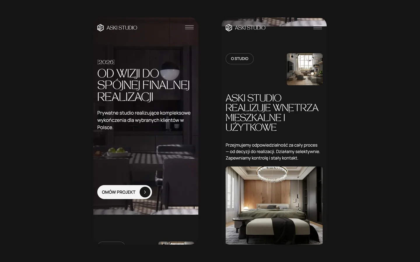
    Start with the large interior image and the selected projects. The visitor can form an initial view of the studio before reading operational detail. On a small screen, that judgment depends on keeping the important part of each room visible rather than simply reducing the desktop image.

  2. Understand the collaboration

    Read the scope and process alongside the work. This is where an attractive portfolio becomes an understandable service: the prospective client can relate their own apartment or commercial space to what the studio describes.

  3. Discuss a real project

    Use the consultation route with enough context for a useful first conversation. The website delivers the enquiry to the studio; feasibility, schedule and a written scope are decisions for the next stage. The page does not need to pretend it can quote an entire interior from a photograph.

Keeping the portfolio useful after launch

ASKI can add projects in Webflow. That ownership matters because a studio’s strongest work changes as new interiors are completed. The long-term content task is to choose representative images, keep descriptions consistent and retire work that no longer reflects the offer. An editable collection makes those changes possible; the selection still needs the studio’s judgment.

For a comparable website, prepare the photography and a short description of your role in each project before discussing elaborate animation. Separate completed work from concepts, identify which images can be published and decide who approves updates. We would also establish the actual enquiry destination and test it with the team. Those inputs determine the scope more reliably than asking for a site that merely looks expensive.

ASKI brings the portfolio, service explanation and consultation form together in a published Polish site. The client can maintain project content, while enquiries reach the studio’s email and Telegram bot. Photography carries the character of the practice; the surrounding interface helps a visitor move from looking at an interior to describing a project. The studio continues that conversation and decides how to respond to the individual brief.

A portfolio with an operational next step

A one-page Webflow portfolio brings project photography, the process and the consultation request together. Enquiries are routed to email and a Telegram bot built for the studio.

Useful when the work is best explained in photographs and the team needs to receive each enquiry in its working channel. Tell us where enquiries arrive now and who should receive them.

Prepare a brief for a similar project

What the site does

Project features

  • Photography leads

    Large images, generous space, short text.

  • Process explained

    From decision to delivery in a few steps, for a client deciding whom to trust with a flat.

  • Lead reaches a phone

    Email and a Telegram bot provide two destinations for the enquiry.

  • Delivered in stages

    Design, mobile, release: the client always knew where things stood.

“I liked that they worked in clear steps: design first, then mobile, then release. You always know exactly what stage you’re at. Thanks for the site.”
ASKI Studio · Creative studio · translated from the original

OriginalСподобалось, що працювали по кроках — спочатку дизайн, потім під телефони, потім реліз. Завжди розумієш, на якому ти етапі. Дякую за сайт.

Questions

About ASKI Studio

Why is the ASKI Studio site a single page?

Because the proof is photographic and the decision is made by looking. One page with large images, the process and a consultation request does the job without a menu to get lost in.

How do enquiries from the ASKI Studio site reach the team?

By email and through a Telegram bot built for the studio. The team handles the response.

Why did HeadPills advise ASKI Studio against WhatsApp?

The project used an agreed email and Telegram route. Adding a channel should depend on who will handle it and how it fits the team’s work, rather than assumptions about every customer in a country.

Start a similar project.

Tell us what your site has to do. A short call, then a fixed price in writing.