Case · Marketing

Bruit Brothers: an animated agency website on Webflow.

A one-page English website for a creative agency, with a photographic opening, expressive typography and manually arranged Webflow interactions. The project records date this motion work to 2024.

  • Marketing
  • Creative
  • Webflow
  • Custom animation
  • Motion design
  • English
bruitbrothers.comBruit Brothers website preview
One page

A single page where the site presents a team standing together, not a generic agency pitch. checked on the live site · Sep 2026

Built on Webflow

Motion built by hand in Webflow interactions. checked on the live site · Sep 2026

Motion work in 2024

The project records describe manually assembled interactions.

The project

Task, approach and delivery

The task

Bruit Brothers needed a website to present the agency and its work. The brief called for a continuous one-page story in which the arrival of blocks, typography and the rhythm of scrolling are part of the design.

The approach

We developed the page around a strong opening and a sequence of sections, with the agency name and visual character carried through the composition.

The motion was manually assembled and tuned to the layout using Webflow interactions.

What we delivered

A one-page Webflow site built almost entirely from hand-tuned motion, matching an agency that creates impact without shouting. Domain and hosting in the client’s name.

Motion as the organising idea of an agency website

Bruit Brothers needed its own presentation as a creative agency. The documented response was a one-page English website on Webflow, with manually arranged interactions and a strong visual rhythm. This case is useful for understanding what an animated portfolio needs beyond an impressive opening: a readable story, deliberate transitions and a route that still makes sense when the visitor moves quickly.

An opening built around scale and contrast

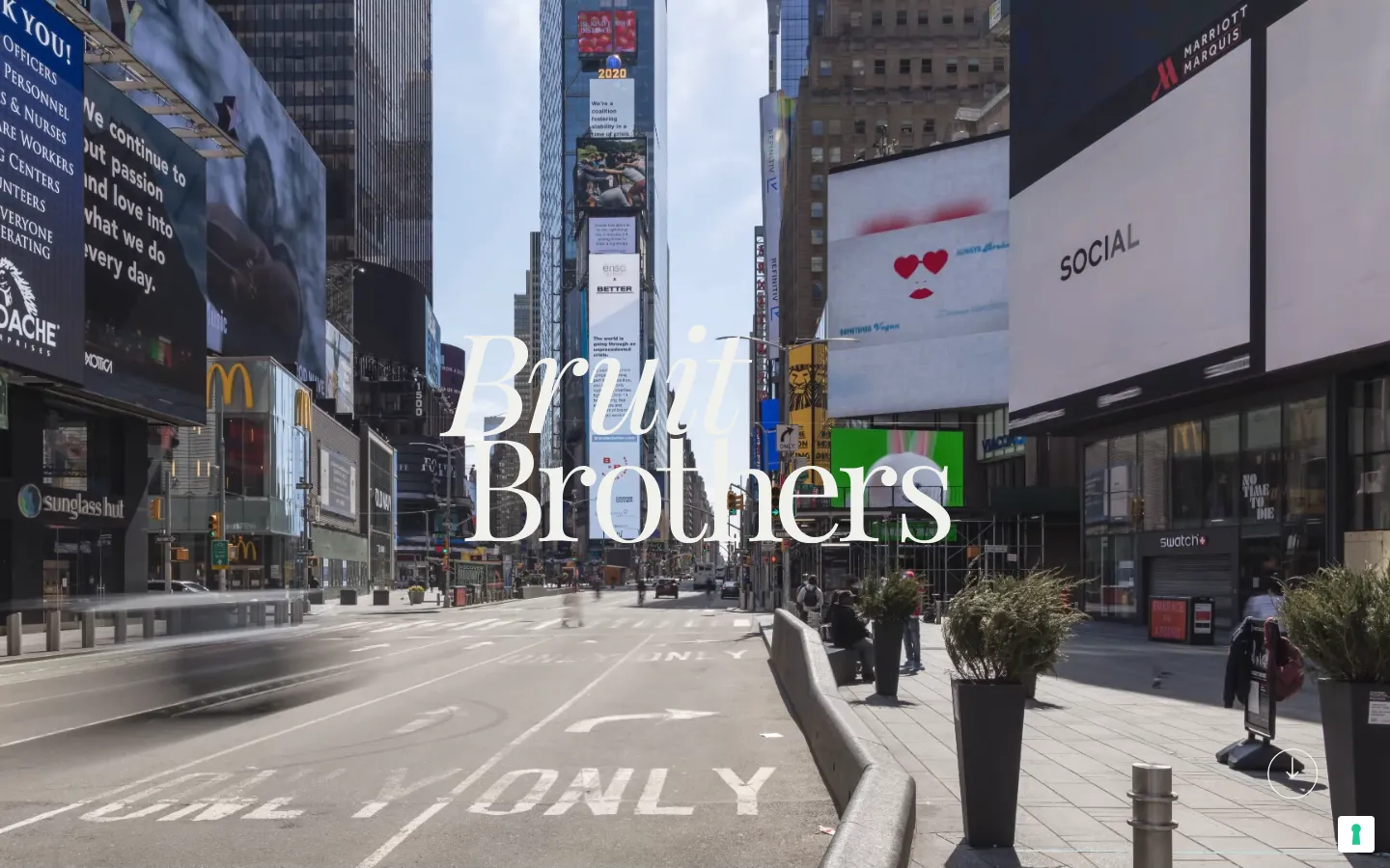
The saved first screen places the agency name over an urban scene filled with advertising surfaces. White serif lettering contrasts with the dense photographic background. One part of the name is italic, so the wordmark has variation without needing a separate colour for every word. A small downward action sits near the corner. The composition invites a continuation through the page rather than presenting a conventional grid of service cards immediately.

The image communicates the context of public communication and visual attention. It should not be interpreted as evidence that the agency produced the campaigns visible in the background. In a portfolio, the difference between an atmospheric opening and credited client work matters. A project image needs an attributable scope; a scene used to establish a mood has another role. Keeping that distinction clear allows a strong composition without inventing ownership of everything shown.

What one page can organise well

The project records describe a single-page brief built around how blocks arrive, how typography behaves and how scrolling connects the sections. That format makes the order of information especially important. A reader can move through one continuous sequence without selecting a new page after every section. The design can use changes of scale and movement to signal a new topic while retaining a coherent visual tone.

For a similar agency portfolio, we would first settle the order of the message in a static layout. The visitor should understand the kind of agency, the work presented and the way to make contact before animation is treated as the solution. Motion can emphasise a relationship or a transition that already exists. If the underlying sequence is confusing, adding movement may make the confusion more memorable without making the offer clearer.

A single page also has limits. A business with extensive service explanations or a growing library of detailed projects may need additional pages. Bruit Brothers demonstrates one particular brief, not a general rule that a second page would damage an agency website. For a new commission, the amount and type of content should determine the structure. The visual ambition can remain high regardless of whether the final site has one page or several.

Three roles for movement

Introduce an element
An entrance can direct attention to a heading or piece of work at the point it becomes relevant. The timing should support reading. In a similar design, we would check that a person who scrolls faster still receives the information and does not arrive at a blank area while waiting for a sequence intended for a slower presentation.
Connect sections
A transition can explain continuity between two parts of the story. Consistent behaviour helps the page feel authored rather than assembled from unrelated effects. The important choice is what relationship the motion expresses. Applying a different animation to every block simply because the tool supports it makes the interaction harder to learn and the page harder to maintain.
Respond to interaction
A button or navigation cue should make its response understandable. The visitor needs to distinguish a decorative moving object from something that can be used. For a comparable portfolio, hover effects also need a sensible touch equivalent. A phone visitor cannot rely on a mouse position to discover the only explanation of what an action does.

Building the behaviour in Webflow

The agency records identify Webflow interactions as the implementation method and describe the motion as manually assembled in 2024. The work involved selecting, arranging and tuning behaviour to suit the page. A static image shows the composition, while the sequence and timing only become apparent as a visitor uses the site.

For a similar build, the editable content and the animation structure should be considered together. A heading that becomes much longer can change the space available to a transition. Replacing a wide image with a portrait can alter a sequence designed around its proportions. The client needs to know which content changes fit the prepared structure and which require review. This is especially important when the animation is closely tied to the composition.

A useful acceptance sequence for an animated portfolio

  1. Read without the effects

    Check whether the headings, work and contact route form an understandable page when considered on their own. In a new project, essential information should remain available if an effect is reduced or cannot run. This is a proposed acceptance criterion, not a claim that the archived site has undergone a new accessibility certification.

  2. Use different reading speeds

    Review a deliberate scroll and a quick move through the page. Watch whether text appears in time, whether controls remain usable and whether a transition traps attention longer than the information warrants. A demonstration recorded at the designer’s preferred speed is useful, but it does not represent every visitor’s behaviour.

  3. Check the small screen

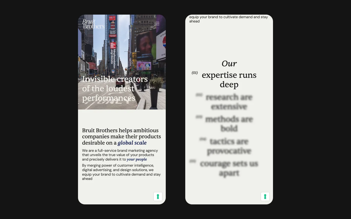
    The mobile layout needs its own composition and understandable controls. A desktop arrangement with several simultaneous moving areas may require a simpler sequence on a phone. For a similar commission, we would agree what should remain visually distinctive and what can be reduced to preserve comfortable reading and predictable navigation.

How to brief a motion-led agency website

Bring the approved agency description, a small set of representative projects and clear information about the work credited to your team. It is also useful to identify where movement has a specific purpose: introducing a visual concept, showing a transformation or connecting related material. Those examples give the designer something more actionable than a request to animate everything. They also help determine which assets need preparation before implementation.

Bruit Brothers’ recorded delivery is a one-page English Webflow website with individually tuned motion. The case demonstrates a visual and interaction approach, not a measured increase in enquiries or a guarantee that animation improves conversion. For a comparable project, the aim is to let the agency’s character appear through the page while keeping its work legible and its contact route available. A memorable sequence succeeds when the visitor can also explain what the agency offers after using it.

What the site does

Project features

  • One page, one story

    The whole agency on a single scroll.

  • Motion as the design

    Blocks arrive, type behaves, the scroll has a rhythm; all hand-tuned.

  • A team, not a pitch

    The site presents people standing together.

  • Expressive wordmark

    The agency name forms a prominent part of the opening composition.

  • Webflow interactions

    Motion built natively, no external libraries.

  • Edited by the client

    Texts and cases updated without a developer.

“We wanted a site that makes people stop scrolling, and that is what we got. The animation, the motion, the whole feel is bold, the way our agency is. HeadPills understood the brief from the first call and delivered a site we are proud to send to clients.”
Bruit Brothers · Marketing agency · approved by the client

Questions

About Bruit Brothers

What is the Bruit Brothers site built on?

Webflow, with the motion built natively in Webflow interactions, as checked on the live site in September 2026.

How was the motion made?

The project records describe manually assembled Webflow interactions in 2024.

Why is the Bruit Brothers site one page?

The one-page format followed the brief for a continuous story. It is a project-specific structural choice; a different agency or content scope may need several pages.

Start a similar project.

Tell us what your site has to do. A short call, then a fixed price in writing.