Case · Tech

Sokil AI: brand identity and a Webflow website.

An identity, logobook and English website for Sokil AI. The visual system connects the mark, colours and typography with service pages, and the Webflow editor was handed to the client’s team before launch.

  • Tech
  • AI
  • Branding
  • Logobook
  • Webflow
  • English
sokil.aiSokil AI website preview
Identity first, then site

A logobook with the mark, palette and type, followed by the website in the same system.

Built on Webflow

The client’s team edits the site; they were never dependent on us for a text change. checked on the live site · Sep 2026

A referral channel

The founder sends work through the site; one referral became the Re.bro project.

The project

Task, approach and delivery

The task

Sokil needed a recognisable identity for its communications and a website explaining strategy, AI agents and custom development. The logo and typography had to work at different sizes across those materials.

The approach

We developed the identity and documented the mark, palette and typography in a logobook, then applied the system to the Webflow website.

The client’s team received the editor before launch to maintain ordinary content changes.

What we delivered

A brand and a Webflow website the founder now sends referrals through; one of those referrals became the Re.bro restaurant project. Domain and hosting in the client’s name.

A shared identity for the company and its website

Sokil AI commissioned both an identity and a website. That sequence matters: the logo, colour choices and typography needed to become working parts of the interface, not remain a separate presentation. The documented project started with a logobook and continued into an English Webflow site explaining the company’s AI services.

The first screen establishes a technical character

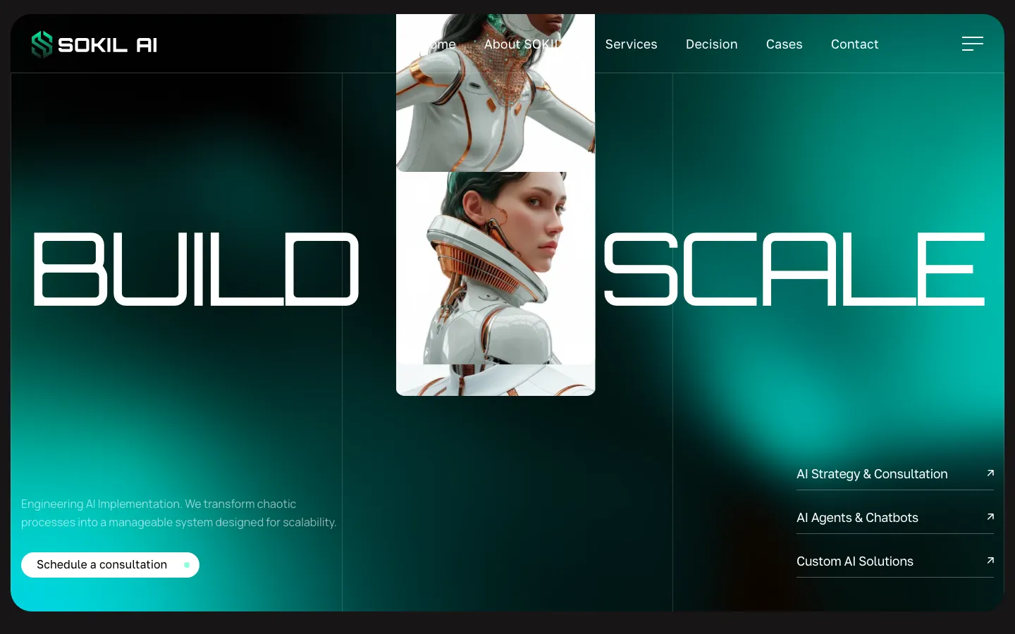
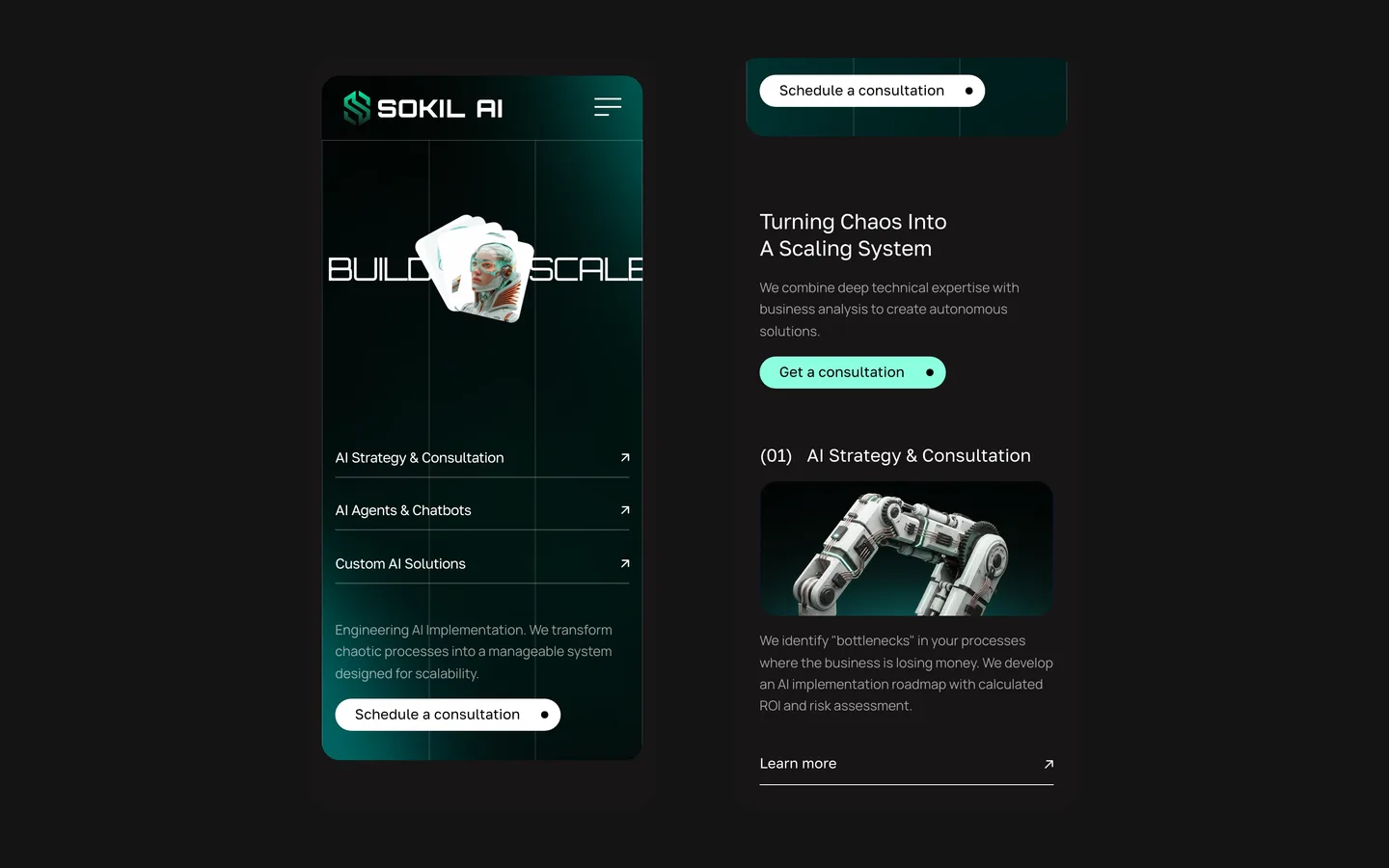
The saved website uses a dark frame, green and turquoise light, fine vertical divisions and wide, geometric lettering. A faceted green mark sits beside the white company name. The composition gives the identity several scales at once: the small header mark, the large headline and the compact service links. Those uses make it possible to assess whether the same visual language remains recognisable when its size and function change.

An illustrated figure occupies a narrow central area, while the headline extends across the surrounding space. The consultation action sits with the explanatory copy, and three service routes appear on the opposite side. This is a deliberately graphic opening. Its strongest practical feature is that the service names remain explicit despite the visual treatment. A visitor does not need to interpret the illustration to discover where the company explains its work.

What the identity needs to specify

Mark and name
The symbol and the company name serve related but different spaces. A compact avatar may use the mark, while a document cover needs the name to identify the sender. The project records describe a mark intended for small use. In a similar identity commission, we would check that use against real interface sizes instead of approving the logo only as a large image on a presentation slide.
Colour roles
The captured site uses green and turquoise against dark areas, with white for prominent text and actions. A useful logobook should explain which colours establish identity and which help people operate the interface. The same accent cannot carry every message with equal force. Applying it consistently allows an expressive background and a practical button to have distinct jobs.
Typography in use
The wide display lettering creates character, while smaller service labels have to remain easy to read. A similar project should specify how those roles work together, including long headings and ordinary explanatory paragraphs. A type treatment that succeeds in a short English phrase may need adjustment in a longer label. The website is therefore a practical test of the identity’s working range.

The offer needs more than an AI label

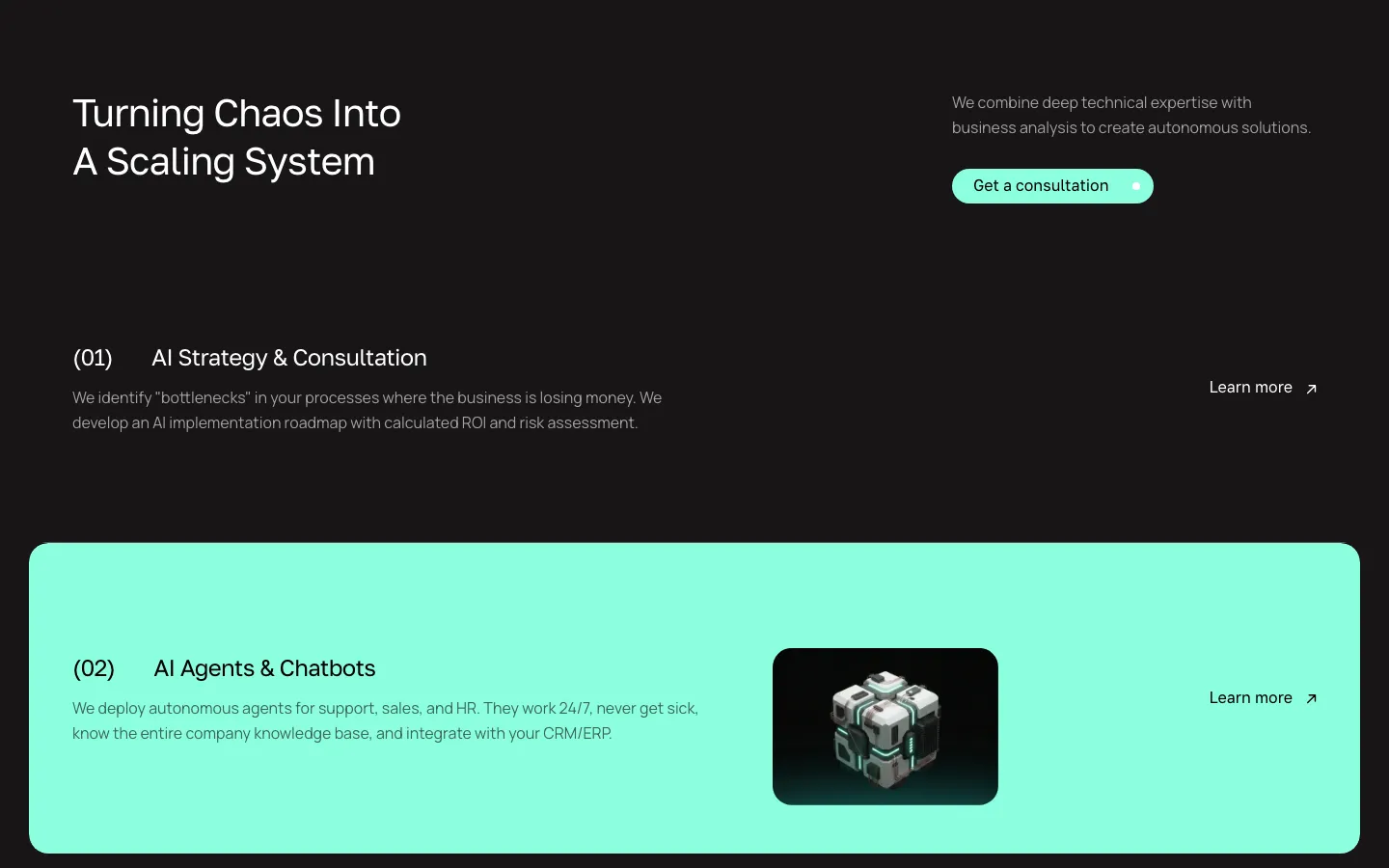
The documented service structure distinguishes strategy, AI agents and custom development. Those categories help a buyer identify the kind of conversation to start. A company investigating its operations may need help defining a problem before it commissions software. Another may already have a specific integration or application in mind. Showing separate routes acknowledges those differences without making the homepage explain the full technical scope of every possible project.

For a comparable AI company website, we would ask what the buyer should bring to each conversation. A strategy enquiry might begin with a description of the process, while an implementation discussion may need existing systems and constraints. These are examples for briefing a website, not assertions about projects delivered by Sokil. The content should let a prospect recognise a suitable starting point without promising that every process can or should be automated.

The distinction between the website and the client’s actual engineering work also matters in this portfolio case. HeadPills’ recorded scope is identity, logobook, website and handover. An illustration of AI on the homepage does not establish that we built the systems Sokil sells. Presenting those boundaries clearly helps a prospective client understand which part of a similar launch they could commission from us.

From brand decisions to an editable site

  1. Establish the visual rules

    The logobook gives the mark, colours and type a defined relationship before they are spread across pages. This creates a reference for later choices. In a similar project, approval should include ordinary applications such as a navigation bar or a document heading, so the identity is considered in working conditions as well as in a showcase.

  2. Apply them to the website

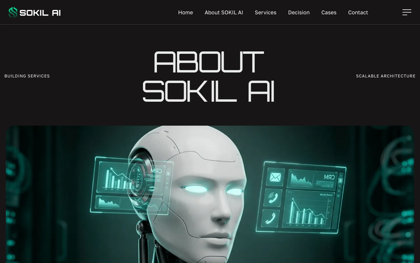
    The Webflow implementation turns those decisions into page layouts, navigation and actions. A shared identity does not mean placing the logo on every block. It means maintaining the hierarchy and visual roles across the service and company pages. The interface needs to explain the business as well as carry its graphic style.

  3. Give the team a usable editor

    The project materials record an editor handover before launch. That lets the client’s team begin maintaining ordinary text changes within the prepared site. For a similar handover, we would use a real service edit to demonstrate what can be changed safely and which structural changes should return to a designer or developer for review.

A page that can be sent after an introduction

The project history records a referral relationship with the founder, including the introduction that became the Re.bro project. That is a specific relationship in the agency’s records, not a measured conversion result from the Sokil website. A useful case should not turn an introduction into a claim that the site produced a known quantity of sales or generated a predictable referral channel.

The design is nevertheless relevant to a common situation: someone receives a company link after a conversation and wants to verify what it does. In a comparable brief, the company page and service routes should make that check straightforward. The visitor needs an intelligible offer and identifiable contact, not a second pitch that assumes they saw the opening animation. This also argues for keeping the small, practical elements of the identity as carefully designed as its large headline.

Preparing a combined identity and website brief

A useful starting package includes the company’s service definitions, approved statements about its experience, existing product materials and the places where the identity will appear. The team should distinguish what is already offered from what is only planned. That helps avoid a polished site promising a service before the business has agreed how to deliver it. It also gives the designer realistic examples for applying the logo and typography.

For a project like Sokil, commissioning the identity and site together allows visual decisions to be tested in the actual interface. The result still needs clear responsibilities after launch: who edits the offer, who approves claims and who maintains additional brand materials. This case demonstrates the connection between a logobook, a Webflow website and a client handover. It does not claim development of the client’s AI products, a particular search position or a verified increase in enquiries.

What the site does

Project features

  • Explains three offers

    Strategy, AI agents and custom development, each on its own pages.

  • A mark that holds small

    Readable as an avatar and on a slide.

  • Green, turquoise and dark tones

    A shared colour system across the brand and website.

  • Cookie choices

    A visitor consent interface included in the site.

  • Edited by the client’s team

    Webflow editor handed over before launch.

  • Referral relationship

    The agency’s project records include a founder introduction that led to Re.bro.

“They gave us several options to choose from and genuinely listened to what we wanted, with no pushback. They did both our site and the logobook. Great work, guys.”
Sokil · Brand & website · translated from the original

OriginalЩо мені зайшло — давали кілька варіантів на вибір і реально дослухались до побажань, без зайвих сперечань. Зробили нам і сайт, і логобук. Дякую, хлопці молодці.

Questions

About Sokil AI

What did HeadPills make for Sokil AI?

The brand identity with a logobook first, then the website on Webflow in the same system, and a handover of the editor to the client’s team before launch.

What is the Sokil AI site built on?

Webflow, as checked on the live site in September 2026. The client’s team edits it without us.

How does the identity appear on the website?

The mark, green and turquoise palette, dark backgrounds and geometric typography form a shared system. The site applies it to navigation, service information and contact.

Start a similar project.

Tell us what your site has to do. A short call, then a fixed price in writing.