Case · Industrial supply

Sequoia2000: brandbook and a B2B company website.

Sequoia2000 supplies sanitary and engineering equipment to businesses of every size and does more than ship boxes: marketing support, sales materials, branding for retail points. The brief was a modern B2B site that stays light, shows the full range and gives proper space to the manufacturers they represent, with a brandbook so identity, catalogue and materials speak one language. Webflow, three languages.

  • Industrial supply
  • Branding
  • Brandbook
  • Webflow
  • UK · EN · RU
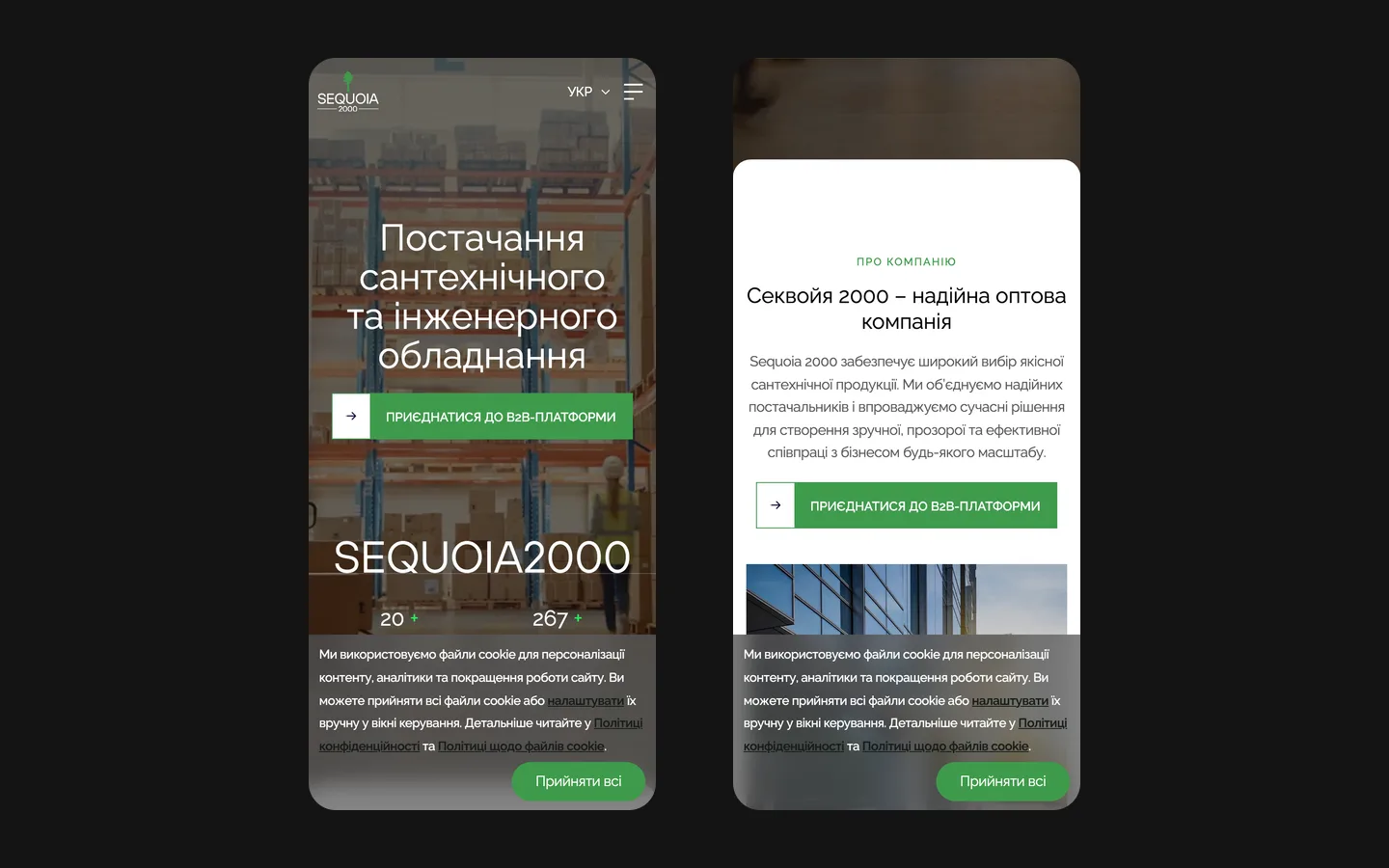
sequoia2000.comSequoia2000 website preview
3 languages

Ukrainian, English and Russian, with language tags for search engines. checked on the live site · Sep 2026

Built on Webflow

The public company website uses Webflow for editable content. checked on the live site · Sep 2026

Brandbook alongside the site

Identity, catalogue and sales materials in one language.

The project

Task, approach and delivery

The task

Sequoia2000 supplies sanitary and engineering equipment and supports its business customers with marketing and sales materials. The website needed to explain this offer and present the manufacturer brands alongside the company.

The approach

We organised a public B2B website around product directions, partner brands and cooperation.

The brandbook was developed alongside the website, providing a shared visual system for the company’s materials.

What we delivered

A structured B2B presence on Webflow in Ukrainian, English and Russian with a brandbook to match, run by the client. Domain and hosting in the client’s name.

A supplier’s identity around the way business buyers navigate

Sequoia2000 combines an industrial supply offer with support for its business customers. The project brings the company identity, represented manufacturers and product directions into a public website. The brandbook and Webflow implementation were developed together, so the same visual decisions could work in the site and the company’s communication materials.

The opening makes the business recognisable

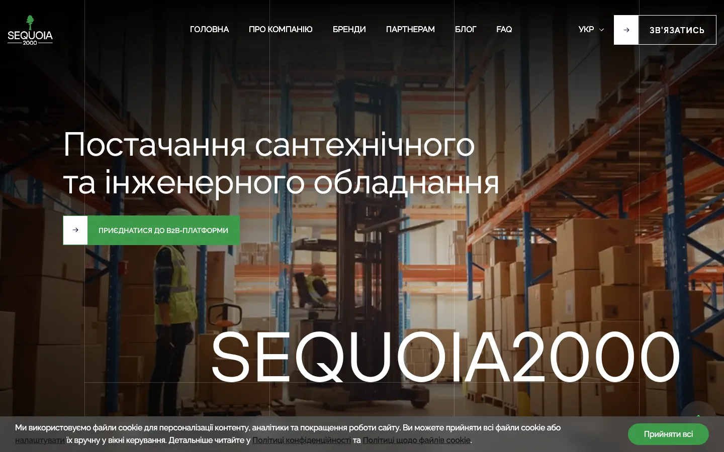
The saved first screen uses warehouse imagery behind a direct statement about sanitary and engineering equipment. The scene establishes the context of supply and distribution. Large white text sits above it, a green action introduces the business route, and thin vertical divisions organise the composition. The company name is repeated at a large scale near the lower edge. This gives the opening a recognisable identity without asking a buyer to decode an abstract industrial metaphor.

The navigation names the company, brands and partners. Those routes match different reasons for visiting: checking the supplier, looking for a manufacturer or considering cooperation. Their presence matters more than filling the first screen with every product detail. The opening should help a business visitor choose a direction; the following pages can explain the relevant part of the offer. The green accent connects the action to the tree symbol in the identity.

Three distinct questions in a supply business

What can you supply?
Product directions help a buyer identify whether the business covers a relevant area. They are useful when someone knows the type of equipment rather than a particular manufacturer. For a comparable website, we would agree the category names with the sales team and make their boundaries understandable. A long list of technical terms is not a substitute for an intelligible assortment structure.
Which brands do you represent?
A manufacturer can be the starting point when a customer already knows the product family they need. The documented project gives partner brands visible space alongside Sequoia2000’s own identity. That requires a clear relationship between the supplier and represented names. A website should not leave the visitor guessing whether a logo identifies a manufacturer, a client or an unrelated reference.
How does cooperation work?
A business customer may be evaluating the relationship as well as the products. The project records include presentation of marketing and sales support. For a similar commission, the partner information should explain what the supplier actually offers and which details require a conversation. The design cannot infer contractual terms, exclusive rights or delivery commitments from the presence of a brand logo.

Public presentation and the B2B platform have different jobs

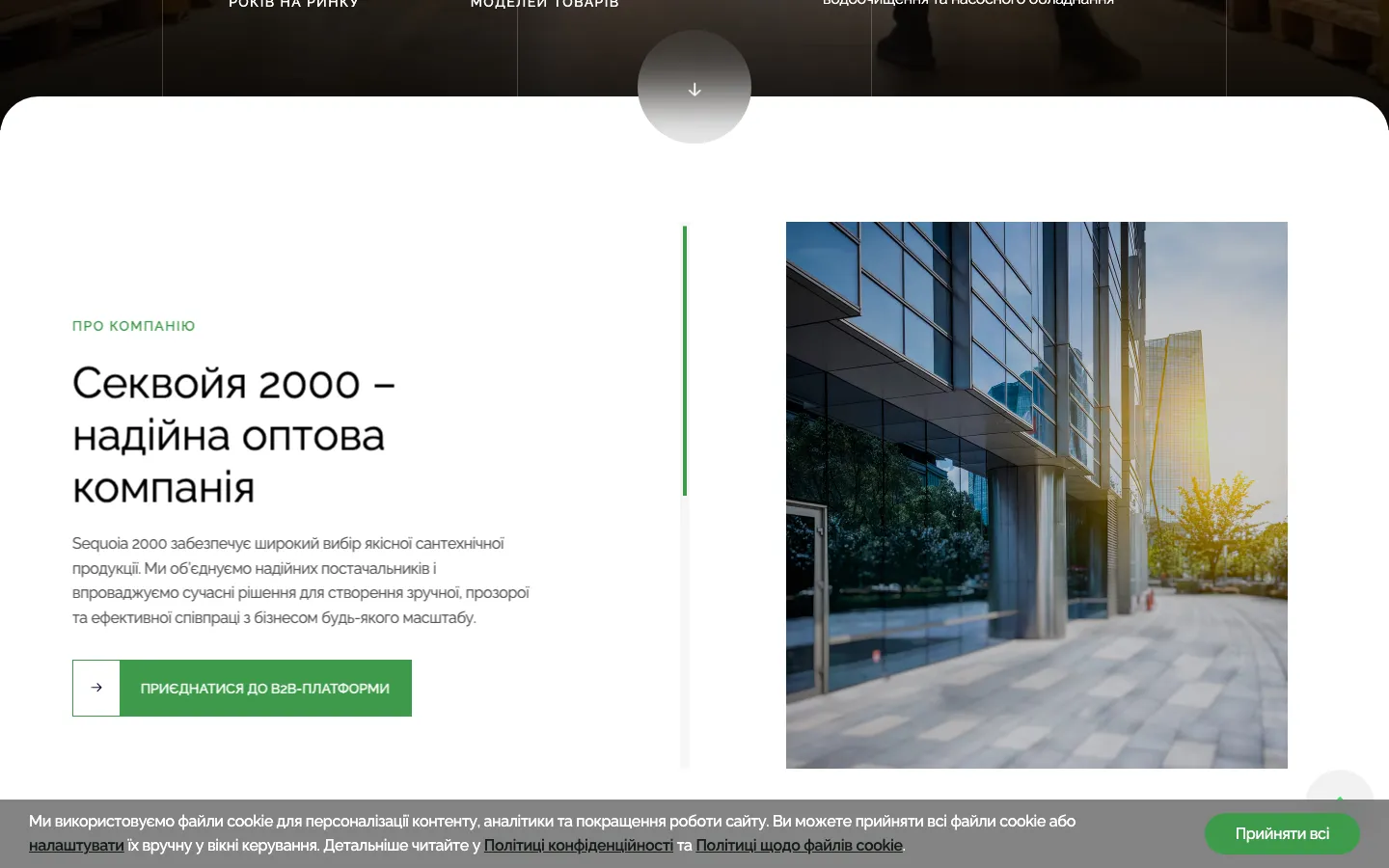
The saved homepage contains a route to a B2B platform. A public website can introduce the business, explain the assortment and invite a company to make contact. A private trading environment may then serve a different task. Linking those experiences does not mean they were developed as a single system, and it does not prove that HeadPills implemented the underlying account or ordering software.

The scope documented here is the public Webflow website and brandbook. We keep that boundary explicit because a buyer commissioning a wholesale site may use the word catalogue to mean very different things. It can describe a presentation of product directions and brands, or a transactional system with account access and commercial data. Those are different requirements, with different implications for content, administration and development.

In a comparable brief, we would map what a visitor can see before contact and what becomes available elsewhere. If an existing platform already handles business orders, the public site should explain the transition clearly. If a new private system is required, it needs its own scope and evidence. A prominent button is a navigation element; its presence alone cannot substantiate an integration, a synchronised stock feed or an automated customer approval process.

A brandbook that supports a multi-brand environment

An industrial supplier’s identity has to coexist with the manufacturers it presents. Making every logo equally large can turn a page into a crowded list without a clear owner. Making the supplier dominate every section can hide the names buyers recognise. The value of a shared visual system is to define a stable frame in which different partner materials can appear without making each page look like a different company.

For a similar project, we would define the treatment of partner marks, the spacing around them and the difference between a brand overview and a detailed presentation. The brandbook should also clarify the company’s own typography and colour roles. These rules can guide sales materials as well as the website. The case documents design of that system; mockups and website images should not be treated as proof that physical materials were manufactured or distributed.

A practical route for maintaining three languages

  1. Keep the names stable

    The project materials record Ukrainian, English and Russian versions. Manufacturer names and product designations need consistent treatment across them. A similar content model should distinguish names that remain unchanged from explanatory text that needs translation. That avoids creating three different-looking identities for the same partner as the pages are edited.

  2. Translate the business meaning

    A category label and a partnership description have different translation needs. The first must remain recognisable to the buyer; the second must explain the proposed relationship accurately. In a comparable workflow, the person approving translations should be able to check both against the actual offer, rather than reviewing sentences without the surrounding product context.

  3. Update the related pages

    When a represented brand or product direction changes, the team needs to know which language pages depend on that information. Editable content helps with the update, but an agreed ownership process is still necessary. The project records identify client editing in Webflow; they do not justify a claim that every change is automatically translated or synchronised with external business software.

What to prepare before commissioning a supplier website

The useful starting materials are the current product directions, the list of represented manufacturers, approved brand assets and a description of how a new business customer starts cooperation. Existing sales materials can reveal which questions the website needs to answer. It is also important to identify any separate ordering platform, so its role is agreed before the public pages are designed.

Sequoia2000’s case demonstrates how a brandbook and a public business website can share a system while making room for partner brands. The recorded delivery includes three language versions and client editing. It does not provide a measured increase in wholesale orders or proof of the supplier’s operational performance. For a comparable commission, the practical objective is to help a buyer recognise the relevant offer, understand who supplies it and take an informed next step towards cooperation.

What the site does

Project features

  • Product directions

    The main areas of supply help a buyer identify the relevant offer.

  • Partner brands visible

    Manufacturers get proper space next to the supplier’s own offer.

  • Three languages

    Ukrainian, English and Russian, switched from the header.

  • Company beyond boxes

    Marketing support and sales materials explained as services.

  • Brandbook and site

    A shared identity prepared for the website and company materials.

  • Client editing

    The prepared Webflow content can be maintained by the client.

“They did our site and brandbook. I liked how structured it all was: a clear proposal, calls, no fluff. Thanks for the work.”
Sequoia2000 · B2B equipment supplier · translated from the original

OriginalДелали нам сайт и брендбук. Понравилось, что всё по структуре — нормальное предложение, созвоны, без воды. Спасибо за работу.

Questions

About Sequoia2000

Which languages does the Sequoia2000 site have?

Ukrainian, English and Russian, as checked on the live site in September 2026, with language tags for search engines.

Did HeadPills make the Sequoia2000 brandbook?

Yes, alongside the site, so identity, catalogue and sales materials speak one language.

What is the Sequoia2000 site built on?

The public website is built on Webflow. This case covers the website and brandbook; it does not claim development of the separate B2B ordering platform.

Start a similar project.

Tell us what your site has to do. A short call, then a fixed price in writing.