Case · Food

WOW Tort: an editable cake catalogue on Webflow.

A Ukrainian website for made-to-order cakes and desserts, with catalogue categories, regular and promotional price fields, delivery information and an enquiry form. The owner can maintain the product content.

  • Food
  • Confectionery
  • Catalogue
  • Webflow
  • Ukrainian
  • Ukraine
wowtort.comWOW Tort website preview
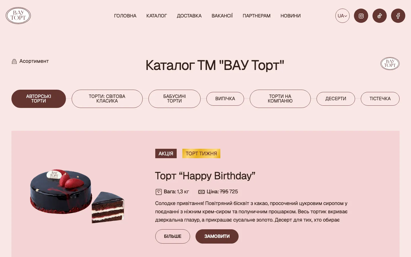
Catalogue with two prices

Every cake has a current price and a separate sale price for promotions, set by the owner. project record and saved screen

Built on Webflow

Categories, cakes, news and vacancies edited without a developer. project record and saved screen

Delivery as a section

Delivery, partners, vacancies and news each have their page. project record and saved screen

The project

Task, approach and delivery

The task

The catalogue needed to combine cake imagery with the practical information used to discuss an order.

The owner wanted to update products, categories, prices and promotions within a prepared content structure.

The approach

We organised signature cakes, classics, gingerbread and pastries as catalogue categories with separate regular and promotional price fields.

The request form records flavour, weight, date and contact for the first conversation. The project included the client’s domain and adjustments during delivery.

What we delivered

A Webflow site in Ukrainian with a catalogue, delivery, partners, vacancies, news and an order form, run by the owner. Domain and hosting in the client’s name.

A cake catalogue that leads from an image to an understandable request

WOW Tort’s recorded brief combined a Ukrainian website with a catalogue the owner could maintain. The Webflow delivery included categories, regular and promotional price fields, delivery information and an order enquiry. This case examines how visual choice and practical details can work together for made-to-order desserts, without treating an initial form submission as a confirmed production order.

An opening built around the making of a cake

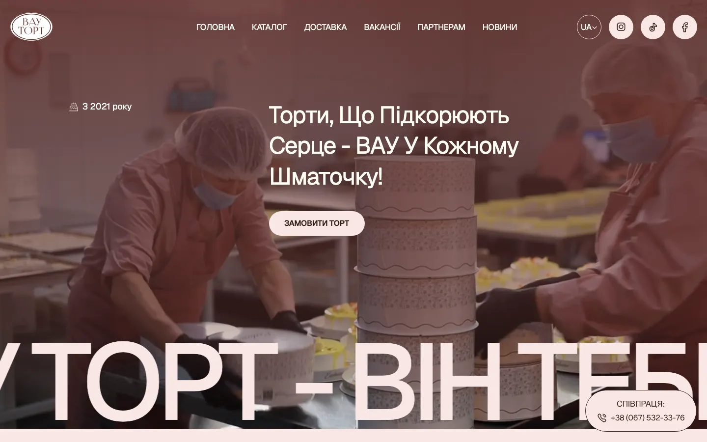
The saved first screen shows a cake being decorated, with a warm muted overlay across the image. Light typography and a rounded pale button sit above that scene. Navigation gives direct access to the catalogue, delivery, vacancies, partners and news. The composition connects the product with the act of making it, while the order action remains easy to identify against the background.

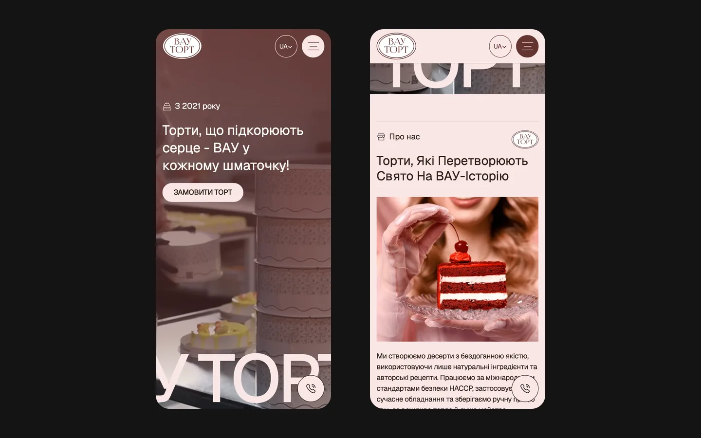
The large lettering near the lower edge gives the opening a strong graphic scale. It is a different layer from the practical menu and the short request button. In a comparable food catalogue, the important question is whether this expressive treatment leaves the product and action understandable on a phone. A dramatic crop can work as a background, but it should not make the only available example of a cake impossible to inspect.

Categories make the first choice manageable

The project records describe separate catalogue categories for signature cakes, classics, gingerbread and pastries. These are different starting points within the same business. Someone choosing a large celebration cake and someone looking for smaller sweets should not have to interpret one undifferentiated image collection. Categories give the visitor a way to narrow the subject before asking about a particular item.

A useful catalogue image also needs a relationship with its description. The photograph may illustrate a decoration, while the available flavour, weight or final configuration needs clarification. For a similar project, we would agree with the bakery which details can be selected directly and which require a conversation. The visual should invite a specific question rather than imply that every pictured combination is available for every date.

The owner’s ability to update the catalogue was a central part of the brief. That means the content structure matters as much as the first prepared set of images. A new cake needs a category, a clear name, appropriate imagery and consistent price information. When those relationships are established, adding another entry can follow an understandable process instead of becoming a small redesign each time.

Three details that shape the enquiry

The chosen cake or category
The visitor needs to keep track of what attracted their attention. A useful enquiry refers to a recognisable item or type of dessert. For a new catalogue, we would make sure the description and request route do not force the customer to invent an internal product name or explain a screenshot from memory.
Weight and flavour
These are among the fields recorded for the project’s request form. They give the bakery a practical starting point. The available choices should come from the business rather than the website team. If an option needs individual agreement, the interface should allow that conversation without presenting it as an automatically accepted configuration.
Date and contact
The requested date and a way to reply help the team understand timing and continue the discussion. A submitted date is not the same as confirmed production capacity. The next message should make the status clear: the bakery still needs to agree the order details rather than the website silently promising availability.

Two price fields need an editorial rule

The recorded catalogue supports a regular price and a separate promotional price. This gives the owner a way to manage an offer without rebuilding the product layout. The useful design question is how a visitor distinguishes the current amount from a comparison amount, and understands what the price applies to. A visual strike-through alone cannot explain whether the figure is for a whole cake, a unit of weight or a particular example.

For a comparable catalogue, we would agree price labels, units and the conditions under which the promotional field appears. A removed promotion should not leave contradictory numbers on a card and an inner page. This is a content maintenance requirement, not a claim that the project produced a measured increase in orders through discount presentation. The business remains responsible for approving the amount and the terms it publishes.

The same care applies to individual decoration. If the final price depends on a discussion, the page should explain that relationship rather than use a precise-looking number to imply a fixed offer. A visitor can still begin with an indicative product and ask for confirmation. Clarity about what is being priced helps both sides make the next conversation useful.

The form starts the order conversation

The project notes describe a concise form with flavour, weight, date and contact. Those fields reflect the information selected for the first request. Their presence does not prove that every additional field would cause abandonment, and the case does not claim a tested conversion lift from reducing the form. The practical objective is a request that the bakery can interpret and answer.

For a similar build, we would compare the form with the team’s actual first conversation. A field is useful when it changes how the enquiry is handled or prevents avoidable clarification. Information that requires detailed agreement may belong later. The confirmation message also deserves attention: it should tell the visitor that the request was received and explain the next step without implying payment, acceptance or a guaranteed delivery slot.

A practical catalogue handover

  1. Add a representative product

    Prepare a new cake entry with its category, image, name and price information. Review whether the owner understands the relationship between the list card and the detailed description. For a comparable project, this exercise reveals editorial questions that an empty CMS demonstration would not show.

  2. Change a promotion

    Update the promotional field and inspect the public presentation, then consider what should happen when the offer ends. The important check is the meaning of the visible price, not simply whether the system saved a number. Clear publishing instructions help the team avoid contradictory messages across the catalogue.

  3. Follow an enquiry

    Choose an item and reach the request route on a phone. Check that the customer still understands what they are asking about and which details need confirmation. This connects the catalogue design with the operational conversation rather than assessing the form as an isolated decorative block.

More than product cards, with a clear scope

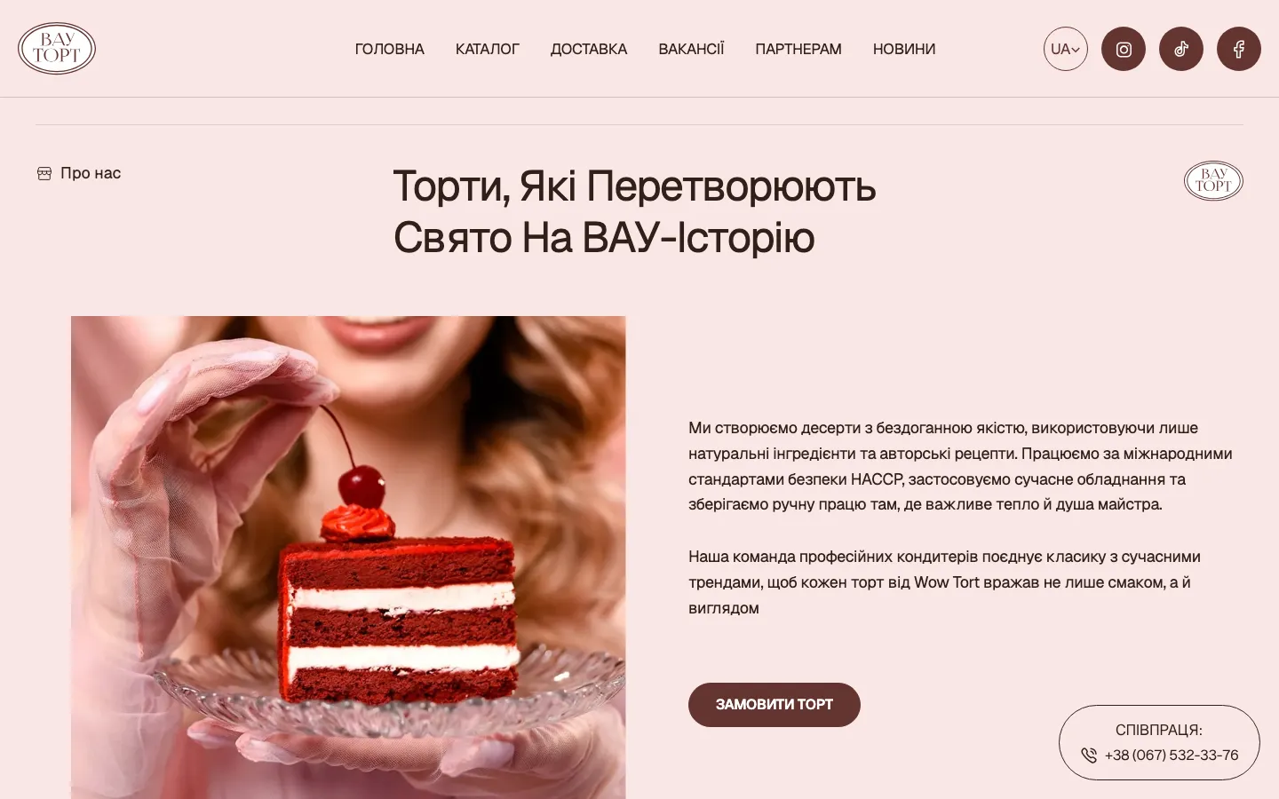
Delivery, partner information, vacancies and news are included in the recorded site structure. They serve different visitors and should not compete with the main cake-selection route. A job applicant or potential partner needs a recognisable place to begin, while a customer needs to find practical ordering information. The navigation gives these subjects names instead of expecting every visitor to use one general message.

The delivery is a Ukrainian Webflow website with an editable catalogue and enquiry form. The records do not establish an integrated payment checkout or a live production calendar, so those features are not claimed here. Nor do we publish order volume or revenue results without supporting data. The case shows a content and interaction approach that can be assessed from the work itself.

For your own bakery site, bring representative products, approved prices, delivery information and the questions your team needs to answer before accepting an order. Identify who will update new designs and promotions. These inputs let the website combine a strong visual first impression with a practical catalogue, so the visitor can move from liking a cake to asking a clear, answerable question.

What the site does

Project features

  • Appetite first

    The brand’s mood and the cakes carry the first screen.

  • Owner-run catalogue

    Categories, prices and sale prices set without a developer.

  • Short order form

    Flavour, weight, date and contact for the first discussion.

  • Delivery explained

    How and when the cake arrives, on its own page.

“Really happy. They built the site, moved it onto our own domain, and stayed in touch the whole time. Whatever I asked, I got an answer right away. Thank you!”
WOW Tort · Custom cakes · translated from the original

OriginalДуже задоволені) Зробили сайт, перенесли на наш домен, постійно були на зв’язку. Що не спитаю — одразу відповідь. Дякуємо!

Questions

About WOW Tort

Can the WOW Tort owner update the catalogue herself?

Yes. The site is on Webflow; cakes, categories, prices and sale prices are edited by the owner without a developer.

Why is the WOW Tort order form so short?

The recorded form asks for flavour, weight, date and contact. These details support the first discussion; the case does not claim a measured conversion increase from removing fields.

What sections does the WOW Tort site have?

The catalogue, delivery, vacancies, a partners page, news and the order form, in Ukrainian.

Start a similar project.

Tell us what your site has to do. A short call, then a fixed price in writing.