Case · Travel

Embert: branding for business travel and events.

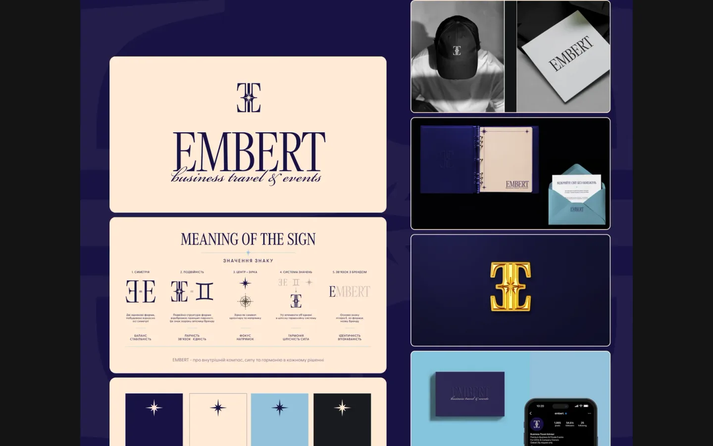
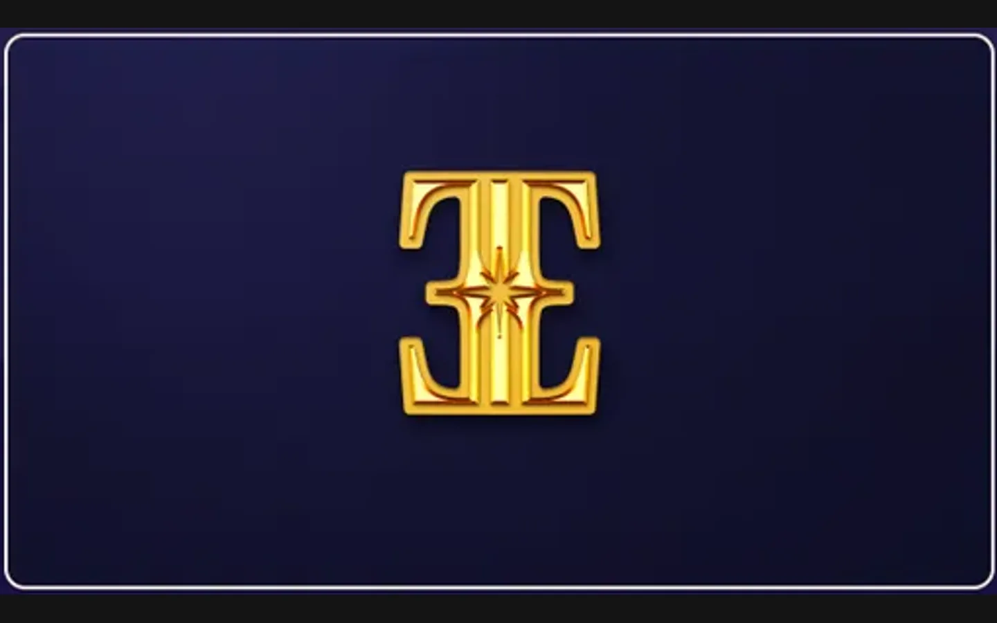
Embert organises business travel and private events for company owners. The identity needed to feel established and consistent, from a business card to a cap. We built a monogram of two mirrored E’s with a star in the centre, a serif wordmark with a script line under it, and a palette of navy, cream and light blue, then carried it onto the things a client actually touches.

  • Travel
  • Business travel and events
  • Brand identity
  • Monogram
  • Ukraine
Embert · identityDesign preview: Embert
A monogram with a meaning

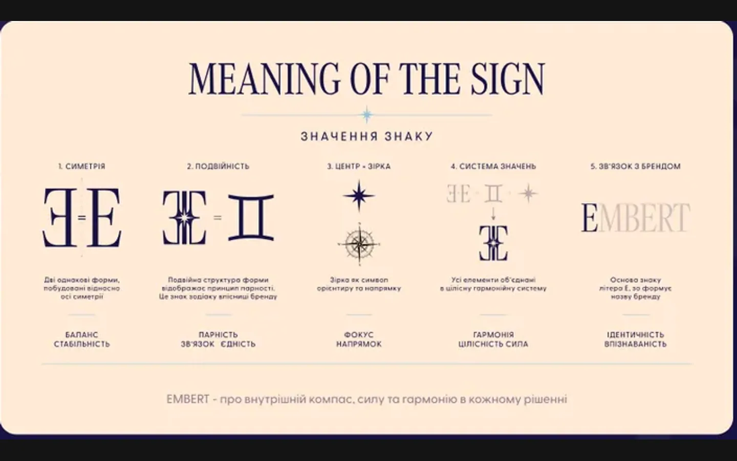
Two mirrored E’s, a star at the centre: symmetry, pairing, a compass. The meaning is written on the board so the client can explain it. from the identity board

Serif wordmark and a script line

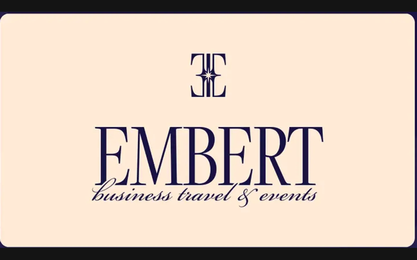
EMBERT in a high-contrast serif, “business travel & events” in script beneath it. from the identity board

Four colours, six applications

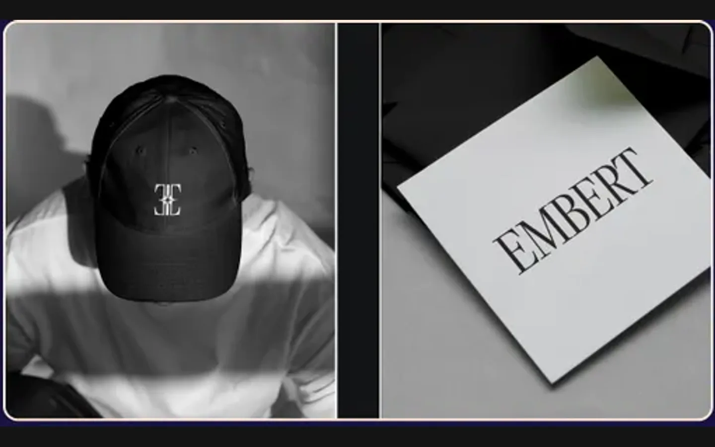
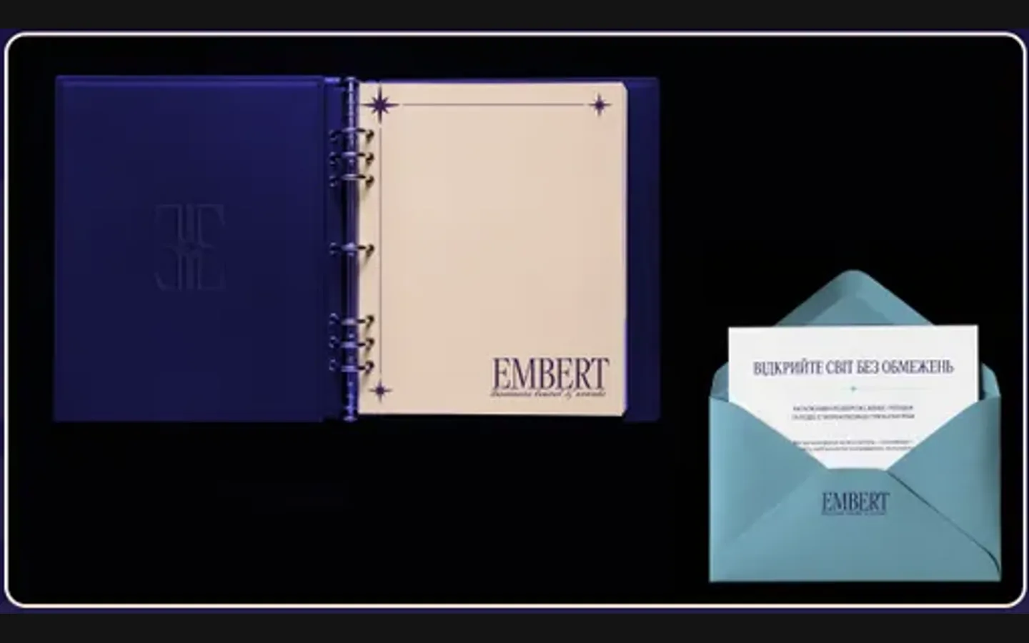
Navy, cream, light blue, black; a cap, a card, a notebook, an envelope, a gold sign and the phone profile. from the identity board

The project

Task, approach and delivery

The task

Embert sells trust: a company owner hands over their travel and their events. The identity had to look established on the first card, not after a year of use.

It also had to hold on very different materials, from a cap to a gold sign, without becoming three different logos.

The approach

We built the monogram first: two mirrored E’s around a star, symmetrical and readable at the size of a cap embroidery, with the meaning written down so the client can explain it.

A high-contrast serif wordmark with a script line under it carries the name; navy, cream and light blue carry the mood. Then the system was applied to the applications on the board.

What we delivered

A brand identity for Embert: monogram, wordmark, palette, the meaning of the sign, and applications for a cap, cards, a notebook, an envelope, a sign and the social profile. Files and rights in the client’s name.

A travel and events identity with a compact signature

Embert's identity combines a monogram with a serif name and the line business travel & events. We built the sign from mirrored E forms around a star, then developed the palette and applications. The presentation shows the system on a cap, card, notebook, envelope, social profile and dimensional sign. These materials let a client evaluate how one identity changes scale and surface while retaining its character.

The monogram has a construction the client can explain

The meaning-of-the-sign page breaks the construction into visible stages: mirrored forms, their connection, a central star and the relationship to the name. The star gives the composition a centre, while the surrounding letters create symmetry. A compass reference connects the form to travel. The explanation provides a useful narrative for the brand, but the mark also needs to remain recognisable when that narrative is absent.

This is why the compact applications matter. A person looking at a cap will not have the construction diagram beside it. The silhouette has to do the work. In the presentation, the same central shape is used on small merchandise and in a larger gold treatment. The relationship between the two helps assess whether the identity depends on an elaborate surrounding composition or can be recognised as a separate sign.

The diagram explains the design intent rather than proving a business outcome. Symmetry can support a composed appearance, but it does not establish the reliability of travel arrangements or event delivery. Those belong to the company's service. The branding work gives Embert a visual way to present itself; the service promise still needs to be stated and fulfilled through its actual operations.

Three voices within one signature

The monogram
The sign acts as the most compact identifier. It can sit above the name or stand alone on a small surface. Its proportions and internal spaces carry the identity when there is no room for a full line of text. That role is particularly clear on the cap application, where the available area is limited.
The serif name
The high-contrast lettering gives the Embert name a formal presence. It introduces the business in a way the abstract monogram cannot. On a card or presentation cover, retaining the full name is useful for someone encountering the company for the first time. Its fine details also need attention when preparing smaller printed or physical versions.
The service line
The script line business travel & events explains the field of work and adds a different rhythm below the name. It is supporting information, not a replacement for the company name. In a comparable identity, a small-size version may need different treatment if the descriptor becomes too fine to read; that decision should be made through a real application test.

Colour distinguishes a formal document from a small object

Navy, cream and light blue form the palette shown on the identity board. The dark field gives the lighter sign a clear setting, while cream supports the large name on the main presentation panel. Light blue appears on the envelope and in the palette. Together they provide more than one way to apply the same brand without introducing an unrelated colour for each object.

The gold sign adds a material treatment to the presentation. It should be read as an application of the underlying geometry, not as a requirement that every use of the logo include a metallic effect. The flat versions remain important for ordinary documents and digital contexts. A dimensional mockup is useful for discussing intent; fabrication and the exact finish need separate specifications for a real physical item.

Stationery tests the relationship between information and identity

The notebook presents a dark cover and a quieter interior with the mark and name. The envelope has another proportion and a different opening shape. These are not interchangeable rectangles. Each gives the identity a different amount of space and a different relationship to the material. Showing both makes the system's range easier to judge than repeating the same full signature on a row of identical mockups.

For an events or business-travel company, documents may pass between an organiser, a participant and a supplier. In a similar project, the useful next step would be to test the identity alongside real information such as an itinerary or event schedule. A clear document hierarchy still needs to make dates, places and responsibilities easy to find. Those operational templates are a separate scope unless they have been included in the agreed delivery.

Review the identity at the sizes it will actually use

  1. Start with the smallest signature

    Choose the smallest required use, such as a profile icon or merchandise mark, and inspect the silhouette without the surrounding presentation. Pay attention to internal gaps and thin elements. The objective is not to preserve every decorative effect at every size, but to retain the recognisable construction in the final output.

  2. Check the introductory version

    Place the full name and service line in a realistic first-contact material. Someone unfamiliar with the business should be able to identify it and understand the field of work. This check helps decide when the monogram can stand alone and when the full signature is necessary.

  3. Agree the production boundary

    Separate design applications from the manufacture of signs, embroidery or printed materials. A cap mockup communicates placement and visual intent; a supplier still needs artwork suitable for the chosen method and a sample to approve. Clear responsibility at this stage keeps the identity project from silently expanding into unspecified production work.

What this project contributes to a new brief

The Embert case demonstrates a system with a strong name, a compact mark and a documented explanation of its construction. The applications offer different levels of formality and scale while drawing from the same source. To brief similar work, bring the actual service description, the first materials that need to be produced and any limitations of their format. That makes it possible to discuss a useful identity package rather than treating every attractive object in a presentation as an automatic deliverable.

The design in use

From the delivered project

  • Reads as established

    A serif wordmark and a monogram with a story, not a startup logo.

  • Holds at every size

    From a cap embroidery to a gold sign, the same mark.

  • Explains itself

    The meaning of the sign is on the board, in the client’s words.

  • Ready for print and gold

    Cards, envelopes, a notebook and a relief sign were designed, not implied.

Questions

About Embert

What does the Embert monogram mean?

Two mirrored E’s around a star: symmetry, pairing and a compass. The steps from the letters to the sign are drawn on the board so the client can tell the story to their own clients.

Did HeadPills build a website for Embert?

No. This project was the brand identity: monogram, wordmark, palette and applications. A site can be built on the same system later.

What brand applications were designed for Embert?

A cap, business cards, a notebook, an envelope, a gold relief sign and the social profile, all shown on the identity board.

Start a similar project.

Tell us what your brand needs. A short conversation, then a fixed written quote.