Case · Printing

Polytech: identity, mascot and artwork for a printing business.

A coordinated brand identity, a brandbook in the client’s Figma, a character, merchandise designs and graphics for the store. The ecommerce platform was developed by the client’s team.

  • Printing
  • Brand identity
  • Brandbook
  • Mascot
  • Merch design
  • Ukraine
polytech.com.uaPolytech Print website preview
Full brandbook

Mark, palette, typography and rules, delivered into the client’s own Figma. project record

Mascot and merch

A custom character and merchandise designed to show the print methods on the products themselves. project record

Further artwork

Project records describe category images, banners and key visuals from 2025; store development belongs to the client’s team. project record

The project

Task, approach and delivery

The task

Polytech needed a recognisable identity for its own communication while showing products that customers can brand for their businesses.

The system had to support different graphic formats and representative merchandise applications, with production requirements considered for each use.

The approach

We developed the mark, palette, typography and application rules as a brandbook in the client’s Figma.

The recorded work also includes a mascot, merchandise layouts, category artwork, banner sets and key visuals. Further graphic work is documented from 2025; the store itself was built by the client’s team.

What we delivered

A brand identity and brandbook, character and merchandise designs, plus recorded artwork for the client’s store. Working files were delivered in the client’s Figma.

An identity and artwork system for a business that prints other brands

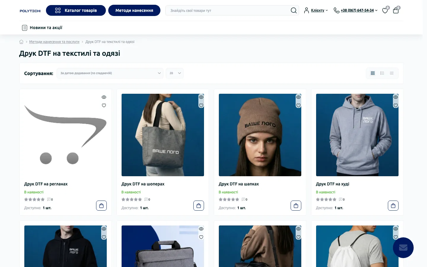
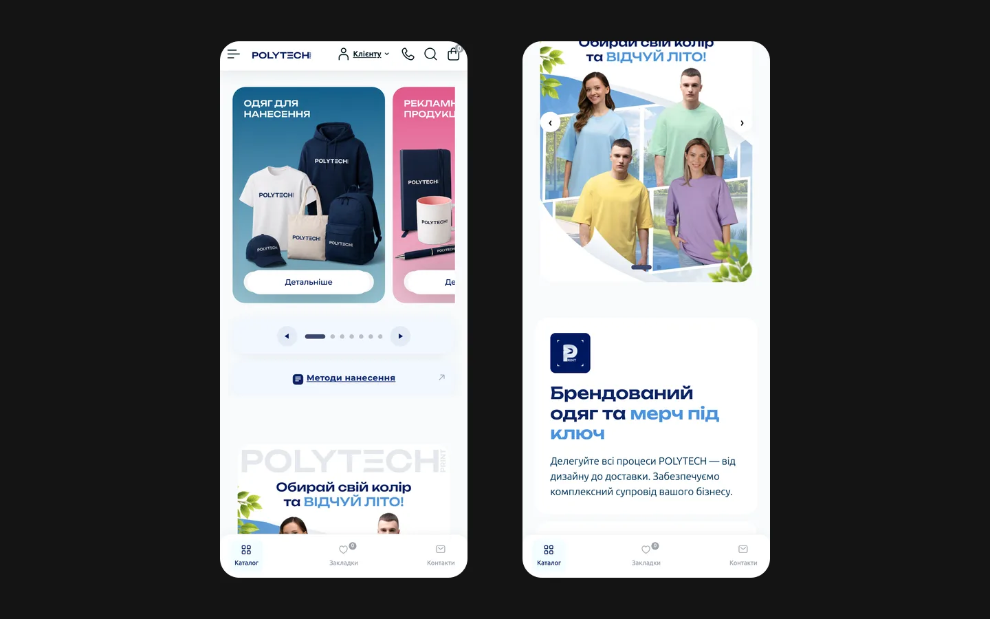
Polytech’s project is a branding and graphic production case. Our recorded work includes the identity, a brandbook in the client’s Figma, a mascot, merchandise designs and artwork for the store. The store itself was built by the client’s team. Its saved screens are shown here as a context in which the identity and artwork appear, not as a claim that HeadPills developed the ecommerce platform.

The supplier’s brand and the customer’s brand have different jobs

A printing company needs to identify itself while presenting products that customers will use for their own branding. Those two layers can easily become confused in a portfolio image. Polytech’s own mark makes a category composition recognisable as its communication. A customer’s eventual logo belongs to the individual order. The design system needs enough character to represent the supplier without suggesting that every demonstration layout is the final product a buyer will receive.

The project records identify the mark, palette and typography as a coordinated identity. Their value lies in repeatable use across the company’s material. A logo on a pen and a wide promotional composition do not have the same space or reading conditions. A useful system explains which elements remain consistent and where the composition can adapt. It should not be described as automatically suitable for every size, surface and production method without further checks.

How the artwork appears in the store

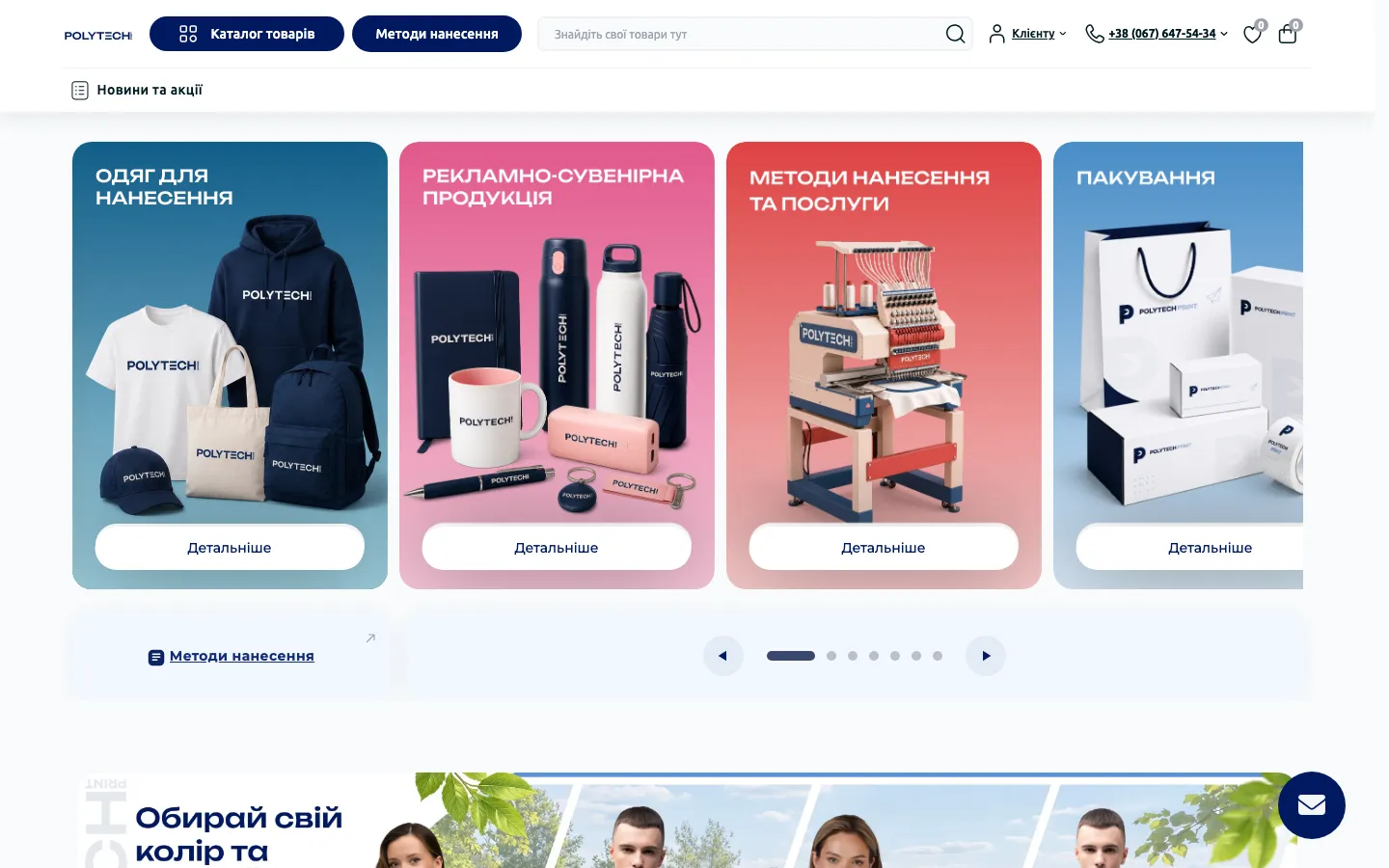
The saved category area groups apparel, promotional objects, application methods and packaging into separate illustrated panels. Clothing appears against a blue background, smaller branded objects against pink, equipment against a warm red tone and packaging against a lighter blue. The compositions share a clear title area and a product focus. This lets different categories have their own imagery while belonging to the same visual family.

The artwork also gives a physical meaning to a broad category. A hoodie, bottle, notebook or paper bag is easier to recognise than an abstract label for promotional production. The important editorial distinction is whether an image is a demonstration, a product representation or a documented finished order. A convincing mockup can explain an idea, but it should not silently become evidence that a particular run has already been manufactured.

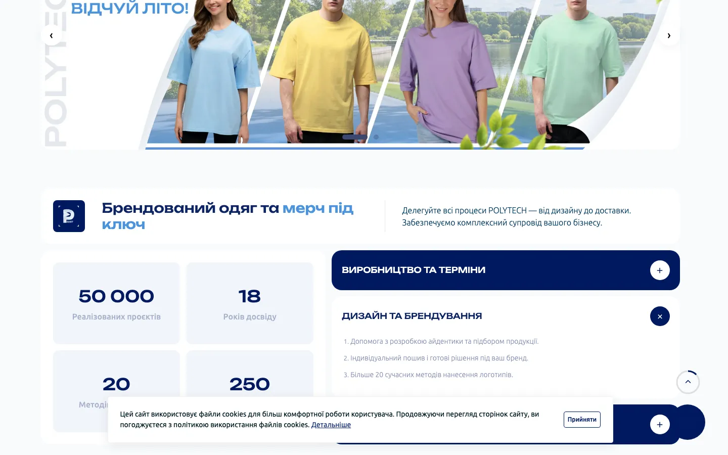
A saved lower section shows a seasonal clothing banner with several colours and diagonal divisions. That is a different format from the category panels, so the system cannot depend on one fixed canvas. The brand vocabulary needs to support both short category communication and a wider campaign message. The recorded artwork work includes banners and key visuals; it is separate from the store’s navigation, search, account and checkout implementation.

Three parts of the delivered design system

The identity foundation
The mark, colour palette and typography establish the company’s own visual reference. The brandbook makes the choices available to people who will create later material. For a comparable project, we would define usage through representative applications rather than assume a logo file alone communicates the rules of composition.
The mascot and merchandise
The project records include a custom character and merchandise designs. A character can give a brand another expressive element, but it needs a defined role alongside the main mark. For a new brief, we would agree where it helps communication and where a simpler identity treatment should remain the main visual focus.
Store artwork
Category images, banner sets and key visuals apply the identity to recurring communication. Their job is to make the offer understandable and recognisable within the client’s platform. Delivering these graphics does not establish authorship of the software or of every other image later published by the business.

Designing for production begins with limits

A printing business works with different materials and application methods. That makes production questions relevant to identity development, but it does not remove the need for method-specific preparation. For a comparable branding brief, we would identify the main intended uses and ask the production team about practical constraints before finalising the application examples. Small lettering and fine details may need a different treatment from a large digital visual.

The appropriate review looks at the actual use: the available area, background, contrast and reproduction process. A beautiful screen mockup is useful for discussing a direction; it is not a substitute for a production proof where one is required. The case documents design work and merchandise layouts, not a guarantee that an unmodified file can be sent to any machine on any material and produce the same result.

This distinction also helps the client maintain the brand. A prepared alternative for a restricted format is easier to manage than an improvised distortion of the logo. In a new project, we would make those alternatives understandable in the handover so the production team knows which version to choose and when a new adaptation needs design review.

From the brandbook to a usable artwork brief

  1. Name the communication task

    Decide whether the material introduces a category, explains an application method or promotes a particular offer. These tasks need different priorities. Before making a new banner, agree what the visitor should understand and which supplied product material may be used to show it accurately.

  2. Choose a composition family

    Use the identity’s type, colours and mark in a layout suited to the placement. A small category image and a wide seasonal banner should feel related without being forced into identical proportions. For a similar commission, the required dimensions and surrounding interface belong in the brief from the beginning.

  3. Review the final placement

    Inspect the artwork inside the actual store area, including its smaller-screen crop. Check that the title, product and brand remain readable and that the image does not imply an unsupported offer. This assesses the graphic in context while keeping responsibility for platform behaviour with the team that develops the store.

Working with the client’s own design files

The brandbook was delivered into the client’s Figma according to the project records. That gives the team access to the design reference and working material in its own environment. The value of this handover is continuity: another designer can understand the intended relationship between the identity and applications instead of rebuilding it from compressed images taken from the public website.

For a comparable delivery, files should distinguish the approved identity from exploratory versions and show which artwork is ready for a particular use. A clear naming and versioning process matters when campaigns accumulate. The records also describe further design work beginning in 2025. We treat that as recorded collaboration, not as an unverified statement that the same service arrangement remains active today.

How to use this case when choosing a branding partner

Polytech is relevant when a business needs both a recognisable identity and a practical supply of graphics for different product categories. The outcome described here is the design system and its applications. The business’s published production statistics, orders and store results are not presented as outcomes measured by HeadPills. The website screenshots show the context of use, with store development credited to the client’s team.

For your own printing or merchandise brand, bring the intended product range, main reproduction methods and examples of the communication you publish repeatedly. Identify which team handles production and which team operates the store. This makes it possible to define a focused identity and artwork scope, prepare useful application examples and hand over files that support the next piece of communication rather than only an isolated launch presentation.

What the site does

Project features

  • Applications across formats

    A coordinated identity with adaptations for the intended use.

  • Brand hierarchy

    The supplier’s identity and the customer’s branding have different roles.

  • A custom character

    A mascot is included in the documented design scope.

  • Store artwork

    Recorded category graphics, banners and key visuals.

“We ordered a brandbook and merch design. Everything was delivered straight into our Figma, so it was easy to work with, and the style came out exactly how we wanted. Really happy.”
Polytech · Print company · translated from the original

OriginalЗамовляли в хлопців брендбук і дизайн мерчу. Все одразу закинули в нашу Figma, працювати було зручно. Стиль вийшов саме такий, як ми хотіли. Залишились задоволені)

Questions

About Polytech Print

Did HeadPills build the Polytech website?

No. HeadPills made the brand identity, the brandbook, the mascot and the merch designs, and produces artwork for the client’s store. The store itself was built and is run by the client’s team.

What did the Polytech identity need to support?

The company’s own communication, product demonstrations and different graphic formats. Production applications still need checks for the intended size, material and method.

What further work is documented for Polytech?

The project records describe category artwork, banners and key visuals from 2025. This case does not confirm the current service arrangement.

Start a similar project.

Tell us what your site has to do. A short call, then a fixed price in writing.