Case · SaaS

Filmcore: a launch page for beta sign-ups.

Filmcore is a production platform for short-format film: commercials, music videos, short films. When we built the page it had no public product yet. A pre-launch page in that position has one job: get the right people to request beta access and let the wrong ones leave without feeling misled. No pricing table, no invented testimonials, no roadmap promises.

  • SaaS
  • Film production
  • Pre-launch
  • Webflow
  • English
filmcore.appFilmcore website preview
Short on purpose

What it is, who it is for, what changes in your week, then a form. About and features, nothing else. checked on the live site · Sep 2026

Beta access and a walkthrough

Two requests, both forms: beta access and a live walkthrough of the product. checked on the live site · Sep 2026

Built on Webflow

The team updates the page as the product changes, without a developer. checked on the live site · Sep 2026

The project

Task, approach and delivery

The task

“For filmmakers by filmmakers” was a line the client had already earned. The page had to hold that standard with a product nobody could try yet.

Everything that would age badly in public had to stay out: a pricing table for a product with no price, testimonials that did not exist, roadmap promises.

The approach

We kept the page short: what Filmcore is, who it is for, what changes in a producer’s week, then a form. The product is shown as it is, on desktop and phone.

Two requests, beta access and a live walkthrough, both as forms the team receives directly. The page was built over three months on Webflow and judged on one measure: whether the beta list filled with actual production people.

What we delivered

A Webflow product page in English with about, features, beta access and walkthrough request forms, edited by the team. Domain and hosting in the client’s name.

A product page that makes a beta invitation understandable

Filmcore's website introduces a platform for short-format film production. The launch brief needed a clear explanation for production professionals before a public product was available. We designed and built the English Webflow page, with product views and separate requests for beta access and a demonstration. This is a case about the public website; the software shown inside the product images is not presented as our application-development work.

A specific production context comes before the feature list

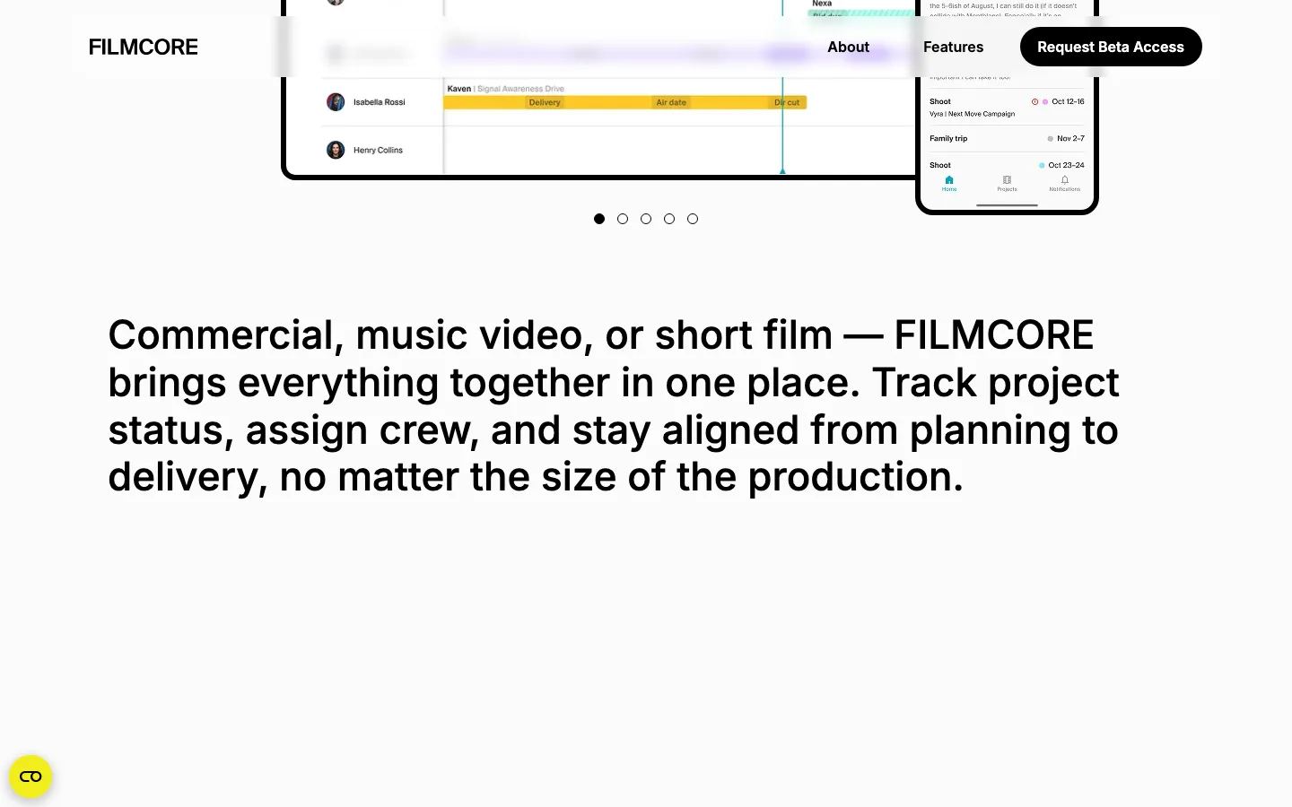
The opening names short-format film production and then explains the relationship between projects, crew and schedules. This gives a producer a frame of reference before the page introduces individual capabilities. A broad statement about organising work would apply to many tools; naming the production context helps the right reader connect the offer with their own week. The page can then use product images as evidence of the proposed workflow rather than as decoration.

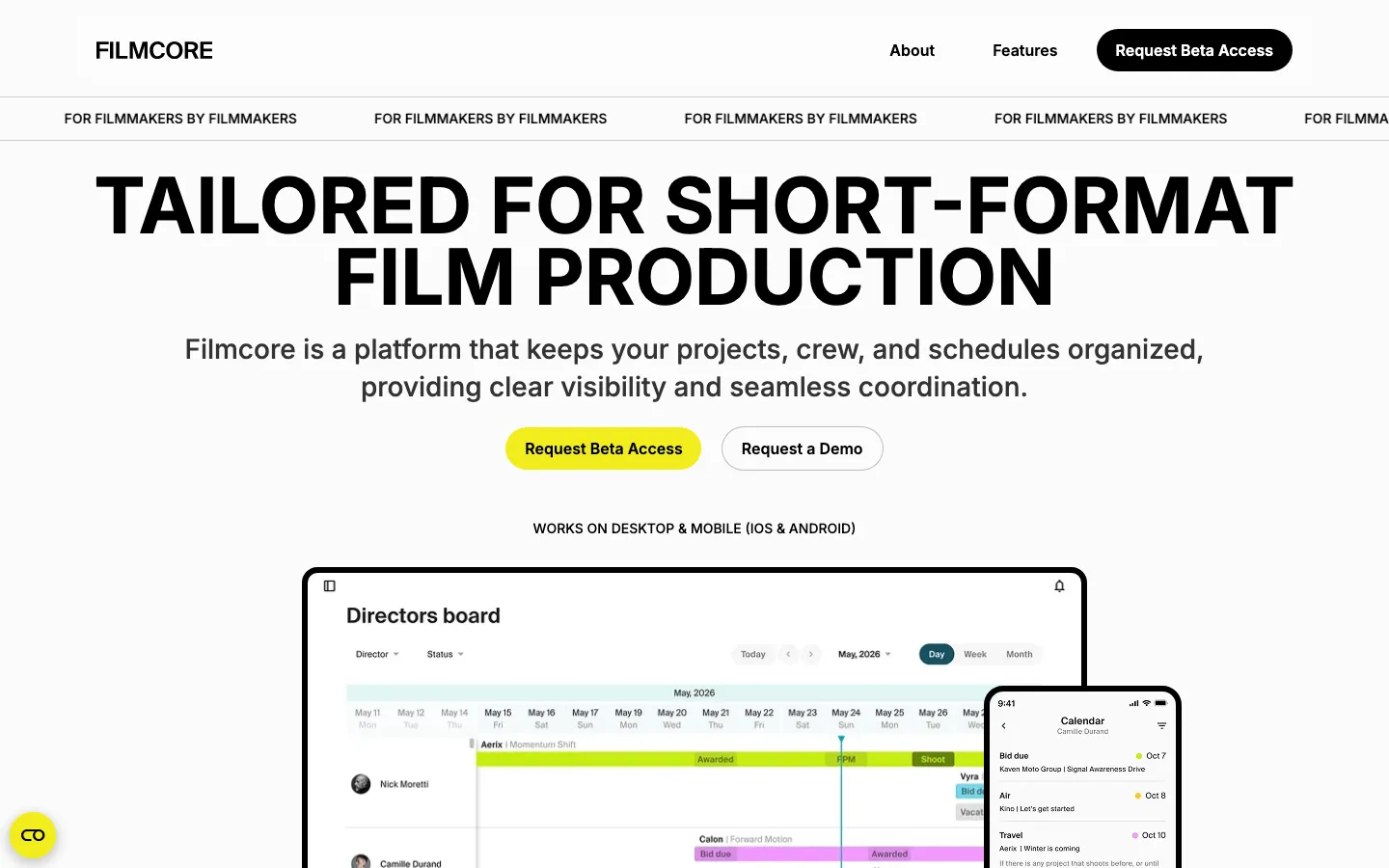
The saved first screen has large black typography on a light background. A yellow beta-access button is paired with a quieter demonstration button, and the product view sits below them. The composition establishes three levels: the proposition, the next action and the interface to inspect. It does not require a long introductory animation before someone can work out what the page is offering.

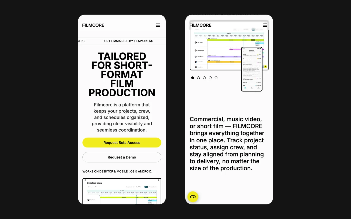
The desktop product image is accompanied by a phone view. They communicate that the offer is meant to be understood across more than one screen context. A marketing image can introduce that idea; it is not a usability test of the application. In the website project, our responsibility was to present the supplied product material clearly and provide an appropriate route to the team.

Beta access and a demonstration answer different questions

Requesting beta access
This action suits someone ready to ask about participating in the product's early stage. The wording should make the request clear: sending a form is not necessarily immediate admission to a working account. For a similar launch, the confirmation needs to state what happens next and who will respond, using the actual access process agreed by the product team.
Requesting a demonstration
Another visitor may recognise the problem but need to see how the proposed tool fits their production process. A demonstration request allows that conversation without requiring the visitor to present themselves as a beta participant. Keeping the route separate helps the team understand the reason for contact before the meeting is arranged.
Continuing to inspect the product
A third visitor is not ready to contact anyone. Product views and the features section give them material to examine. The page should support that reading instead of treating every scroll as hesitation to overcome. Clear information can help a prospect form a more specific question, or decide that the product does not match their current work.

Screenshots need context to become useful evidence

An interface image contains many small details. At full desktop size it may show the shape of a working view; on a phone, individual labels may be too small to read. The surrounding heading and explanation therefore need to identify what the viewer should notice. A screenshot is most useful when it supports one point, rather than carrying the entire explanation inside tiny interface text.

For a comparable page, the selection should start with the task being explained. A view of scheduling belongs beside a discussion of availability; a broader project view can introduce how work is organised. Using a real product image does not remove the need for editorial selection. The website has limited space and should not turn into an unstructured archive of every screen the product team has designed.

The screenshots also have a date, even when that date is not printed on them. If an interface changes, the team needs to decide whether the existing public image still represents the offer. This is part of maintaining an early product page. A convincing launch presentation can become confusing if it continues to show a workflow that no longer matches the demonstration a prospect receives.

Make the stage of the product visible

The project record describes a page prepared before a public product launch. That stage shaped the content choices: the team needed a way to introduce the proposal and collect interest without inventing customer evidence. A beta invitation and a demonstration route were appropriate actions for that brief. They made the next step understandable without requiring the website to behave like a self-service store.

This distinction matters when reading the case today. The client's public product description can evolve after the website handover. The case records the website scope and the launch problem it addressed; it does not freeze the application at its original stage or certify every feature currently described by the client. Commercial results and the quality of the resulting beta list require their own records, which are not supplied as figures here.

Prepare a launch page around the conversations it starts

  1. Choose the first professional audience

    Describe the role and working situation of the people you want to hear from. For a production tool, that is more informative than a broad audience such as creative people. It helps decide which product view to show first, what terminology needs explanation and which questions the team should be ready to answer after contact.

  2. Define each request

    Agree the purpose of beta access and demonstrations, the information needed to handle them and the response that follows. Keep the fields proportionate to the action. A demonstration request should collect enough context to make the conversation useful without pretending to complete a procurement process in a short form.

  3. Plan content ownership

    Name the person who approves changes to product descriptions, images and access conditions. The Webflow page can be edited by the team, but accuracy still needs an owner. Review connected elements together so an updated feature description, screenshot and button continue to tell the same story after the next product change.

What the delivery demonstrates

Filmcore combines a direct audience statement, readable hierarchy, product imagery and two clearly named requests. The confirmed result is an English website the client team can maintain, with sections explaining the product and routes to contact. For a founder considering similar work, the important starting materials are the current product stage, representative interface views and a precise account of the conversation the website should begin. Those details make the design brief concrete before any visual effects are discussed.

What the site does

Project features

  • Says what it is

    One sentence, one audience, one screenshot.

  • Lets the wrong people leave

    No persuasion aimed at everyone; a producer recognises the tool, others move on.

  • Collects the right requests

    Beta access and a walkthrough as two clear forms.

  • Editable by the team

    Descriptions and product images can be updated as the offer develops.

“For a software product the landing page is the first demo. HeadPills built ours on Webflow so our team can edit it without developers, and it explains what Filmcore does in one scroll.”
Filmcore · Film production software · approved by the client

Questions

About Filmcore

Why is the Filmcore page so short?

Because the product had no public version yet. The page says what it is, who it is for and what changes in your week, then asks for a beta request. Anything more would have aged badly.

What did HeadPills leave out of the Filmcore page on purpose?

A pricing table for a product with no price, testimonials that did not exist, and roadmap promises. All three would have had to be removed later.

What platform is the Filmcore page built on?

Webflow. The team updates the page as the product changes, without a developer.

Start a similar project.

Tell us what your site has to do. A short call, then a fixed price in writing.