Case · Tech

MVP Founders: a website for a Berlin venture studio.

An English presentation of the studio’s thesis, working method, portfolio, team and opportunities. The project applies an expressive identity to a clear sequence of information and contact routes.

  • Tech
  • Venture studio
  • Custom build
  • English
  • Berlin, Germany
mvpfounders.comMVP Founders website preview
Clear structure

Thesis, method, portfolio, team and opportunities. project record and saved screen

Portfolio material

A place for approved descriptions of the studio’s involvement. project record and saved screen

English website

A shared presentation with routes to information and contact. project record and saved screen

The project

Task, approach and delivery

The task

The studio needed to explain its position and working approach to people considering a relationship with the business.

Its thesis, portfolio, team and opportunities needed distinct roles within one presentation.

The approach

We organised the material around the thesis, method, portfolio, team and jobs.

Bright colour fields, strong typography and outlined controls apply the studio’s identity while giving the information a recognisable hierarchy.

What we delivered

A site in English with thesis, method, portfolio, team, jobs and contact, in the studio’s own bold identity. Domain and hosting in the client’s name.

A venture studio website with a clear point of view

MVP Founders needed an English presentation of its venture studio: its thesis, working approach, portfolio, team and opportunities to get involved. The recorded project applies the studio’s bold identity to a structured website. This case concerns that presentation and its information routes. It does not attribute the studio’s company building, investment performance or underlying AI systems to the website team.

A visual language that is difficult to overlook

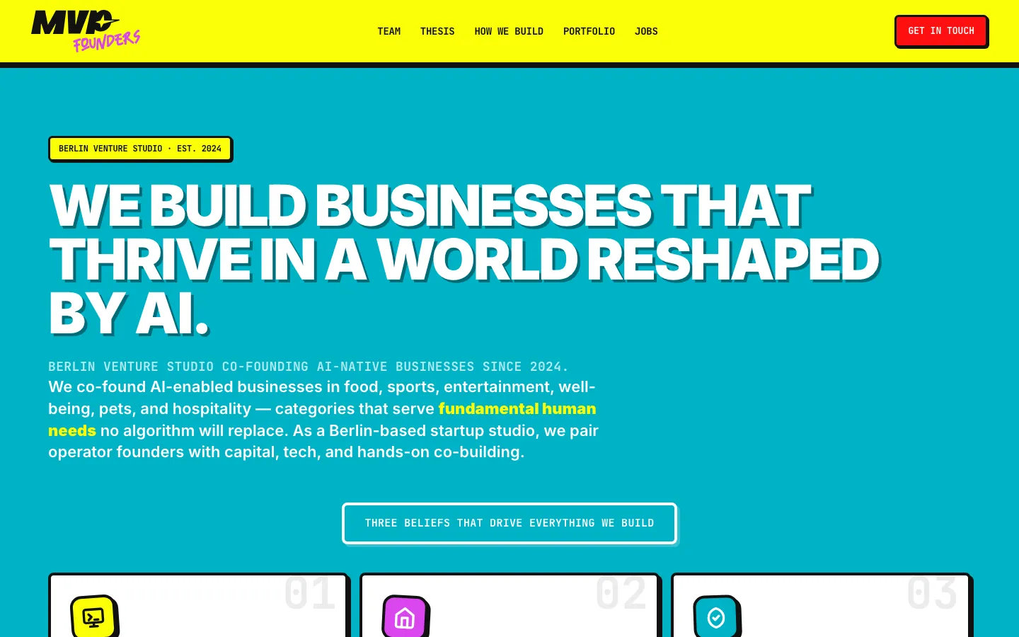
The saved opening uses a bright yellow navigation bar above a turquoise main area. The studio mark combines a heavy black form with a smaller expressive word underneath. A red contact control is separated from the navigation by a dark border and offset shadow. The main statement is large, white and strongly weighted. Smaller labels use a different typographic rhythm, allowing the first screen to contain both a position and practical orientation.

The design does not try to create seriousness through a neutral palette alone. Instead, it gives a distinctive identity a consistent set of visual rules: strong colour fields, outlined controls, clear type levels and emphatic shapes. The useful question for a comparable project is whether those rules help the reader recognise sections and actions. Boldness needs organisation so that every element does not compete at the same intensity.

Give the thesis an understandable structure

The site’s opening connects its general statement to three numbered beliefs. This breaks a large proposition into parts that can be read individually. The visitor is given a route from the studio’s overall position to its explanation, rather than being asked to accept an abstract headline on its own. Numbering and separate cards help communicate the relationship between the parts without requiring a long uninterrupted paragraph.

For a similar venture studio brief, we would start by clarifying what the company means by its thesis and which claims it is prepared to publish. The website can express that position clearly; it should not silently convert a belief about a market into an independently proven forecast. A strong statement and a verified result are different types of content and need to remain recognisable as such.

The project records describe a sequence that also includes the working method, portfolio, team and jobs. Those sections allow the studio to explain itself from several angles. The method answers how collaboration is organised. The portfolio presents examples within an agreed scope. The team supplies named context, and opportunities show how someone can engage. Each area has a purpose beyond filling another coloured block.

Different readers need different routes

A potential founder
Needs to understand the studio’s focus and whether their experience or idea is relevant to a conversation. The thesis and working approach provide that context. For a comparable site, the contact wording should explain what kind of discussion is invited without implying automatic acceptance, funding or a promise that the studio will build any submitted idea.
Someone reviewing the studio
May want to inspect the people, portfolio and stated approach before making contact. These areas should be understandable when opened through a direct link. The site can organise the studio’s approved information, but the design should not turn a portfolio association into a claim of sole authorship or verified financial performance.
A potential team member
Looks for relevant roles and a clear way to learn more. The recorded structure includes jobs as a recognisable subject. For a new commission, opportunities should be distinguished from general founder enquiries so a candidate does not have to guess whether a broad contact button is also an application process.

A portfolio needs meaningful relationships

A venture studio’s portfolio may contain different kinds of involvement. The website needs to express the relationship attached to each item rather than allow every logo to imply the same role. For a similar project, we would ask the client to approve names, descriptions and grouping before building the presentation. A visual filter is useful only when the categories have a meaning that the reader can understand.

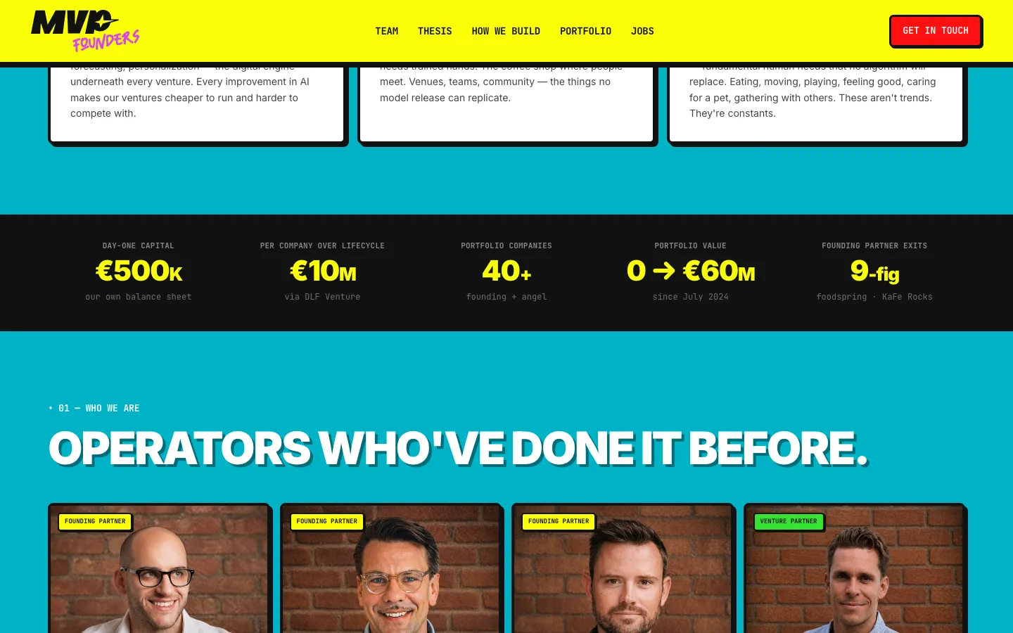
The project records include portfolio material and team information, but this case does not repeat financial figures as results achieved by HeadPills. A valuation, investment or operating result belongs to the business and requires its own evidence and context. The website’s contribution is the organisation and presentation of approved material. Keeping that boundary clear makes the design case more useful to someone choosing a web team.

Apply the identity without flattening every section

The saved opening has a strong visual character, but the content includes several formats: a large statement, short belief cards, people, portfolio material and opportunities. A coherent design does not require all of them to use the same box. Typography, colour, border treatment and spacing can create continuity while the layout changes to fit the information. That is the practical value of applying an identity across a website.

For a comparable design, a person’s profile needs a different reading priority from a thesis statement. A project list may need scanning and grouping; a process explanation may need a sequence. Choosing the format around the question helps the site remain interesting without inventing a new decorative device for every section. The studio’s character stays visible, while the content determines how much visual emphasis each area needs.

A useful sequence for a venture studio website brief

  1. Agree the message and its boundaries

    Separate the studio’s point of view, its documented work and the type of collaboration it seeks. Identify the person who approves business claims. This gives the design a clear editorial foundation before visual development and avoids using a strong colour palette to conceal an unresolved offer.

  2. Prepare the supporting material

    Collect approved team information, portfolio relationships and opportunities. Decide which details belong on the site and which are better handled in a direct conversation. For a new commission, each item needs enough context to be meaningful rather than simply increasing the number of logos or biographies.

  3. Review each reader’s next step

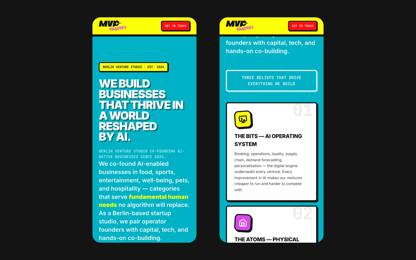
    Follow the route from the thesis to contact, from a portfolio item to its context and from an opportunity to the appropriate action. Check whether the meaning remains clear on a phone. This turns the page sequence into a usable presentation rather than only a visually impressive walkthrough.

What the project demonstrates

The recorded delivery is an English website with the studio’s thesis, method, portfolio, team, jobs and contact in its established visual language. The saved screens show a distinctive treatment with clear differences between statements, supporting material and actions. The case does not claim that the design generated a particular investment, founder application or business outcome; those would require separate measurement.

For a similar organisation, useful starting material includes an approved explanation of how you work, the relationships you want to present and the people you want to hear from. Bring examples of your identity as well as your content. We can then define a website that preserves the company’s character and makes the practical routes understandable, so a visitor can explain both your point of view and how to begin the right conversation.

What the site does

Project features

  • Explain the position

    A broad statement connects with supporting principles.

  • Show the method

    A dedicated explanation of the studio’s approach.

  • Present people and work

    Team and portfolio information have distinct roles.

  • Identify opportunities

    Jobs have a recognisable place in the structure.

“We build products fast and needed a site that says so: short, sharp, credible. HeadPills got the tone right and shipped quickly, which is exactly how we like to work.”
MVP Founders · Venture studio, Berlin · approved by the client

Questions

About MVP Founders

How is the MVP Founders site structured?

The presentation includes thesis, method, portfolio, team, jobs and contact.

Who is the MVP Founders site for?

People exploring collaboration with the studio, reviewing its work or considering team opportunities. The website provides information before contact.

Where is MVP Founders based?

The studio presents itself as based in Berlin. The case does not independently verify its financial or operating claims.

Start a similar project.

Tell us what your site has to do. A short call, then a fixed price in writing.