Case · SaaS

Hypotest: making a new product easy to understand.

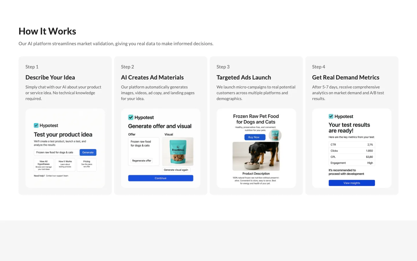
Hypotest tests whether a business idea has real demand before a founder spends a year building it: describe the idea to an AI, get creatives and landing pages, run micro-campaigns at real audiences, get data instead of opinions from friends. The page was prepared for visitors who may not know the product, so it explains the offer first: four steps in plain order, four audiences, then reasons to believe.

  • SaaS
  • Startup validation
  • Webflow
  • English
  • Product page
hypotest.comHypotest website preview
Four steps in order

Describe the idea, the AI creates ad materials, targeted ads launch, data comes back. checked on the live site · Sep 2026

Four audiences

Who needs Hypotest, addressed one by one with the fear each one has. checked on the live site · Sep 2026

Built for paid traffic

A short page with one action, made to be tested with ads rather than found by search. project record

The project

Task, approach and delivery

The task

The product’s promise is testing demand before building. The page gets judged by exactly that standard, without assuming an established stream of search visitors.

Founders arrive skeptical. The page had to explain the mechanism before asking for anything.

The approach

We explained before persuading: how it works in four steps, who it is for in four audiences, why choose it, and the founder’s own reason for building it.

One action, test your idea, repeated where it makes sense; a short page built to be pushed with paid traffic and measured. Built on Webflow.

What we delivered

A Webflow product page in English with how it works, who it is for, solutions, why choose us and a contact and early-access request, edited by the client. Domain and hosting in the client’s name.

Explain a new product before asking someone to try it

Hypotest presents a way to test business ideas with AI-assisted materials and small advertising campaigns. Our work was the English product website on Webflow: the explanation, audience sections and route to an enquiry. The case concerns how that offer is presented. It does not claim that HeadPills built the underlying validation platform or that an enquiry proves a business idea will sell.

The opening names the decision a founder is facing

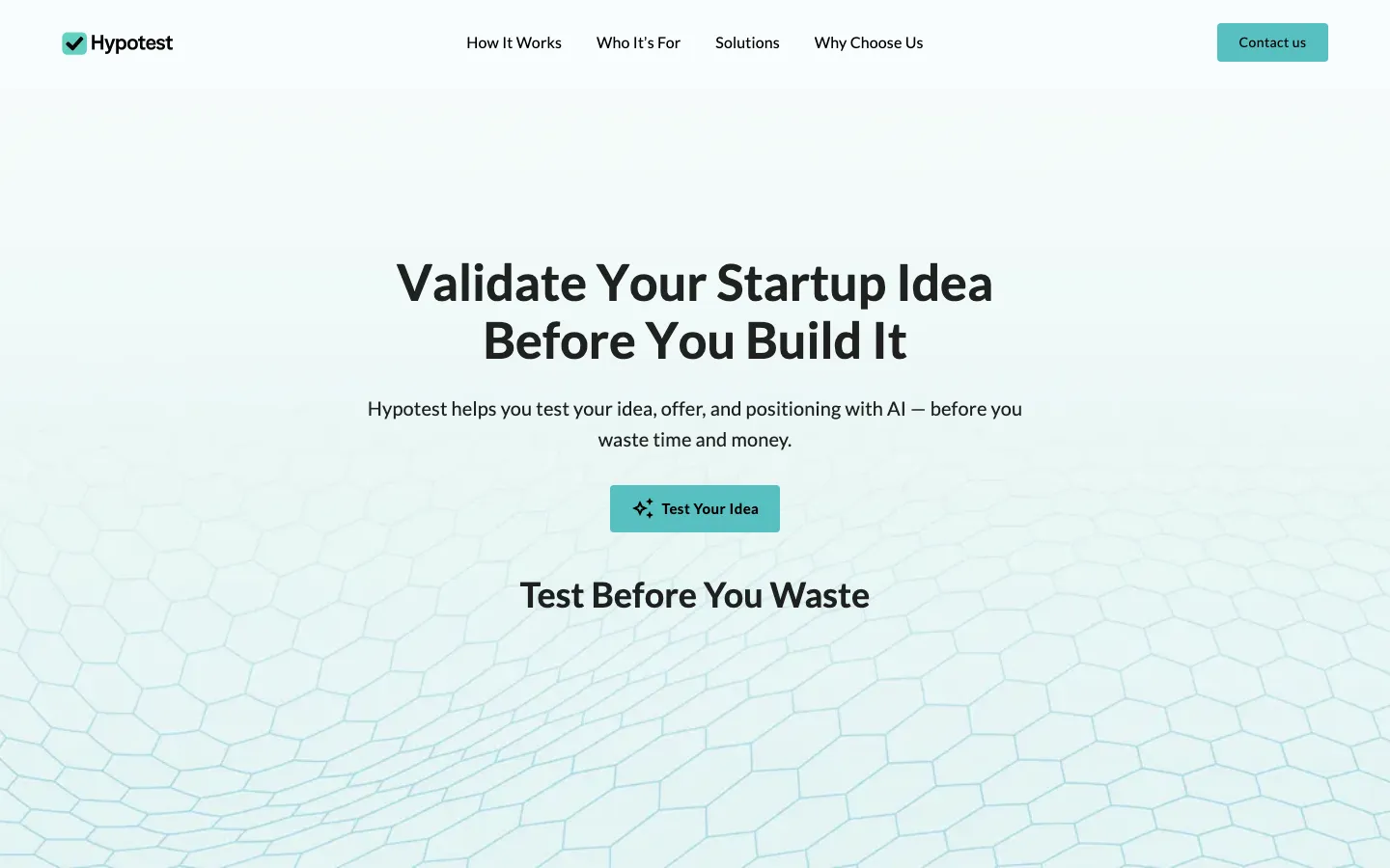
The first screen centres on checking an idea before building the product. A short supporting line connects that decision with the idea, offer and positioning. The main button continues the same subject. This gives the page a clear entry point for a visitor coming from an advertisement: they do not need to identify the category from a technical diagram before understanding why the product might matter to them.

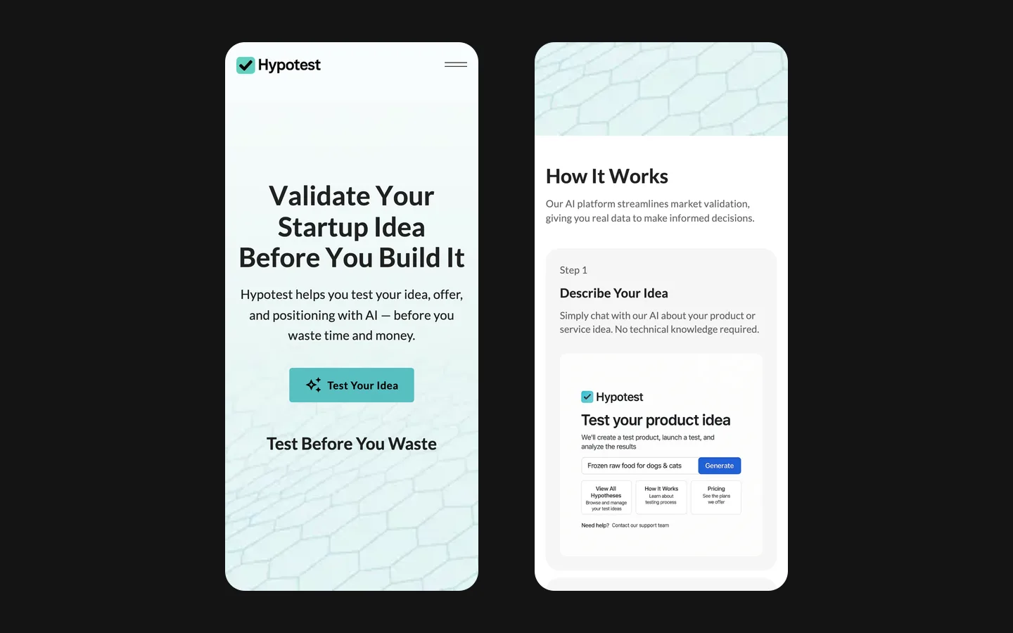
The preserved website view uses a pale surface, dark typography and a turquoise action. The visual field behind the lower headline is more decorative, while the main statement remains readable in a quieter area above it. The page gives the explanation the leading role. A new tool can be unfamiliar without needing to look complicated, and the opening does not have to explain its entire internal architecture to introduce the next step.

The brief emphasised paid traffic. That is a distribution choice, not evidence that nobody searches for the subject. We do not have a verified keyword-volume study for this project. A comparable launch should distinguish the traffic expected from campaigns from any later organic discovery, then evaluate both using actual visitors and enquiries rather than an assumption about the category.

Four stages turn the promise into a sequence

  1. Describe and prepare

    The product presentation starts with an idea description and the preparation of advertising materials. This separates the founder's input from what the service proposes to produce. For a similar page, it is useful to state what makes an idea specific enough to test: the intended customer, the problem and the offer. A vague description leaves too much room for interpreting the result later.

  2. Reach a relevant audience

    The next stage in the public explanation is a small campaign aimed at potential customers. The website needs to make the transition from generated material to real audience exposure understandable. Creative quality and the choice of audience are different questions. A result cannot be interpreted well if the person evaluating it does not know what message was shown and to whom.

  3. Review the evidence

    The final stage concerns the data returned by the test. The design task is to make that outcome concrete without presenting an automatic guarantee. Interest in a message, a submitted contact and a completed purchase are different signals. A comparable product explanation should identify which event is actually measured and what decision the founder can reasonably make from it.

Audience sections need different reasons to continue

The page has four audience groups. That structure recognises that a new founder, an investor and a team developing a new direction do not arrive with the same context. A founder may be deciding what to build first; another organisation may be comparing proposals or exploring an additional offer. The useful part of the section is the difference in their decision, not merely a set of job titles displayed in matching boxes.

For a similar project, those descriptions should be checked against the service the team can actually deliver. If every audience receives the same test, the copy can explain its different uses without inventing separate packages. If the requirements genuinely differ, the next conversation should capture that context. This is a reason to plan the contact path together with the audience content, rather than treating the form as an unrelated item at the bottom.

Keep three scopes separate

The product's proposition
Hypotest's public presentation describes an AI-assisted validation process. Those statements explain the client's offer. They should not be confused with an independent verification of every platform feature, the accuracy of a forecast or the success of a tested business. A marketing page communicates a proposal; the service itself needs to supply the evidence behind it.
The website delivery
The confirmed HeadPills work is the Webflow page, including the sequence of explanations, audience content and enquiry route. This is the interface through which a visitor learns about the offer. The underlying AI system and the management of client advertising campaigns are not added to our delivery merely because the page describes them.
The launch evaluation
The site's structure makes an initial action visible and gives the team something concrete to revise. It does not establish a measured improvement on its own. Evaluating a launch requires traffic sources, a reliable record of submitted enquiries and a definition of a suitable lead. None of those business results is invented in this case study.

Prepare the handover around changes the team will make

An early product page changes as the offer becomes clearer. The client can update the Webflow content, but a useful update still needs an owner and a reason. A new audience, a changed process or a different access condition should lead to a deliberate edit across the relevant sections. Changing only the main button while leaving an older explanation below can create conflicting expectations.

For a similar launch, we would agree which information is stable and which is likely to change soon. That affects the content structure and the editing guidance. It also helps avoid treating every future adjustment as a complete redesign. The first version should explain the current offer accurately and leave a manageable route for revisions as the team learns from real conversations.

What a founder should bring to the brief

Bring a concrete description of the offer, its present stage, the first audience to approach and the action you want after a visit. Include examples of the information a prospect will receive and a clear account of what happens after an enquiry. For this kind of page, those details determine the structure more directly than a long list of fashionable interactions. Hypotest demonstrates an explanation-led landing page: the potential customer can follow the proposal, recognise their situation and decide whether to contact the team.

What the site does

Project features

  • Explains the mechanism

    Four steps a founder can follow without a walkthrough.

  • Names the fear

    Four audiences, each with the doubt they arrive with.

  • One action

    Test your idea, from the first screen.

  • Measurable

    Short enough to test with paid traffic and change.

Questions

About Hypotest

Why does the Hypotest page explain before it persuades?

Because visitors may be unfamiliar with the product. A founder arrives skeptical, so the page shows the four steps and the four audiences before asking for anything.

What does the Hypotest product do?

A founder describes an idea to an AI, which generates ad materials and landing pages, launches micro-campaigns at real audiences, and returns demand data instead of opinions.

What platform is the Hypotest page built on?

Webflow, with a short structure and one action, made to be tested with paid traffic and changed quickly.

Start a similar project.

Tell us what your site has to do. A short call, then a fixed price in writing.