Studio concept · Energy

Built by HeadPills for itself, no client and no brief from outside. Not counted with the client projects.

Keldvik: a maritime website concept.

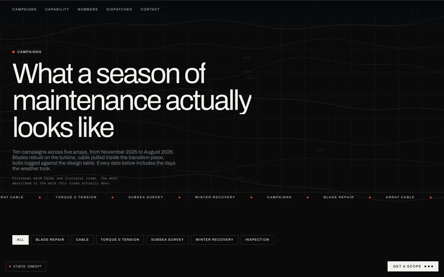
A fictional contractor presented through film, technical typography, a filterable campaign log and six pages of studio exploration.

  • Energy
  • Offshore wind
  • Studio concept
  • Six pages
  • Film
  • Baltic and North Sea
keldvik.pages.devKELDVIK website preview
Fictional organisation

The concept label identifies its status. project records and saved screens

Campaign log

Ten fictional campaigns across five fictional arrays in the demonstration. project records and saved screens

Six pages

A multi-page presentation with distinct content formats. project records and saved screens

The project

Task, approach and delivery

The task

Develop a cinematic visual direction into a usable multi-page presentation with distinct content types.

The approach

We combined stock footage edited to one look with a campaign log, capability information, labelled indicators and editorial material.

What we delivered

A six-page studio concept with film, fictional campaign entries, filters, source-label patterns and a custom error page. It is separate from client work.

A maritime identity expressed through a working website

Keldvik is a studio concept for a fictional offshore wind maintenance contractor. HeadPills created it to explore the relationship between cinematic imagery, technical information and a navigable record of work. The farms, crews and campaign entries are fictional. The project belongs to our experimental work and is not evidence of an energy-sector client engagement.

The environment gives the opening its character

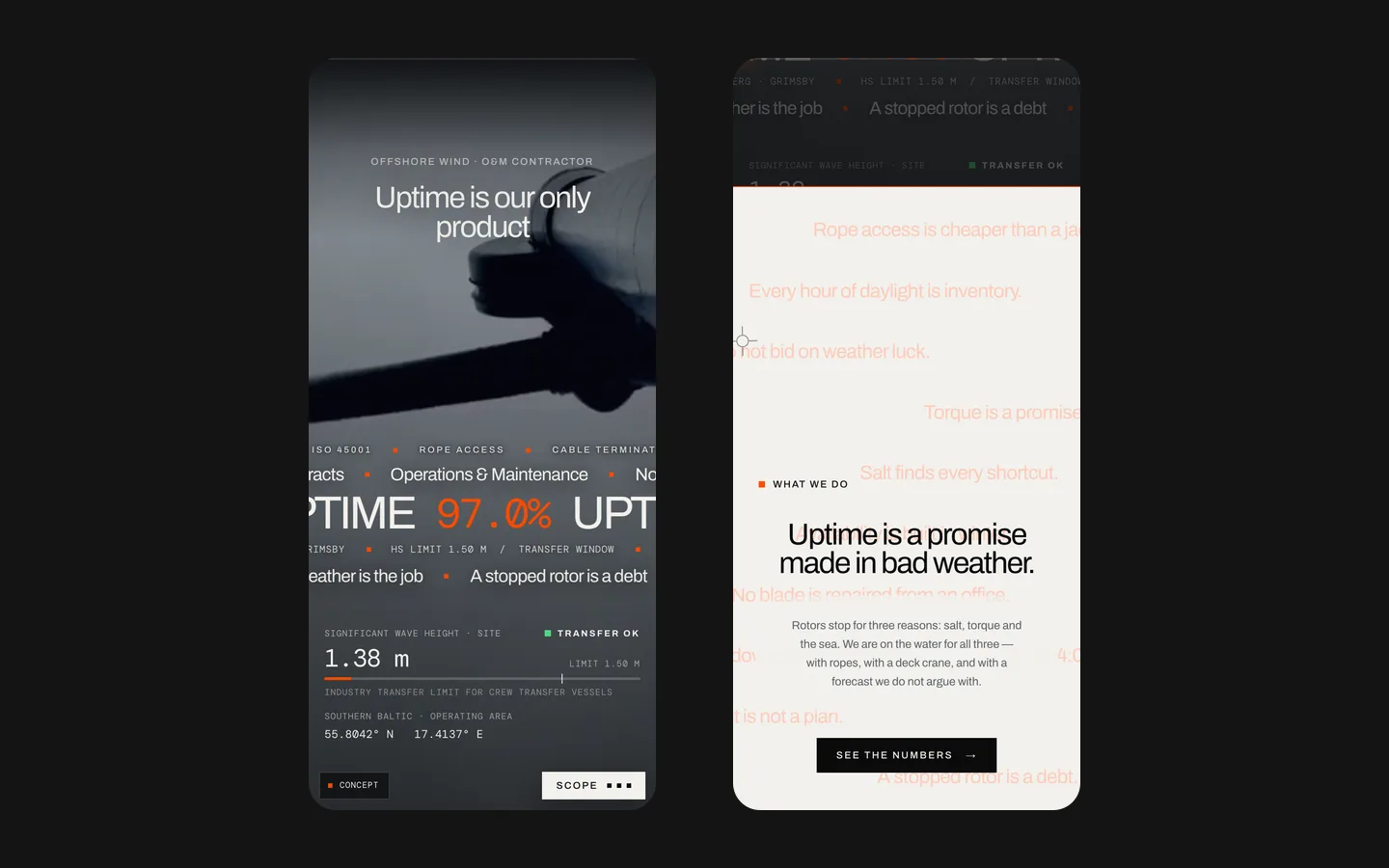
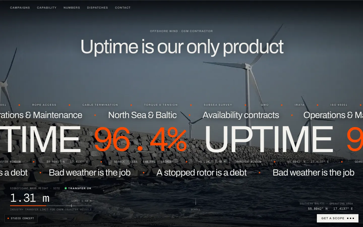
The saved homepage places large white typography over full-screen footage of an offshore setting. The palette is dark and restrained, with orange accents and small technical labels. A prominent numerical ticker and a compact sea-state panel make the composition resemble an operational interface. The visible studio-concept label is therefore important: this is a designed demonstration, not a live monitoring system.

The opening phrase centres the idea of uptime. In the concept, that theme connects the visual environment with the service being imagined. Film, typography and data-like elements speak about the same subject instead of competing for attention. We do not use the screen to establish an actual contractor's uptime, a measured maintenance result or HeadPills' involvement in offshore operations.

The sea-state panel includes a wave value, a transfer threshold and a status. Those are illustrative interface contents. They must not be read as current weather or an operational instruction. A real maritime system would require specialist-approved data and rules well beyond this website concept. The useful design lesson is how a small information panel can support a cinematic opening while retaining readable labels and a visible context.

Six pages give the visual idea a usable structure

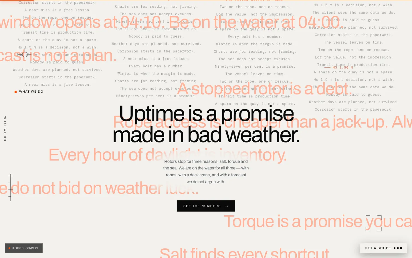
The recorded scope is a six-page website with a campaigns log, capability information, a numbers section, dispatches, contact and a custom error page. The concept was developed beyond a single impressive screenshot. Different kinds of content needed their own place: a reader looking for an overview should not have to navigate the same way as someone examining individual work entries.

The campaigns log uses filters to organise fictional examples. This demonstrates a possible alternative to presenting every service as an isolated card. A work record can connect a task, setting and period in one entry. For a real contractor, such entries would require approved project information and a clear explanation of the company's role. The existence of a well-designed record does not make invented examples real evidence.

The other sections extend that structure. Capability explains what the imagined organisation offers, numbers provide a place for labelled indicators, and dispatches introduce an editorial format. These content types should not be interchangeable. A company update, a service description and a project result answer different questions, even if they share typography and a consistent page shell.
Three relationships guide the design

Film and readable information
The footage establishes scale and atmosphere while the headings and labels carry meaning. Important text cannot depend on one convenient video frame staying behind it. In a commissioned version, we would review the moving background across its sequence and provide a readable still presentation where motion is unavailable or unsuitable.
A log and its supporting details
The filterable record is useful only when an entry contains enough context to understand what it represents. Keldvik uses fictional campaigns to demonstrate the structure. A client version would need permission to publish project names, accurate descriptions of responsibility and a distinction between completed work and planned activity.
Numbers and attribution
The concept places source labels with numerical information. This shows a presentation pattern, not an independent validation of every statement in the demo. For a real website, the source must support the particular metric, period and definition being displayed. A name beneath a large number cannot replace that editorial check.

Stock film becomes one visual sequence

Project records explicitly describe stock footage edited and graded to a consistent look. This matters when explaining the scope: HeadPills did not conduct a turbine-site shoot for Keldvik. The work shown here concerns selection, sequence and presentation. The case also should not label all of that footage as AI-generated simply because an adjacent agency service concerns AI video.

Consistency is a practical design concern. Clips with unrelated colour, pace or framing can make a short opening feel like several different brands. A coherent treatment gives typography a more predictable background and keeps the environment recognisable. It does not prove that any pictured asset belongs to the fictional company or that the depicted activity was performed by a real client.

For a similar commission, the starting decision would be which materials the company owns or has permission to use, which require captions and which need replacement. A film-heavy homepage also needs a sensible loading and fallback plan. The first explanation and contact route should remain available before the entire visual sequence is ready; the business message should not depend on watching every second.

The technical mood does not replace clear writing

Small labels, grid-like spacing and orange markers give Keldvik an engineering character. Their role is to support navigation and context. If every sentence were written as an unexplained abbreviation, the appearance could become more technical while the page became less useful. A prospective buyer still needs understandable descriptions of services, evidence and the next conversation.

The large numerical ticker creates emphasis, but prominence also increases the need for precise labels. A percentage without a defined measure or period is difficult to interpret. In this case the visible value belongs to the fictional presentation and is not reported as a measured client outcome. The distinction between a design example and a documented performance claim stays explicit throughout the case.

A real energy-sector brief could include certification names, equipment details and operational terminology. Those would need review by the client's responsible specialists. The web team can organise and present approved information, but should not invent qualifications to make a capabilities section look complete. Keldvik demonstrates the container and reading structure rather than actual certificates or operational competence.

Filtering should help a reader examine the record

The saved campaign-page description includes categories of maintenance work and a note identifying the farms and crews as fictional. Filters are a way to reduce the list to a relevant subset. They should preserve context: the reader needs to know which category is active and how to return to the full log. A visible empty state would be preferable to a blank region that appears broken.

For a commissioned site, we would agree the fields before building the filter interface. A short set of consistently maintained categories is often more useful than a long menu populated inconsistently. The record also needs a maintainable publishing process. An impressive initial collection loses value if the client cannot add the next approved project without rebuilding the whole page.

Preparing a comparable industrial website

  1. Collect approved evidence

    Separate real projects, company capabilities, editorial material and illustrative imagery. Record which names and figures can be published and who confirms their meaning. This creates a content foundation for the log and the overview without turning an attractive concept into unverified client claims.

  2. Design the main reading routes

    Plan how someone moves from the opening to a relevant capability, an example of work and contact. Give the film a defined role and provide text that stands on its own. The hierarchy should serve both a quick first assessment and a more detailed review of the company.

  3. Review content and interaction together

    Check filters, links, labels, moving backgrounds and narrow-screen layouts alongside the accuracy of the material. Confirm that the receiving team understands the enquiry route. Visual approval and content approval are related, but neither one alone demonstrates that the entire website is ready for use.

The result is a design experiment, not an operational claim

Keldvik adds a cinematic six-page direction, a filterable work-log model and a disciplined technical visual language to the portfolio. Its value is the relationship between these parts and the explicit fictional status. A comparable client project would begin with real capabilities and approved evidence, then use the design to make that material easier to investigate. No offshore sales, uptime improvement or maintenance delivery is attributed to this concept.

What the site does

Project features

  • Introduce the setting

    Film and a technical visual language.

  • Browse the log

    Filters organise fictional work entries.

  • Label the figures

    A pattern for showing context and attribution.

  • State the status

    A visible studio-concept disclosure.

Questions

About KELDVIK

Is Keldvik a real company?

No. The contractor, farms and crews are fictional; the project is a studio concept.

Why put the sea state on the first screen of a maintenance site?

It connects the setting with the imagined service. Its wave values and status are illustrative, not live weather or operational guidance.

What did the Keldvik concept test?

The relationship between film, technical information and a filterable record of work, across a multi-page website.

Start a similar project.

Tell us what your site has to do. A short call, then a fixed price in writing.