Studio concept · Logistics

Built by HeadPills for itself, no client and no brief from outside. Not counted with the client projects.

Northdock: a fulfilment calculator concept.

A one-page studio experiment with a connected order-volume calculator, an open demonstration rate card and seven numbered sections.

  • Logistics
  • Fulfilment
  • Studio concept
  • One page
  • Calculator
  • US
northdock.pages.devNORTHDOCK website preview
Shared scenario

Monthly volume connects the calculator and comparison. project records and saved screens

Demonstration rates

The published amounts belong to the fictional model. project records and saved screens

Seven sections

Numbered navigation on a single page. project records and saved screens

The project

Task, approach and delivery

The task

Explore how a seller could compare an in-house scenario with a fulfilment service before making an enquiry.

The approach

We connected the volume controls, result cards and threshold messages to one scenario, using line illustrations and a visible price structure.

What we delivered

A studio-built one-page concept with a calculator, demonstration rates, numbered navigation and an enquiry route. No warehouse client or measured commercial results.

A fulfilment website that starts with the calculation

Northdock is a HeadPills studio concept for a fictional fulfilment service. There is no warehouse client behind it. We used the project to explore a commercial interface in which an order-volume estimate changes the comparison before a visitor is asked to make contact. The figures demonstrate the interface and its assumptions; they are not a real warehouse quotation.

The opening makes the question tangible

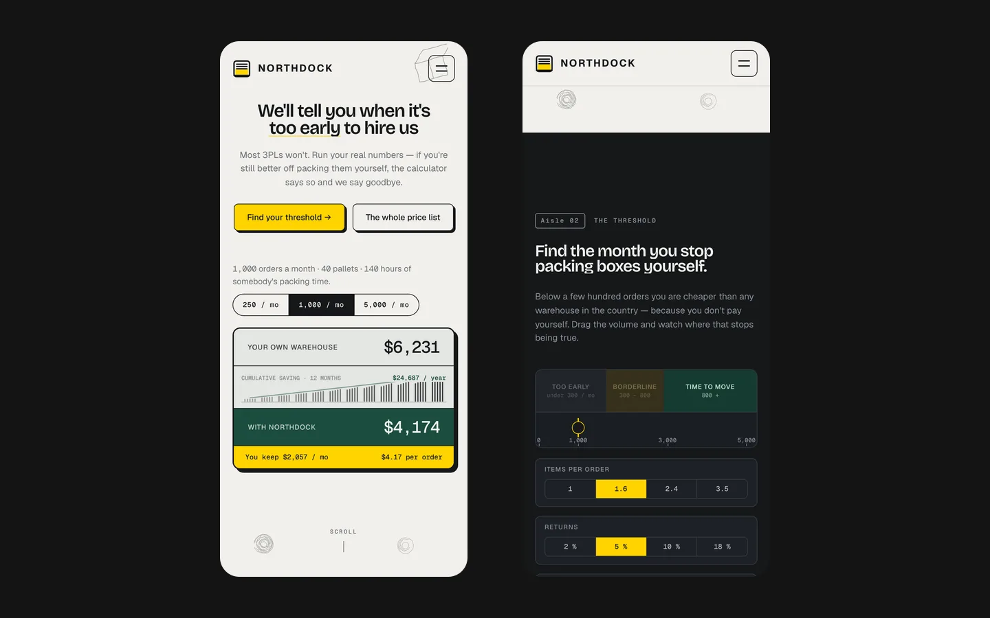
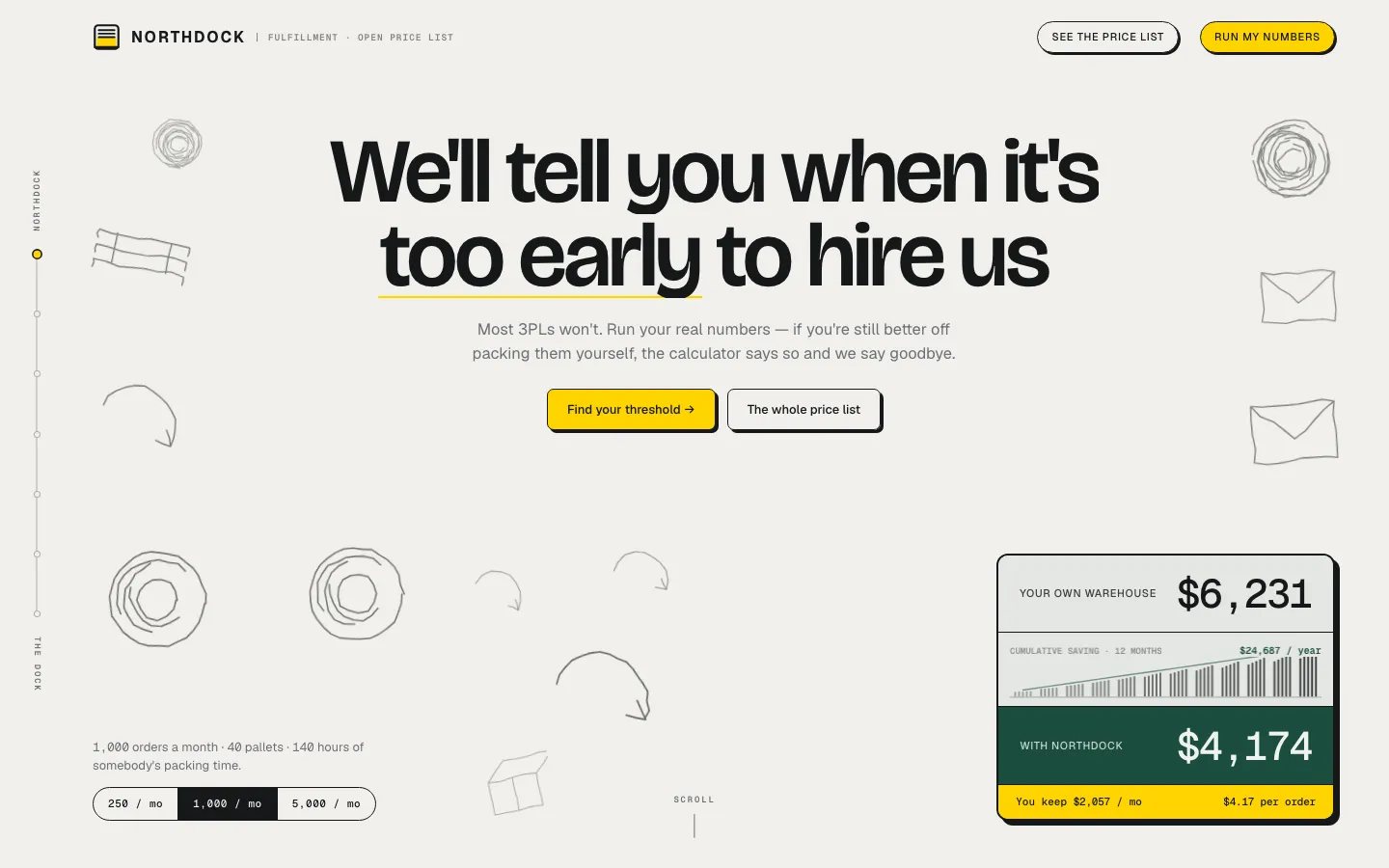
The saved homepage pairs large black typography on an off-white background with yellow controls and a dark green calculation panel. Simple line drawings of parcels, tape and arrows connect the composition to packing and dispatch. Instead of leading with a photograph of an anonymous warehouse, the screen gives a seller something to examine: a monthly order volume and the costs associated with the selected scenario.

This choice gives the first screen a clear purpose. Someone considering outsourced fulfilment needs to understand what would change in their own operation. A visual comparison can introduce that conversation earlier than a general promise about reliable logistics. The concept does not establish that outsourcing is cheaper in every situation. Its central interaction deliberately allows the answer to depend on the chosen volume and the assumptions in the model.

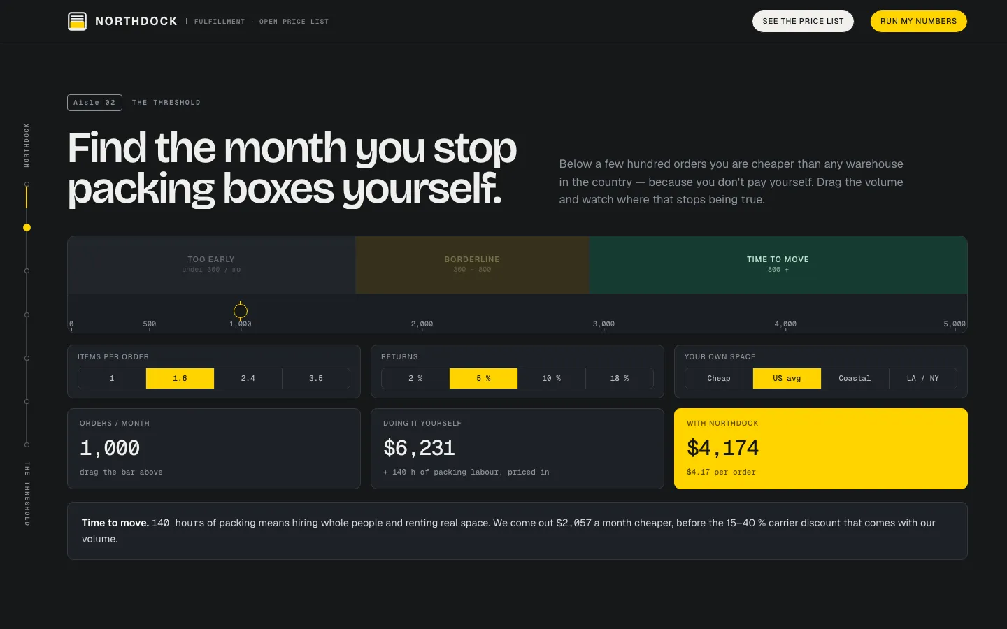
The saved controls include several order-volume presets and a slider. The result panel presents two labelled totals and their difference. Labels are essential here: a coloured savings figure would be easy to notice but difficult to interpret without knowing what is being compared. The interface places the scenario and the result within the same opening composition, so the reader can connect an input to its consequence.

One value connects several parts of the page

The project record describes monthly order volume as shared state for the opening, the threshold slider and the comparison cards. Changing it should produce one coherent scenario throughout the page. This is more than an animated counter. If one section showed a new volume while another retained the previous result, the visitor would be comparing different situations without being told.

For a comparable calculator, we would define which values are inputs, which are fixed assumptions and which are outputs before arranging the interface. Order volume alone cannot describe every fulfilment operation. Storage, item characteristics, packaging and service scope may affect a real quotation. Those details would need the operator's approved model; the fictional Northdock rates cannot be copied into a real sales calculator as if they were market evidence.

A useful result also explains its boundaries. The concept uses stages such as too early, borderline and time to move. These are messages within the demonstration model, not universal thresholds for every seller. For a commissioned version, the wording and calculation would need to agree: a conditional estimate should remain conditional even when the visual design makes the recommendation prominent.
Three decisions behind the calculator

Expose the scenario
Keep the chosen volume visible near the outcome. A reader should be able to explain what they changed and why the result moved. This makes the interaction useful as a comparison rather than a decorative number animation. A new project would also identify which assumptions remain fixed while the slider changes.
Show the price structure
The concept publishes its rate card on the page instead of making every price detail depend on a contact request. That does not mean all real logistics prices can be standardised. It demonstrates how a business with an approved, publishable model could explain the calculation and reserve genuinely variable questions for a conversation.
Allow an unsuitable result
A calculator becomes less informative if every input produces the same invitation to buy. Northdock explores an outcome where the model can say the proposed service is not yet the better fit. This is a design hypothesis about clearer qualification, not a claim that the concept generated more profitable leads.

The rate card gives the result somewhere to point

The recorded page includes the complete rate card used by the concept. This supports the calculator because a visitor can inspect the components behind its conclusion. A total without an explanation can feel arbitrary. A separate table without a connection to the chosen scenario can be equally difficult to use. The design problem is to keep the relationship between them understandable.

For an actual fulfilment company, we would ask which charges are recurring, which occur at setup and which depend on use. The operator would approve the amounts, units and applicability. The website should not silently mix a monthly figure with a one-time fee. Where a charge needs further assessment, its status should be explicit rather than hidden behind an attractive estimate.

This is also why we do not repeat the old claim that almost no warehouse publishes prices. The value of Northdock does not depend on proving that an entire industry behaves badly. The case demonstrates a specific interface approach: make a model inspectable, show how an input affects it and let the visitor decide whether a detailed discussion would be worthwhile.

Seven numbered sections keep the explanation navigable

Northdock is recorded as a single page divided into seven numbered sections with a rail on the left. The rail gives a long explanation an identifiable structure. A visitor can move between the proposition, calculation and supporting information without needing a separate page for every question. The section system is part of the visual identity as well as a navigation device.

Line illustrations keep the page visually connected to the work without suggesting that HeadPills photographed a real Northdock warehouse. Their restrained detail also leaves room for the numbers. The yellow accents mark actions, while the green result area separates the calculation from the surrounding explanation. These choices create contrast between reading, changing a scenario and deciding what to do next.

On smaller screens, a comparable implementation needs controls that remain understandable without a desktop rail. The order volume, units and result labels must still appear in a sensible reading order. A narrow layout should not reduce the price explanation to a clipped table or move the important assumptions away from the estimate. These are acceptance considerations for a future project, not measured conversion results from this concept.

A request should continue the calculation

The concept's contact route asks for real operating numbers. This follows the purpose of the page: move from an illustrative scenario to a discussion about an actual business. A generic message saying only that someone is interested would discard much of the context established by the calculator. For a commissioned version, the team would decide which scenario details should accompany the request and what the visitor needs to confirm.

The receiving team also needs a clear distinction between an estimate and an offer. A calculator result does not reserve capacity or establish a service agreement. A useful handoff helps the operator check the assumptions and prepare a relevant response. We have no client sales data for Northdock and do not present this studio experiment as evidence of increased warehouse revenue.

From a concept to a commissioned calculator

  1. Approve the model

    Start with the business rules and units, including what the estimate covers and what needs individual assessment. Use examples supplied by the operator to compare expected outcomes. The website team should not invent commercially binding rates simply to make the demo feel complete.

  2. Connect the interface

    Give the volume controls, result cards and explanation a consistent scenario. Define a readable initial state and the behaviour at the ends of the supported range. The visitor should understand a changed result without having to infer the formula from motion or colour alone.

  3. Prepare the enquiry

    Agree what information reaches the team after the visitor has explored a scenario. Explain the next step and the status of the estimate. The completed project should be reviewed for calculation correctness, readable presentation and an operational contact route, with each of those checks kept distinct.

What Northdock contributes to the portfolio

This work demonstrates an original interface, a connected calculator, a published demonstration rate card and a structured one-page explanation. It is labelled as a studio concept and kept separate from client projects. If your service has a meaningful comparison customers struggle to understand, the useful starting point is your approved model and the questions behind it—not the fictional prices shown here.

What the site does

Project features

  • Compare scenarios

    An estimate tied to stated assumptions.

  • Change the volume

    Connected controls and results.

  • Inspect the model

    The demonstration rate card is visible.

  • Continue the discussion

    An enquiry asks for actual operating figures.

Questions

About NORTHDOCK

Is Northdock a real warehouse?

No. It is a studio concept without a warehouse client and is kept separate from client work.

What does the Northdock calculator do?

It compares scenarios at a selected monthly order volume within a fictional demonstration model. It is not a real warehouse quote.

Why publish the whole rate card on a fulfilment site?

It lets a visitor inspect the demonstration calculation before making contact. The case makes no claim about pricing practices across the whole industry.

Start a similar project.

Tell us what your site has to do. A short call, then a fixed price in writing.