Case · Healthcare

NOWA Clinic: an identity built around care.

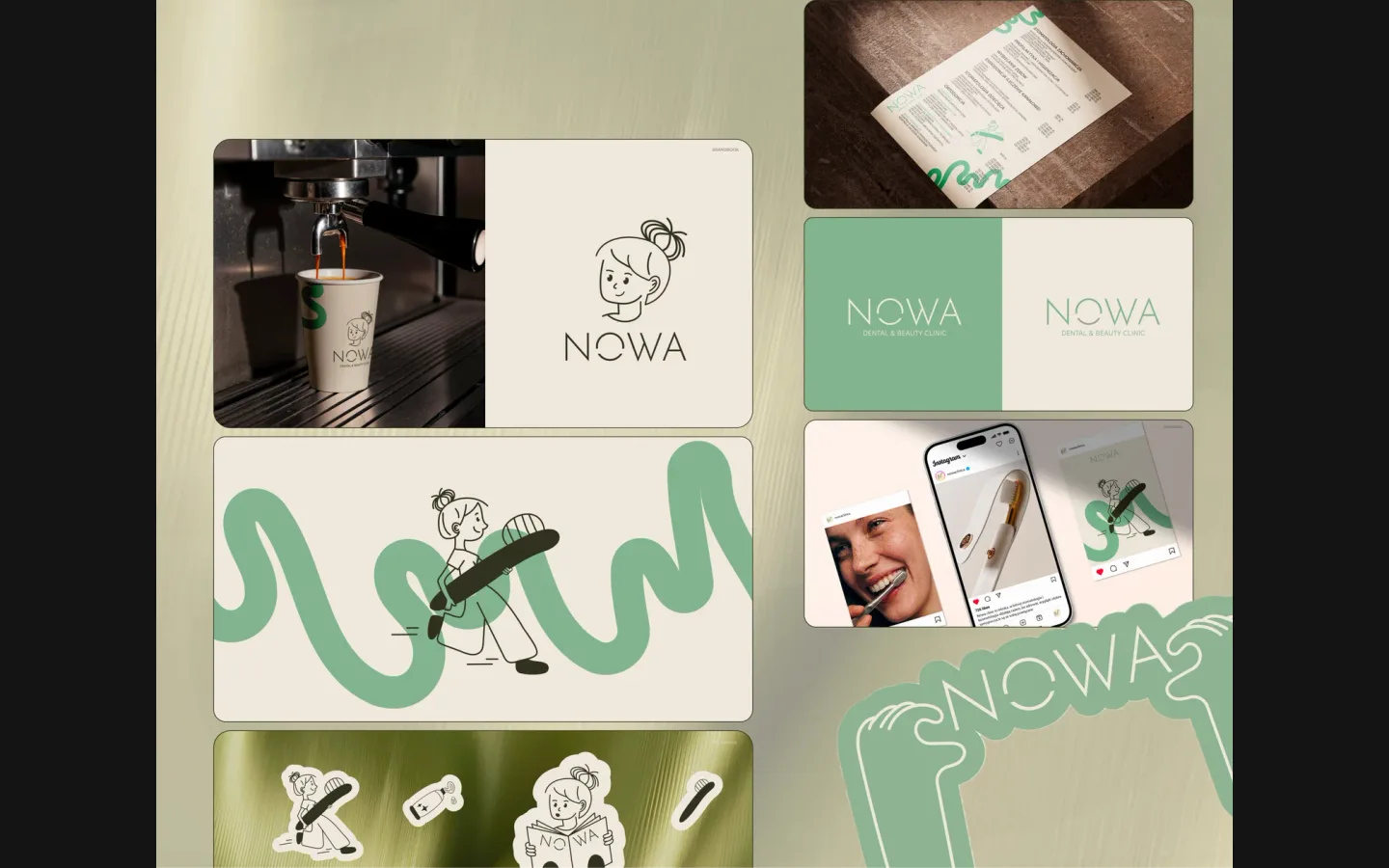
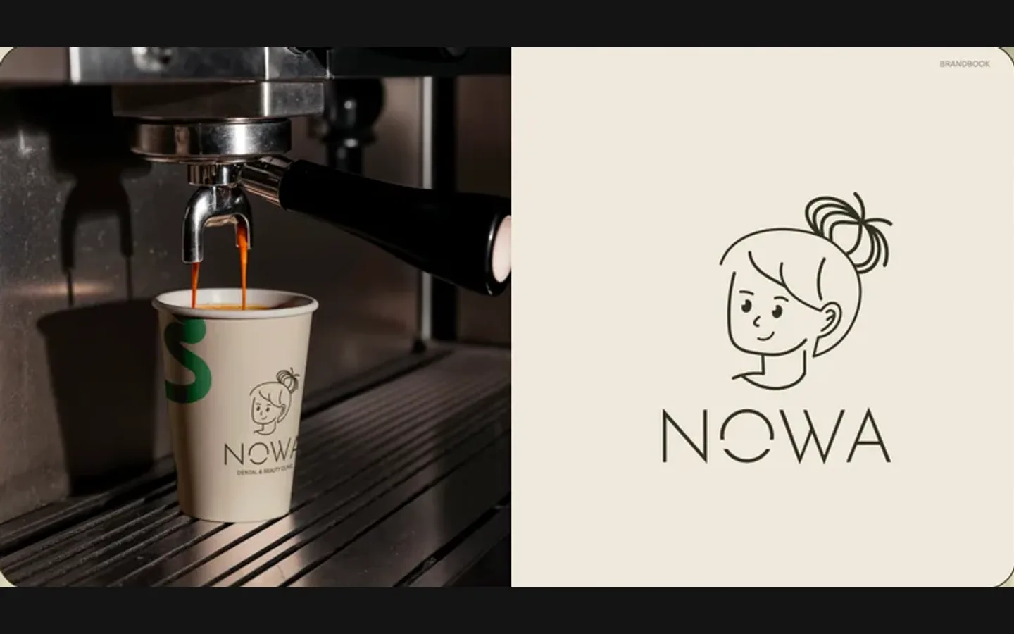
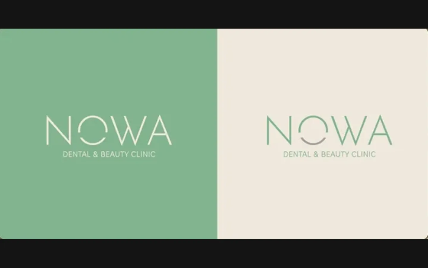
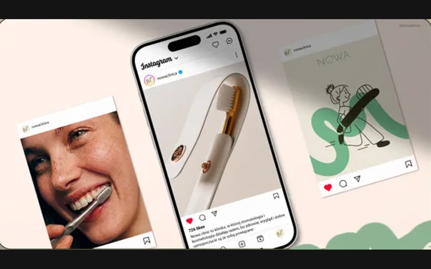
NOWA is a dental and beauty clinic. It needed an identity from the ground up: something to build the rest of its presence on. We drew a character a patient smiles at instead of fearing, set the NOWA wordmark with “Dental & Beauty Clinic” under it, and let one green wave run across every application: the coffee cup, the price list, the social feed, the stickers. Branding only; the site is not ours.

  • Healthcare
  • Dental and beauty clinic
  • Brand identity
  • Brandbook
  • Poland
NOWA · brandbookDesign preview: NOWA Clinic
A character, not a tooth

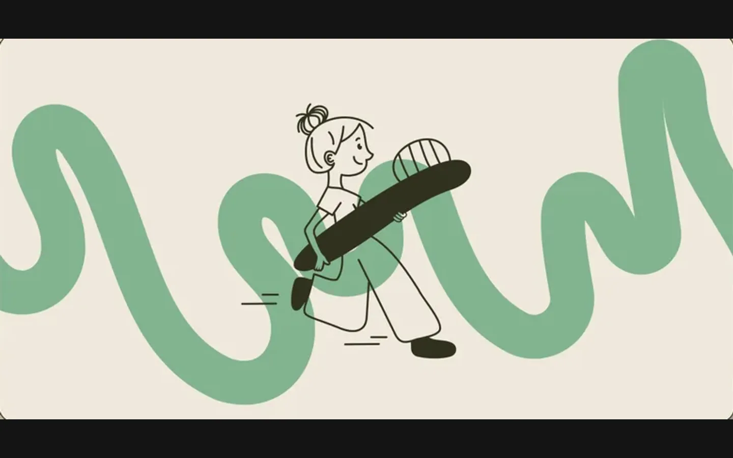
A line-drawn figure with a toothbrush and a ponytail carries the brand where a clinic would usually put a tooth icon. from the identity board

Two colours and a wave

Sage green and warm beige, with one wave that runs across the cup, the price list, the feed and the sign. from the identity board

Brandbook, not a logo file

Name treatment, logo, type and colour system, and the rules for signage, print and social. project record

The project

Task, approach and delivery

The task

A dental and beauty clinic needed an identity from the ground up. Most clinic brands lead with a tooth and a shade of blue, and a patient reads that as a waiting room.

The identity had to feel like care rather than treatment, and behave the same on a cup, a price list, a sign and a social feed, because the clinic would handle all of them itself.

The approach

We drew a character instead of a tooth: a figure with a ponytail and a toothbrush a patient can smile at. The NOWA wordmark sits under it with “Dental & Beauty Clinic” spelled out, in sage green and warm beige.

One wave runs across every application and holds the system together; the rules for signage, print and social went into the brandbook so the clinic can produce new pieces without us.

What we delivered

A brand identity for NOWA Clinic: name treatment, logo, type and colour system, and a brandbook with the rules for signage, print and social. Files and rights in the client’s name. The clinic’s website was not built by HeadPills.

The design in use

From the delivered project

  • Reads as care

    A character and warm colours where a clinic usually puts a tooth and a blue.

  • Holds on every application

    Cup, price list, sign, feed, stickers: one wave, one system.

  • Produced without us

    The brandbook gives the clinic the rules to make new pieces on its own.

  • Room for a site

    The system is ready to become a website; that step was not part of this project.

Questions

About NOWA Clinic

Did HeadPills build the NOWA Clinic website?

No. This project was the brand identity: mark, wordmark, colours, type and a brandbook with rules for signage, print and social. The clinic’s website was not built by HeadPills.

Why does the NOWA Clinic identity use a character instead of a tooth?

Because a tooth and a blue read as a waiting room. A line-drawn character a patient can smile at, in sage green and warm beige, reads as care, which is what a dental and beauty clinic sells.

What is in the NOWA Clinic brandbook?

The name treatment, the logo, the type and colour system, and the rules for how the identity behaves on signage, print and social, so the clinic can produce new pieces without an agency.

Start a similar project.

Tell us what your brand needs. A short conversation, then a fixed written quote.