Case · Wellness

Spartisan Global: a website for partnership enquiries.

An English presentation connecting the Spartisan format, its components and a partnership conversation through the visual language of the consumer brand.

  • Wellness
  • Franchise and investment
  • Custom design
  • English
  • Budapest, Hungary
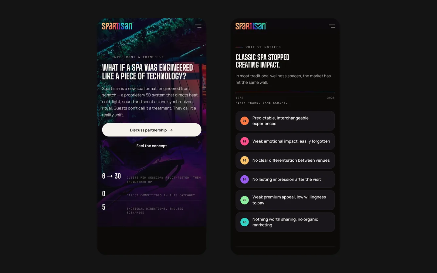
globalspartisan.comSpartisan Global website preview
English presentation

A dedicated business audience. project records and saved screens

Shared identity

Photography and a mark connect the two Spartisan websites. project records and saved screens

Recorded publication

August 2026. project records and saved screens

The project

Task, approach and delivery

The task

Explain the partnership presentation to a business reader while retaining the identity shared with the consumer site.

The approach

We organised the concept, sound, rituals, venue, supporting material and partnership route into a distinct presentation.

What we delivered

A franchise and investor site in English with concept, sound, rituals, venue, proof and partnership sections and a partnership request, published in August 2026 next to the consumer site. Domain and hosting in the client’s name.

A partnership presentation for the same brand, with a different reader in mind

Spartisan Global is the English partnership and franchise presentation developed alongside the consumer Spartisan website. Project records place publication in August 2026 and describe sections for the concept, sound, rituals, venue, supporting material and partnership. The design task was to retain the brand's atmosphere while organising information for someone considering a business conversation rather than booking a visit.

The opening identifies a partnership context

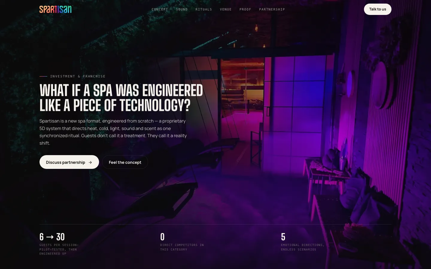
The saved first screen uses a dark interior photograph with a strong violet area and a compact Spartisan mark. The headline is narrower and more condensed than the large consumer-site typography. A small investment-and-franchise label establishes the subject, while a light partnership button stands beside a secondary route into the concept. The same brand can therefore address a different intention without inventing an unrelated identity.

The distinction matters at the first action. A prospective guest is choosing an experience; a potential partner wants to understand the format and what a conversation might cover. Sending both to the same generic contact prompt would hide those differences. Here the saved composition explicitly presents partnership as a route, with the conceptual explanation available for someone who is still learning what the offer means.

The interior image supplies continuity with the consumer brand, but the structure is not simply a copy of the programme page. A business reader needs the elements of the format to be named and explained. The atmosphere introduces the subject; the following information must carry the practical meaning. A striking dark page alone cannot establish that the underlying opportunity has been evaluated or that a partnership is suitable for a particular reader.

A section sequence follows the questions behind the enquiry

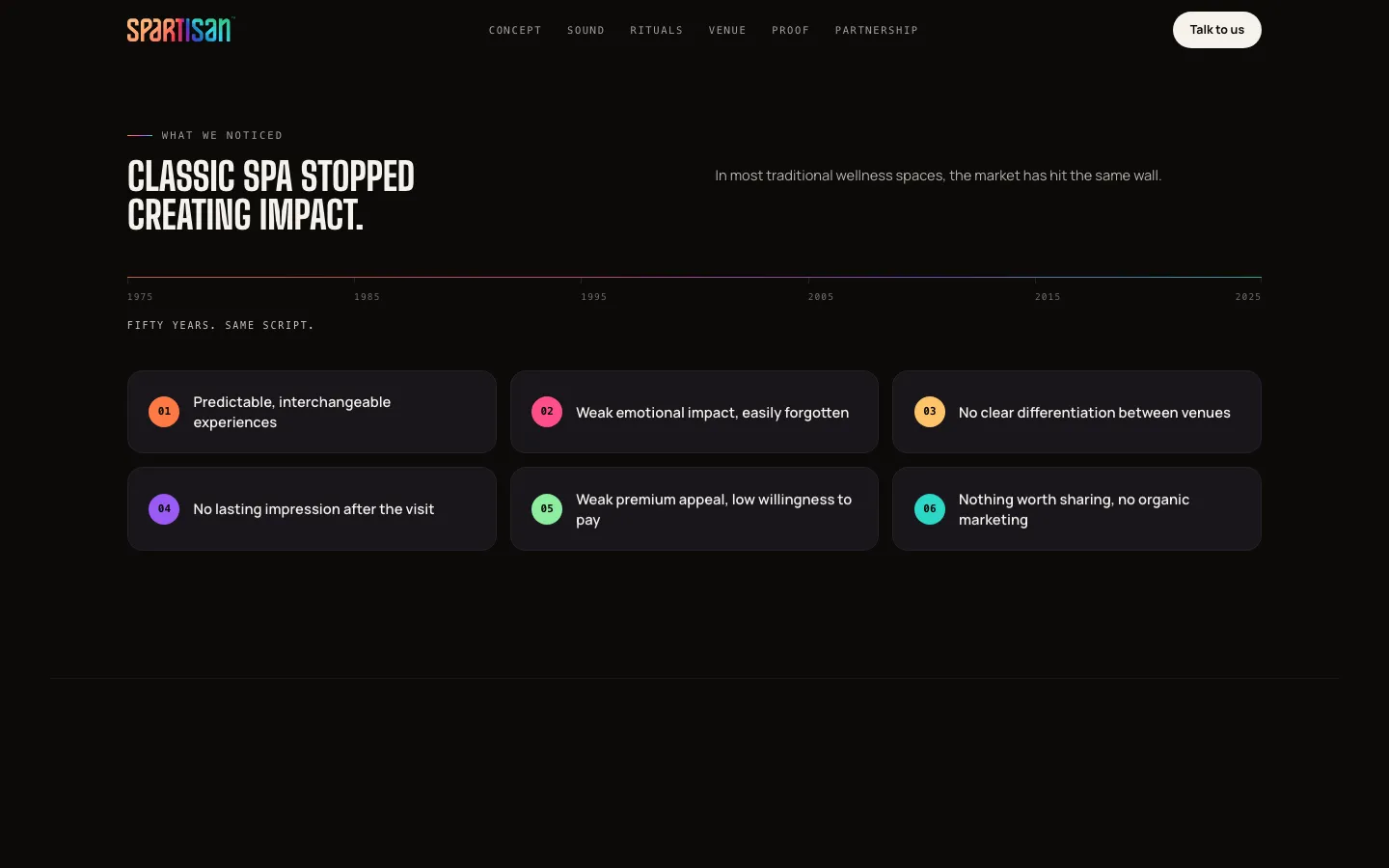
The recorded navigation includes concept, sound, rituals, venue, proof and partnership. These labels divide a broad proposition into parts a reader can investigate. The concept introduces the format; the following sections explain its components and setting; the partnership route gives the reader somewhere to take the next question. The sequence is useful because it keeps different kinds of explanation from becoming one long undifferentiated pitch.

For a comparable partnership website, the material should make clear what is being presented at each stage. A description of the experience is different from a list of supplied components or a requirement for a future venue. The web team needs approved source material for those distinctions. If the client has not defined what a package includes, a polished layout cannot supply that missing commercial decision.

A section called proof also needs specific content rather than an impressive label. It may contain approved material about an operating location or the format, but the page should explain what that material actually demonstrates. A photograph proves that the depicted space was photographed; it does not independently establish financial performance. The case describes a way of organising the client's presentation, not a due-diligence opinion about its business offer.
Keep three kinds of information distinguishable

The experience and brand
Images and descriptions introduce the format a partner is being asked to consider. They should remain consistent with the consumer presentation while answering the business reader's questions. The design can show how the brand is expressed without claiming ownership of the physical venue, its technology or the programmes delivered there.
The proposed partnership scope
The client must define the supplied elements, responsibilities and matters that require discussion. A website can organise these clearly and make the next conversation more focused. For a new brief, we would separate confirmed package information from options still being negotiated instead of presenting every possibility as an included deliverable.
Figures and their meaning
A number needs a label, a context and an explanation of whether it is an observation, an assumption or a target. The visual treatment should not make those categories appear interchangeable. A large figure on a first screen is a communication decision, not independent evidence that an economic or market claim is correct.

Readable figures require careful wording

The saved first screen includes numerical statements beneath the introduction. This case does not adopt claims about competitors, capacity or investment returns as verified agency results. Their presence shows the information hierarchy of the design. For a comparable presentation, we would ask the client to identify the source, date and conditions behind important figures before deciding how prominently they should appear.

The original brief includes questions about opening a venue, the proposed package and financial expectations. Those questions belong to the client's commercial materials. A design team should not invent a payback period or make an assumed return look like a historical result merely because a table needs filling. If the material is incomplete, the correct design response is to identify what needs clarification and make the remaining information understandable.

A consistent numerical layout can improve comparison. Labels should remain close to the value they describe, and any essential qualification should stay readable on a phone. Hiding the condition in an unrelated section can change the meaning of an otherwise accurate figure. These are practical editorial and layout requirements for a new project; they do not amount to an audit of the figures visible in this archived delivery.

Shared photography, separate information architecture

The project records say that the partnership and consumer sites were built alongside one another and share the brand's mark and photographic mood. Reusing those elements helps the two presentations remain recognisable. The useful difference is the order and purpose of the information. The consumer site explains a visit, while Global gives a business reader a route through the format and the partnership discussion.

This is relevant to companies with both customer and partner audiences. A separate presentation is justified when the questions, evidence and next action are materially different. It should not exist merely to duplicate the same paragraphs under another domain. For a similar commission, we would compare the two journeys and decide which material can be shared and which needs its own explanation before building a second website.

The partnership action should lead to a defined conversation

The saved primary action invites discussion. That is an appropriate description of what the website can initiate without pretending to complete the partnership process. A useful enquiry route can help the client understand the person's interest and respond with relevant material. The specific information collected should match the agreed first conversation, rather than imitate a formal application process that the business does not actually use.

For a comparable site, we would agree who receives the request, what the visitor is told to expect and how the team distinguishes a partnership enquiry from a consumer booking question. That operational boundary matters when two presentations share a brand. A clear route can improve the handoff, but a sent form is not yet a qualified opportunity, an accepted proposal or a signed agreement.

Preparing a similar partner presentation

  1. Define the business reader's questions

    List the decisions the presentation should support before a conversation begins. Separate the visitor experience from package details and venue requirements. This gives the website a content plan based on the actual offer rather than an attractive sequence of headings that the client still needs to interpret after the design is finished.

  2. Approve the supporting material

    Gather the images, descriptions and figures the client is prepared to publish. Record what important numbers mean and which statements need a source or qualification. The visual team can then choose a hierarchy that preserves meaning instead of amplifying uncertain claims simply because they look strong in a large headline.

  3. Review the handoff and brand continuity

    Check that the partner presentation remains recognisable beside the consumer website while providing a distinct route to contact. Review the long explanations and numerical labels on smaller screens. The final acceptance should include the purpose of the enquiry and the receiving team's process, not only the appearance of the first screen.

The scope demonstrated here

Spartisan Global demonstrates an English business presentation with a dark photographic direction, structured explanation and a partnership request. The recorded publication date belongs to the project history. We do not claim that the site raised investment, sold franchises or verified financial projections. For a similar website, bring the approved partnership offer and the material behind its key statements so the design can make a substantive conversation easier to begin.

What the site does

Project features

  • Explain the format

    Separate sections introduce its components.

  • Retain the brand

    A shared photographic mood.

  • Organise information

    Labelled figures and readable explanations.

  • Begin a conversation

    A visible partnership action.

Questions

About Spartisan Global

How is Spartisan Global different from the Spartisan site?

It addresses partnership questions through a separate structure while sharing the consumer brand’s mark and photographic mood.

When was the Spartisan Global site published?

Project records state August 2026.

What is the first action on Spartisan Global?

Discuss partnership: an invitation to a business conversation, rather than a consumer booking.

Start a similar project.

Tell us what your site has to do. A short call, then a fixed price in writing.