Case · E-commerce

The Beast Beauty: a perfume store on WooCommerce.

A niche perfume and cosmetics store on WordPress and WooCommerce, with Ukrainian and Russian versions, a mobile shopping flow and marketing blocks the team can edit.

  • E-commerce
  • Beauty
  • WordPress
  • WooCommerce
  • UK · RU
  • AI visuals
thebeastbeauty.comThe Beast Beauty website preview
2 languages

Ukrainian and Russian, with language tags for search engines. checked on the live site · Sep 2026

WordPress with WooCommerce

Catalogue, product cards, cart and checkout on the client’s own hosting. checked on the live site · Sep 2026

Editable from day one

Promotions, collections and recommendation blocks changed by the team, not by a developer.

The project

Task, approach and delivery

The task

The store needed to combine an expressive product presentation with a clear path from browsing to ordering on a phone. The team also needed control over promotions, collections and recommendation blocks.

The approach

We designed the catalogue, product pages, basket and checkout with mobile use in mind. Page structure, titles and loading performance were considered within the implementation.

Promotions, collections and recommendation blocks were made editable. The project records also document labelled AI mood visuals as part of the creative work.

What we delivered

A WordPress and WooCommerce store in Ukrainian and Russian, with editable marketing content. The store, domain and hosting are held by the client.

Making an expressive perfume storefront usable for shopping

A perfume store asks the interface to do two different jobs. It needs enough visual character to support discovery, and enough precision for a customer to understand the exact product they are buying. The Beast Beauty brings those tasks together in a WordPress and WooCommerce store with a mobile shopping flow and content the team can update for campaigns.

The product creates the visual atmosphere

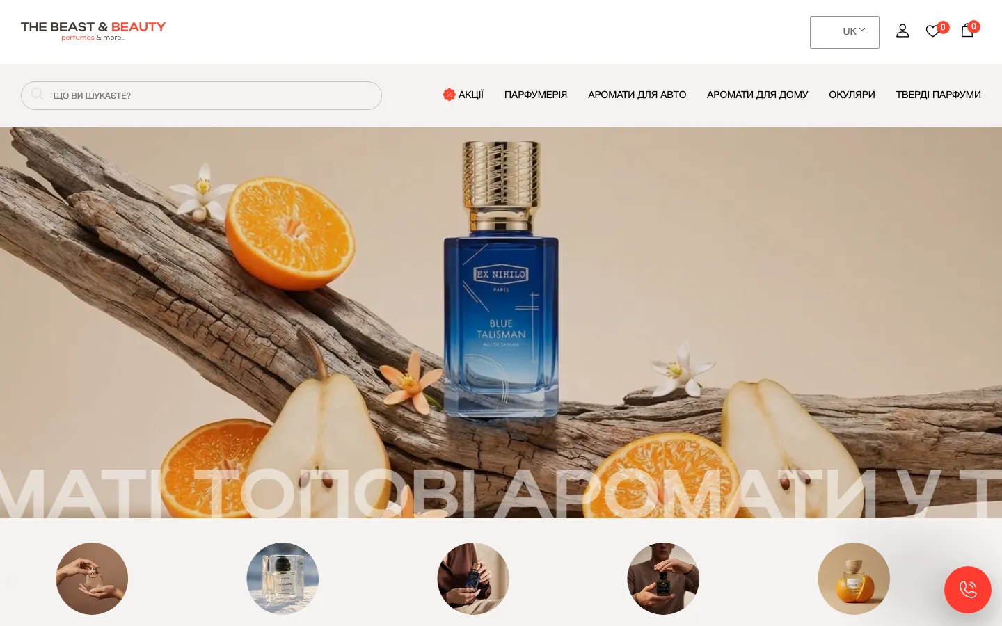
The saved homepage places a bottle in a large composition with wood, fruit and flowers. The image communicates a mood before the visitor reaches a product grid. Above it, the navigation is restrained: a white header, search, category links and familiar account, favourites and bag symbols. A red accent picks out a few functional details. The image receives most of the visual attention while the store controls remain recognisable.

This division is important for a beauty retailer. A campaign image can be expressive, but the shopping interface should still behave predictably. A visitor who already knows the desired fragrance needs a route to the catalogue or search without first interpreting the campaign. Someone browsing for inspiration can spend time with the imagery. The design should accommodate both kinds of visit instead of assuming every customer begins with the same level of product knowledge.

Three layers of product information

The discovery image
A mood composition introduces the product world. It should not replace the factual description of what is sold. In a similar store, we would distinguish campaign imagery from product photography and agree how generated visual material is identified. A decorative ingredient in an image cannot, by itself, substantiate a claim about the perfume’s composition or the contents of the delivered package.
The catalogue card
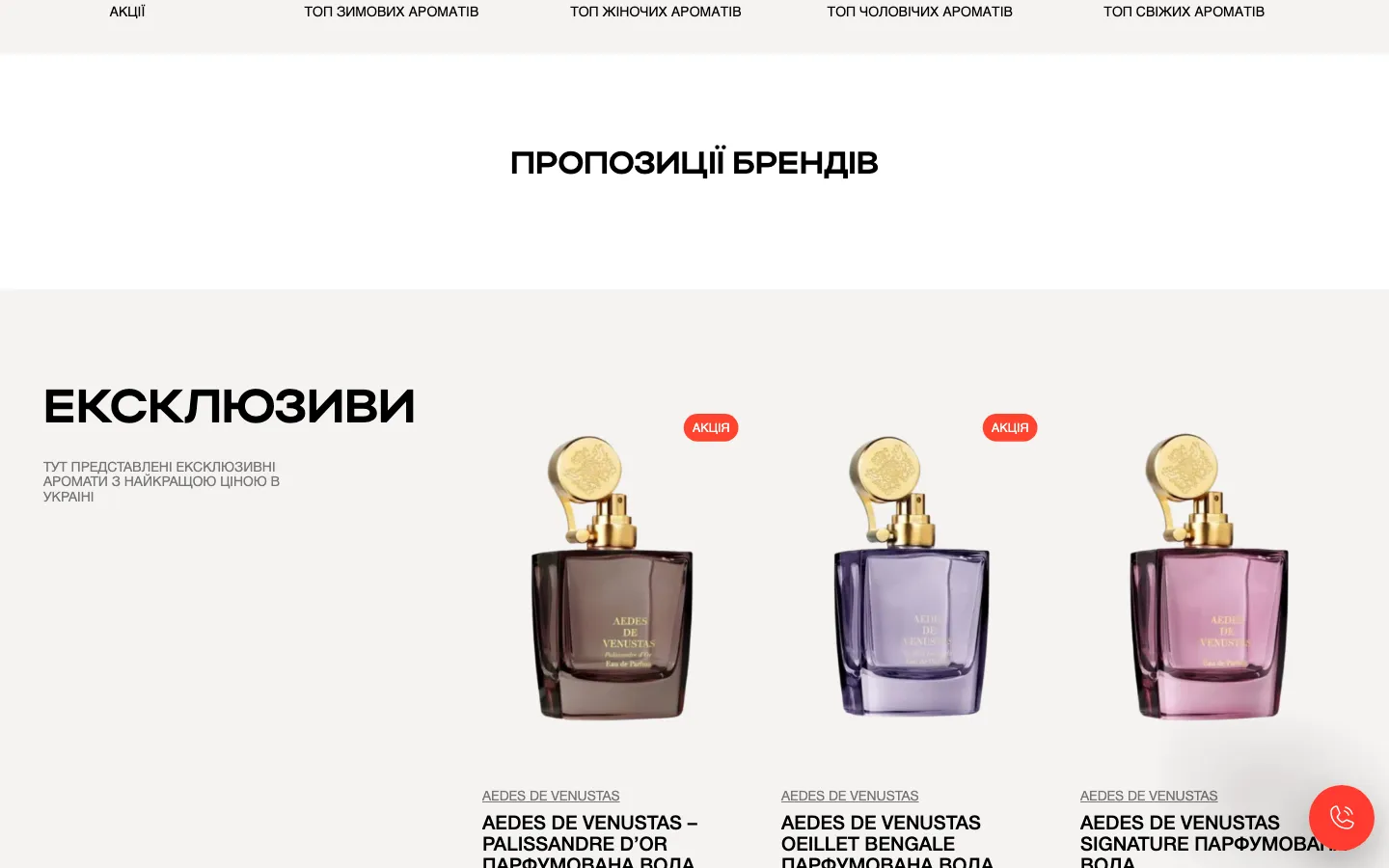
The card helps a shopper recognise a product and decide whether to open it. Names, brands and price labels need a stable order even when one perfume has a much longer name than another. A price presented as a starting amount must not be confused with the cost of every available option. The card introduces a choice; the product page supplies the detail needed to complete it.
The selected option
A customer needs to know which version is entering the basket. For a comparable WooCommerce project, we would agree the available product attributes and how they affect the displayed price and availability. The interface should make the chosen option visible before the order step. It is not enough for the underlying catalogue to contain correct data if the shopper cannot interpret that data on a phone.

Mobile shopping is a sequence, not one screenshot

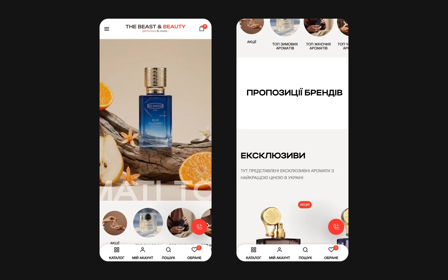
The documented scope includes catalogue pages, product cards, basket and checkout with attention to mobile use. These screens form a continuous decision. A polished catalogue does not help if a customer loses the selected option later or cannot understand the next field. When reviewing a similar store, we would follow one representative purchase through every stage, checking the consistency of the product name, option, quantity and displayed cost.

The review also needs less convenient conditions: a long product name, a missing selection or a correction to the quantity. These are ordinary shopping situations, not exotic edge cases. Their messages should appear close to the action that caused them. If a required option has not been chosen, the customer needs a clear explanation, not just a button that seems unresponsive. Such acceptance criteria can be defined without claiming that any particular payment method was included in this project.

Loading performance belongs to this experience as well, but it needs measurement. Large campaign artwork, catalogue images and third-party store features can all affect the page a customer receives. The project records identify performance as a design consideration; they do not provide a benchmark that would justify an invented speed score. For a new store, we would agree representative pages and devices for testing before treating performance as an accepted result.

A campaign that the team can maintain

  1. Select the offer

    The marketing team decides which products and collections belong to the campaign. The documented editing scope covers promotions, collections and recommendation blocks. These are editorial choices: the store should allow the team to change them without confusing a manually selected recommendation with a personalised system that has not been implemented.

  2. Connect image and destination

    A banner should lead to the offer it describes. For a similar campaign workflow, we would preview the artwork, wording and destination together. Replacing an image while leaving an old link can create a convincing promotion that opens the wrong collection. The useful editing unit is therefore the complete message and its route, not the picture in isolation.

  3. Review the shopping context

    Before a comparable campaign goes live, the team should inspect the promoted products in both languages and on a phone. The selected offer, product details and price presentation need to agree. When the campaign ends, its entry points also need attention. Editable blocks make this work possible; an agreed owner and review routine make it dependable.

Two languages, one understandable assortment

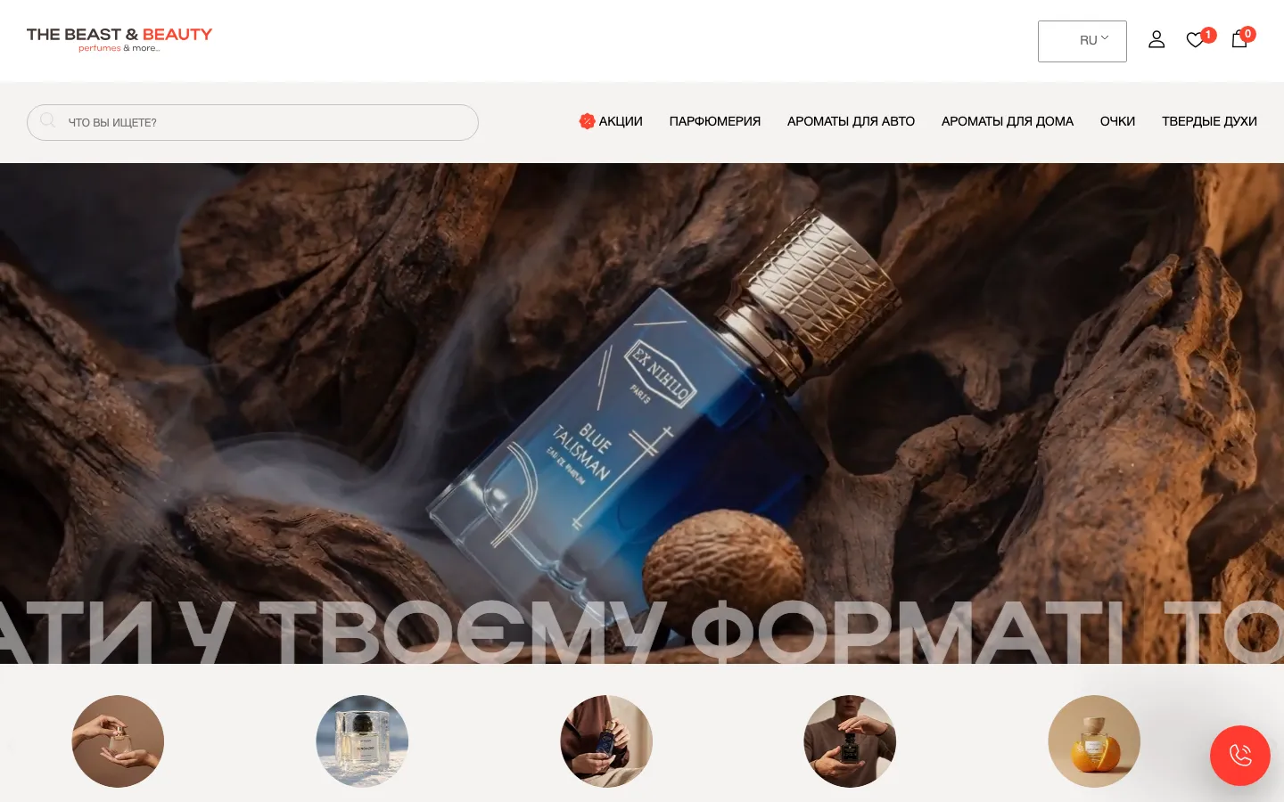
Ukrainian and Russian versions are part of the recorded scope. In a store, localisation reaches beyond introductory text: category labels, product options, basket wording and messages all influence the purchase. Brand names may remain unchanged while the surrounding explanation needs a natural translation. A customer should not wonder whether switching languages has taken them to a different product or a different version of the offer.

A similar implementation should decide which product values are shared and which descriptions are translated. This matters when the team updates a large assortment: stock or option data should not become separate editorial guesses in each language. Search structure and page titles also deserve care, but language tags alone do not establish rankings. The purpose is a coherent catalogue for shoppers and a clear representation of its pages, with search outcomes assessed using actual data later.

What a comparable store brief should contain

Before estimating a similar project, we would ask for a representative product export, the types of options sold, approved imagery and the way campaigns are prepared. It helps to include an ordinary product, a product with several choices and one with a long description. The brief should also identify who maintains prices and who approves imagery. These responsibilities influence the editing model as directly as the desired appearance does.

The Beast Beauty demonstrates a custom retail presentation on WordPress and WooCommerce, with two language versions and editable marketing blocks. AI mood visuals are recorded as part of the creative work, not as evidence that every product image is synthetic. The case does not provide verified order growth or a conversion comparison. Its useful lesson for a store owner is how to keep an expressive visual identity connected to clear product choices, a consistent mobile flow and a manageable publishing routine.

What the site does

Project features

  • Catalogue built for a phone

    Product cards, cart and checkout tuned for the screen where perfume is bought.

  • Two languages

    Ukrainian and Russian versions switched from the header.

  • Promotions without a developer

    Banners, collections and recommendations edited by the team.

  • Search basics built in

    Titles, structure and speed done as part of the build.

  • AI mood visuals

    Made where photographs did not exist, labelled.

  • Wholesale and retail

    Retail buyers and business buyers from the same site.

“They built the site for our perfume bar and absolutely nailed our mood. Every little detail was refined, and they always replied fast. Can recommend.”
Parfum Bar · Perfume retail · translated from the original

OriginalЗробили сайт для нашого парфюм-бару, і вийшло прям у нашому настрої. По дрібницях все допрацювали, на повідомлення відповідали швидко. Можу рекомендувати.

Questions

About The Beast Beauty

What is The Beast Beauty store built on?

WordPress with WooCommerce on the client’s own hosting, as checked on the live site in September 2026.

Which languages does The Beast Beauty store have?

Ukrainian and Russian, as separate versions switched from the header, with language tags for search engines.

Can The Beast Beauty team run promotions without a developer?

Yes. Promotions, curated collections and recommendation blocks were built editable from the start, so a campaign goes live the day marketing decides.

Start a similar project.

Tell us what your site has to do. A short call, then a fixed price in writing.