Case · Real estate

Unia Deweloperów: a website for residential projects.

A property website that connects architectural photography, individual offers and contact with the developer. We worked with a structured presentation of residential projects on Webflow, with Polish and Ukrainian versions recorded in the project materials.

  • Real estate
  • Developer website
  • Webflow
  • PL · UK
  • Poland
uniadeweloperow.plUnia Deweloperów website preview
Webflow

Website implementation recorded in the project materials.

Polish and Ukrainian

Language versions documented in the project and illustrated in the gallery.

Property presentation

Large architectural images followed by structured information about homes.

The project

Task, approach and delivery

The task

The website needed to connect the developer’s identity with its residential offer. A visitor should be able to recognise a project, inspect a property and find a route to the company without piecing those elements together from unrelated pages.

The approach

The visual presentation starts with architecture, then moves into more detailed property information. Consistent labels and a clear hierarchy separate the company, the residential project and the individual home.

What we delivered

A Webflow website presenting residential projects, with Polish and Ukrainian versions in the documented scope. The gallery records the visual work; it is not evidence of sales performance.

A developer website built around the property decision

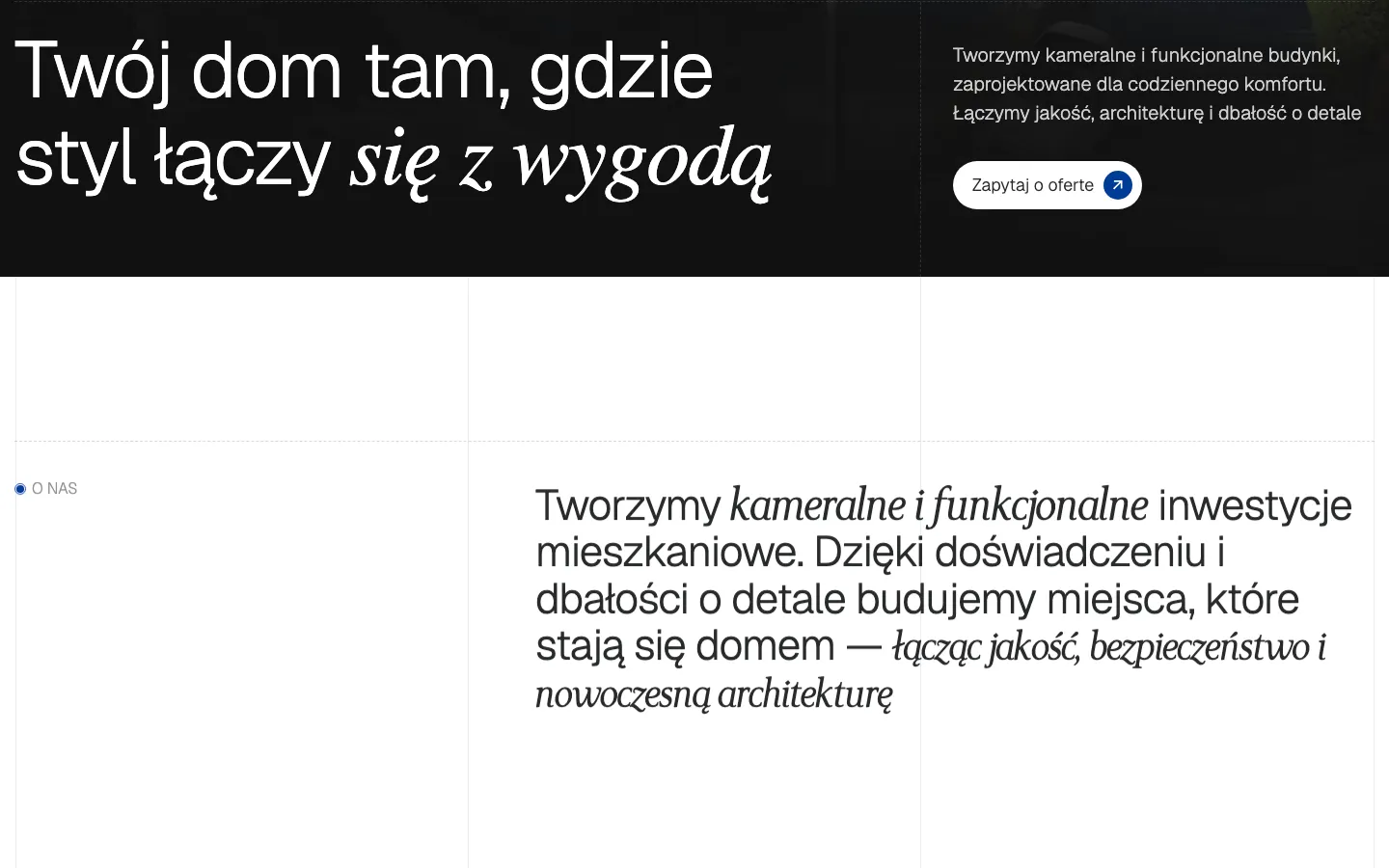
Unia Deweloperów illustrates a specific real estate website problem: connecting the impression of a finished building with the practical information needed to choose a home. The design gives photography room, then changes pace when the visitor starts comparing individual properties. These are different reading tasks, and the page should accommodate both.

The building establishes the context

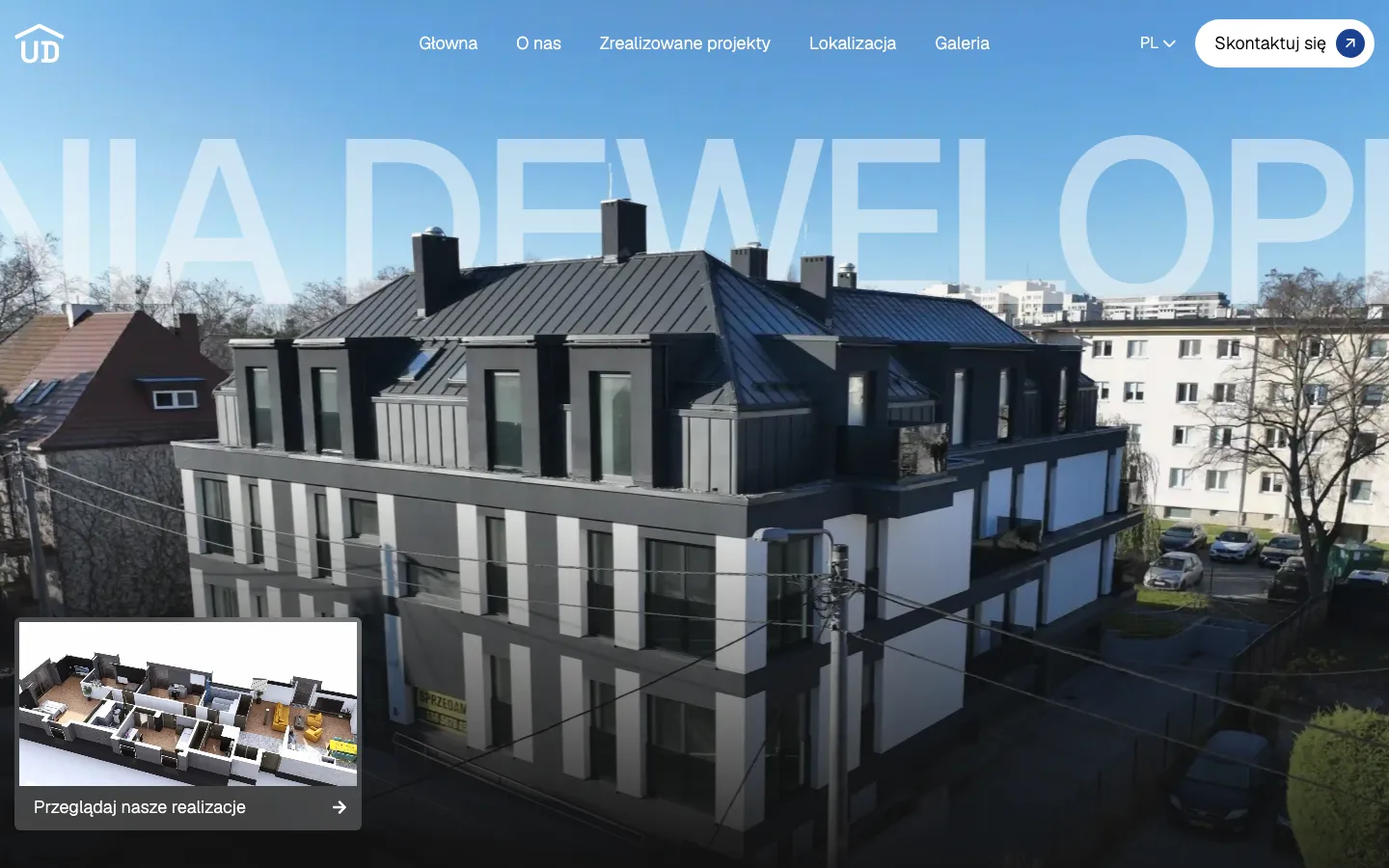
The saved opening screen uses a large architectural photograph rather than a collage of small property tiles. The building occupies most of the viewport; the name sits across the sky in oversized, translucent lettering. This places the company in a recognisable physical setting. A visitor sees the scale and character of the architecture before encountering a dense offer. The white navigation and rounded contact button retain a separate, readable layer over that image.

A smaller card in the lower corner introduces an interior layout and a route to the projects. It has a different job from the background: the photograph invites a closer look, while the card gives that interest a direction. This is a useful distinction when reviewing a developer website. An impressive first screen still needs an obvious next step, and a useful next step does not have to occupy the entire composition. The captured design balances those roles without filling the photograph with a long sales pitch.

Three levels of property information

Company
The company level answers who is presenting the development and where a buyer can find contact details and completed work. It should remain easy to reach from a property page. A person arriving through a shared link may never have seen the homepage, so the company identity cannot depend on that opening photograph alone.
Development
A development provides shared context: the building, surroundings and location. Keeping that context together avoids repeating a complete neighbourhood description on every apartment card. It also helps distinguish a project photograph from the particulars of one available home. An attractive image of the building should not be mistaken for a photograph of a specific interior.
Individual home
An individual offer needs stable, labelled fields. Address, area and the characteristics relevant to that property should be found in a predictable place. A buyer comparing two homes should spend attention on their differences, not on decoding two different layouts. The same discipline applies when the listing contains a house rather than an apartment: the labels must say what each area actually measures.

A catalogue needs an editorial structure

The original project records identify Webflow as the implementation platform and describe editable property content. The important design question is how an editor recognises what belongs where. A photograph, a location description and a numerical property characteristic have different purposes. Treating all of them as a single freeform text field makes future editing harder and makes visual consistency depend on whoever updates the page that day.

For a comparable commission, we would first agree a sample property record with the sales team. That record should contain real content, including a long address, a property with fewer photographs and any information that is not yet available. Testing only the most complete offer conceals the cases that will create uneven cards later. Missing information also needs an agreed presentation: an empty area and a made-up value are both poor substitutes for a clear status.

The catalogue is part of an ongoing publishing process. Someone needs to own changes to availability, descriptions and photographs. The website can make those changes easier to enter, but it cannot determine whether a property is still for sale. We would therefore define editorial responsibility alongside the page structure. This is a practical requirement for a new project, rather than a claim that this portfolio case includes an automated connection to the developer’s sales system.

How the visit leads to a conversation

  1. Recognise the project

    The opening image and company identity establish what kind of place is being presented. The visitor can move towards the offer without reading the entire company history. At this stage, clear navigation is more useful than asking for a detailed enquiry before the person has seen a home that interests them.

  2. Examine an option

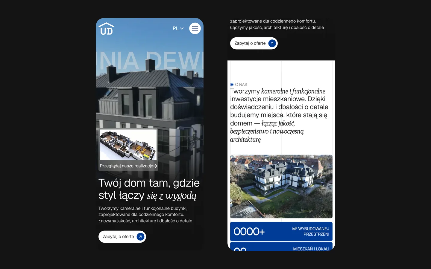
    The property information lets the visitor form a concrete question. A useful page can be shared with a partner or revisited before a call. For a new implementation, we would check that the address, imagery and labels still make sense when someone opens that page directly on a phone, without following the homepage journey.

  3. Contact the team

    The contact route should preserve the meaning of the visit. In a similar brief, we would establish whether enquiries need an explicit property reference and how the team will receive it. That is a workflow decision to agree with the client; displaying a contact form alone does not prove that an enquiry has reached a salesperson or resulted in a viewing.

Two languages and one set of property facts

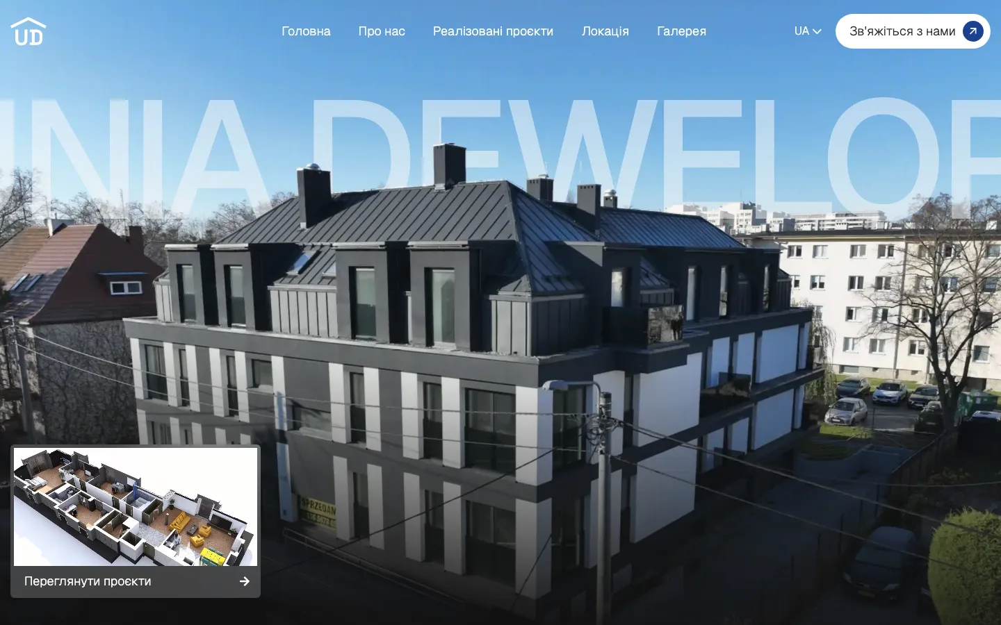
Polish and Ukrainian versions are recorded in the project materials, with a language control visible in the saved design. Localisation in this setting is more than translating an introductory paragraph. Property names, navigation labels and the route to contact should remain understandable after a switch. The buyer should not have to reconstruct which building they were looking at because the translated version uses a different naming convention.

The underlying facts also need consistent ownership. Translating the description of a home should not create a second, independently maintained version of its area. On a comparable site, we would decide which values are shared and which descriptions require language-specific editing before preparing the templates. That distinction keeps the publishing task manageable as the catalogue changes. It does not depend on promising a particular search ranking for either language.

What to bring to a similar website project

A useful starting package includes a list of developments, representative property records, approved plans and photographs, and the contact process used by the sales team. We would also ask which parts of the offer change most often. A website for a small number of homes can have a very different editing routine from a business publishing new projects throughout the year, even if their first screens look equally polished.

This case demonstrates a visual approach, property presentation and a Webflow website recorded in our project materials. It does not establish a sales uplift, an enquiry conversion rate or an automatic property reservation system. Those outcomes require separate evidence. When assessing a similar commission, the useful question is whether the proposed structure helps a buyer understand the offer and gives the team a workable way to maintain it. Photography earns attention; accurate property information and a clear contact route make that attention usable.

What the site does

Project features

  • Architecture on the first screen

    A large building photograph establishes the subject of the site.

  • Individual offers

    Property cards organise the details needed for a closer look.

  • Contact with the developer

    Visible navigation and contact routes connect browsing with an enquiry.

  • Language versions

    The presentation is documented in Polish and Ukrainian.

“We represent several developers, so the site had to present the projects in one consistent way and make it easy to reach us. HeadPills structured it well, the property pages read clearly and the site went live without delays.”
Unia Deweloperów · Real-estate developers, Poland · approved by the client

Questions

About Unia Deweloperów

What does this case cover?

The design and Webflow website for Unia Deweloperów, presenting residential projects. It is not a marketplace for unrelated developers.

Does the case report sales results?

No. We show the website and explain its design; verified sales or conversion figures are not available here.

Start a similar project.

Tell us what your site has to do. A short call, then a fixed price in writing.