The project
Task, approach and delivery
The task
An automation product sells precision. An identity with ornament would contradict the product before the first call.
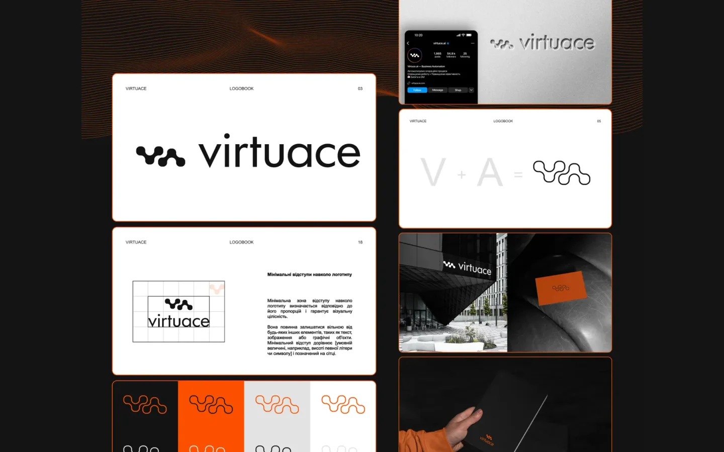
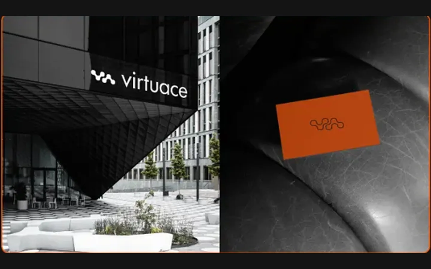
The brand had to work in a product interface, on a building sign and on a card at the same size of restraint.
The approach
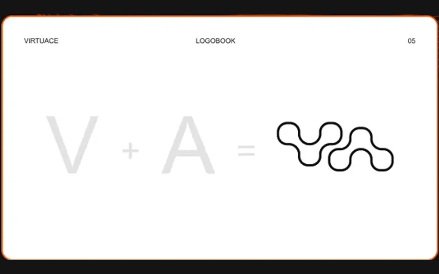
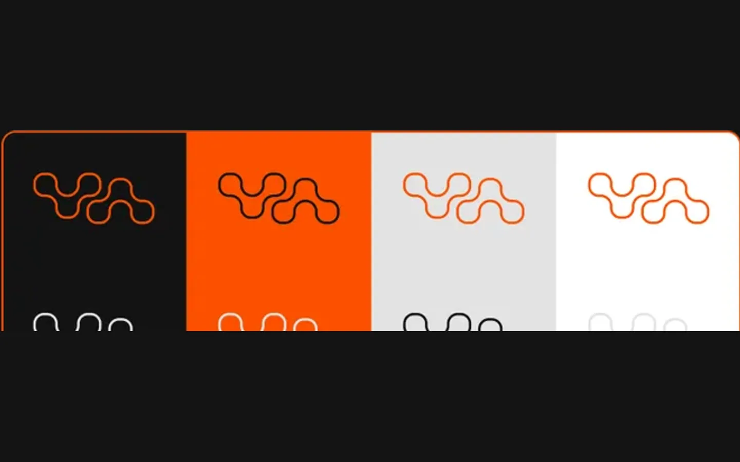
We built the mark from the initials, V and A, joined into one rounded shape that reads at favicon size and on a wall.
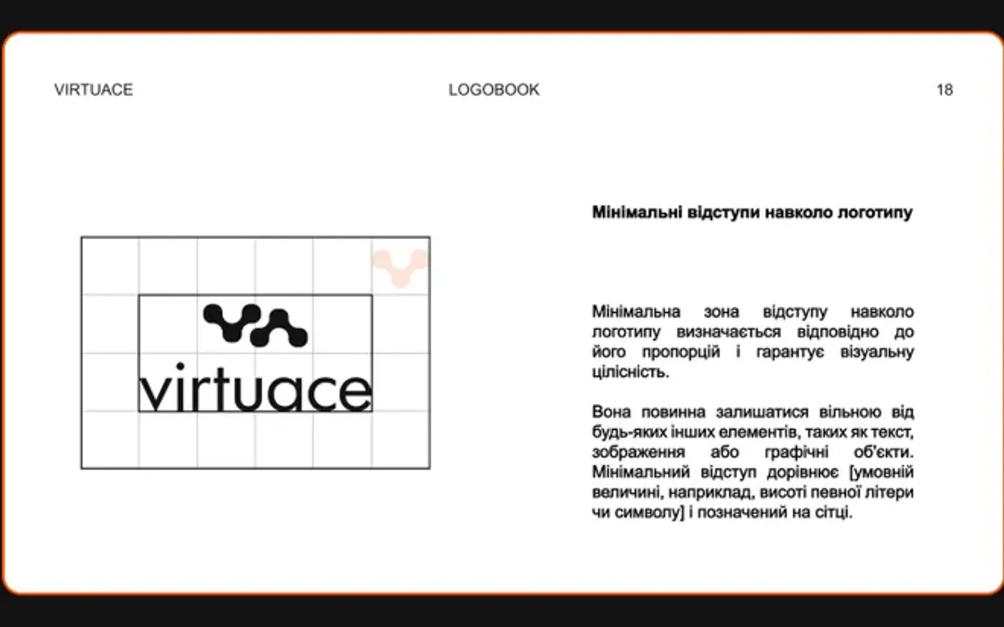
The wordmark is lowercase and plain; the palette is black, orange and grey. The rules, including clear space on a grid, went into a numbered logobook so the identity stays tight when other people use it.
What we delivered
A brand identity and logobook for Virtuace: mark, wordmark, colour versions, clear-space rules, and applications for a sign, a card, a folder and the social profile. Files and rights in the client’s name.