Case · Interiors

Matterio: a visual identity for a materials supplier.

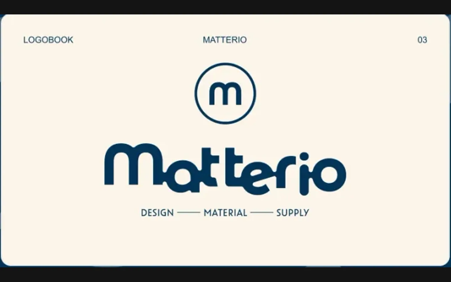
Matterio supplies materials for interior designers’ projects: design, material, supply, as the line under the wordmark says. The identity needed to reflect a dependable partner for designers and their projects. We built a rounded wordmark, a circled m, and a symbol that joins a molecule with a pipe wrench, in orange and deep blue, and wrote it down as a logobook.

  • Interiors
  • Designers’ project supply
  • Brand identity
  • Logobook
  • Ukraine
Matterio · logobookDesign preview: Matterio
A symbol with two parts

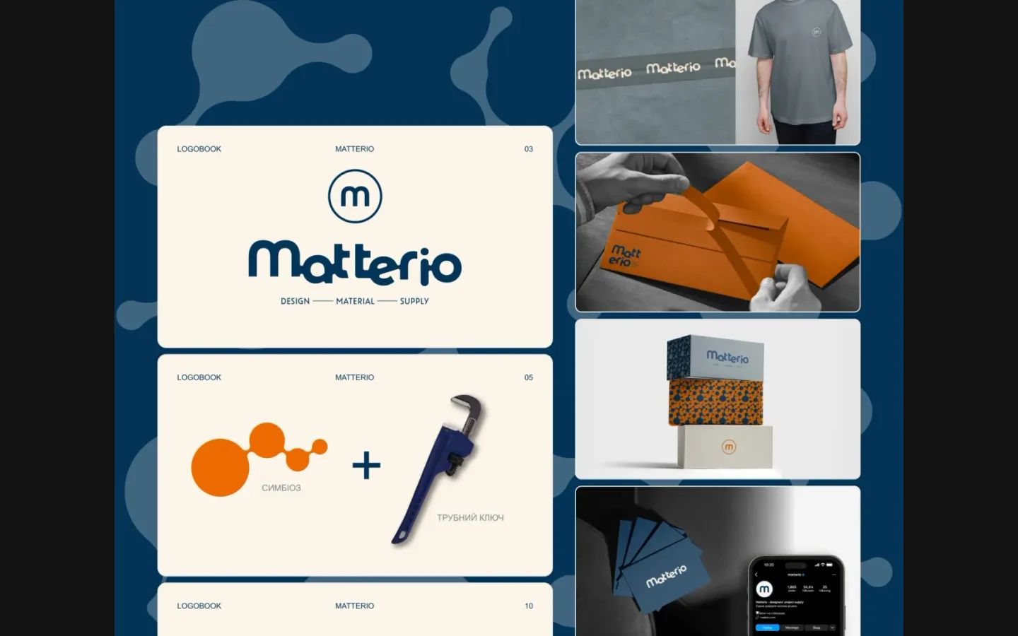
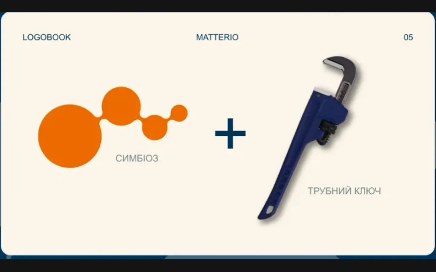
A molecule for symbiosis and a pipe wrench for the trade, joined into one mark; the board shows the sum. from the identity board

Logobook, numbered pages

The wordmark, the symbol and the rules delivered as a numbered logobook, not a single file. from the identity board

Orange and deep blue

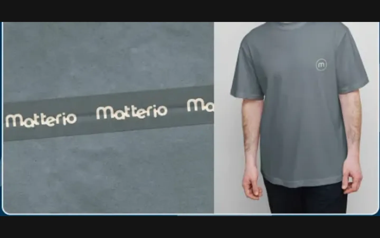
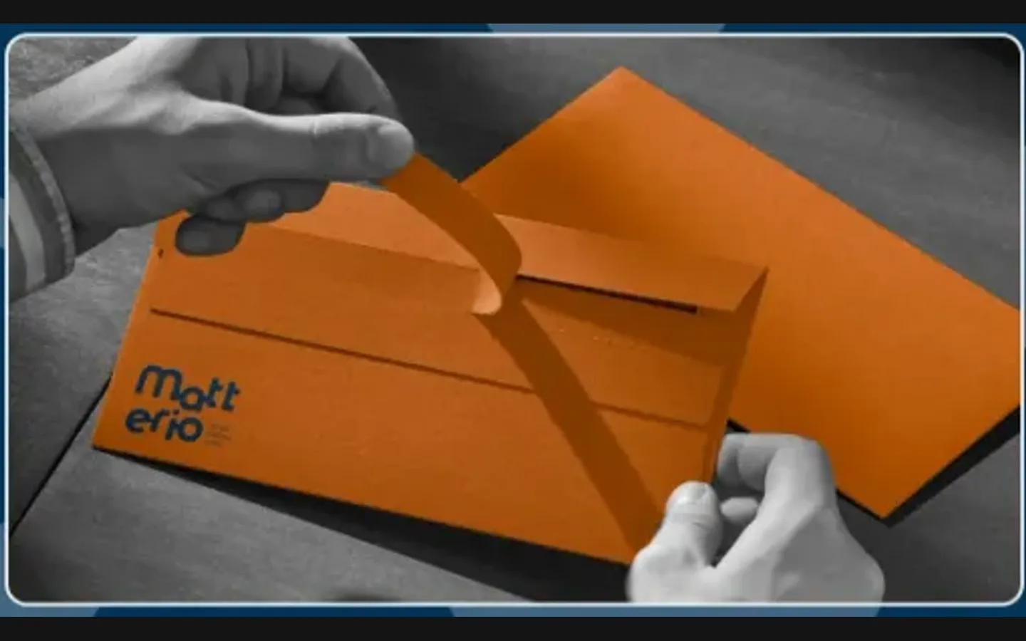
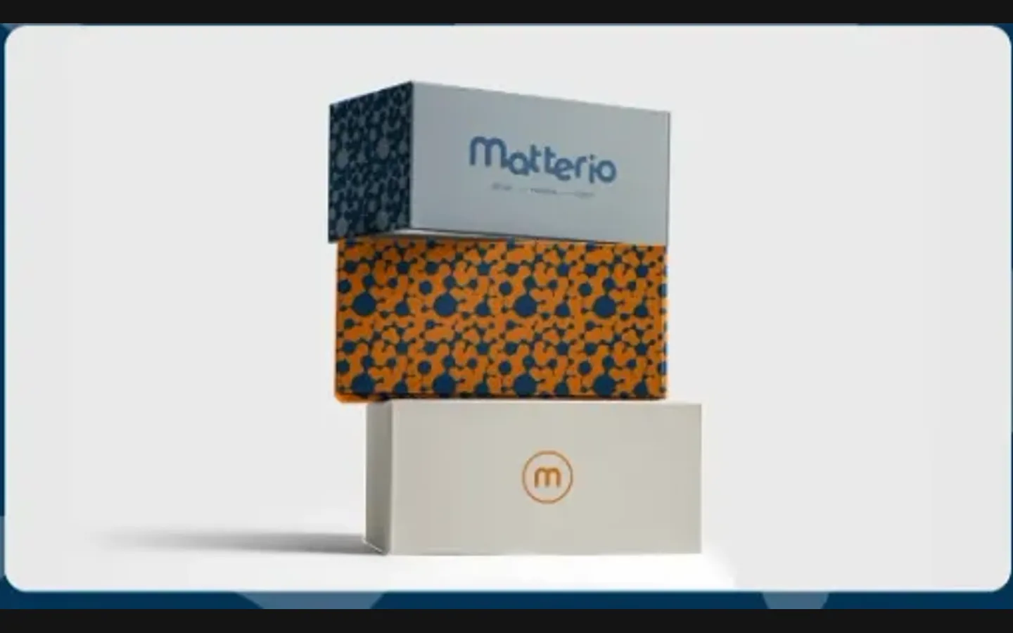
Tape, a T-shirt, an orange envelope, patterned boxes, business cards and the phone profile. from the identity board

The project

Task, approach and delivery

The task

Matterio supplies designers, and designers judge a supplier by its own design. The identity had to be coherent enough to survive being handled by a young company on tape, boxes and T-shirts.

It also had to say what the company does: materials for projects, delivered. A wrench alone would read as a hardware shop; a molecule alone would read as a lab.

The approach

We built the symbol from both: a molecule for symbiosis between designer and supplier, a pipe wrench for the trade, joined into one rounded mark that matches the wordmark.

The rules went into a numbered logobook: wordmark, symbol, pattern, colours and clear space, then the applications: tape, envelope, boxes, T-shirt, cards, the phone profile.

What we delivered

A brand identity and logobook for Matterio: circled m, wordmark, symbol, pattern, palette, rules and applications. Files and rights in the client’s name.

A supplier's identity that belongs in a designer's working world

Matterio supplies materials for design projects. Its identity connects that practical role with a visual language suited to an audience that works with design every day. We developed the wordmark, symbol, pattern, palette and usage rules in a logobook, then showed them on packaging, stationery, clothing and a social profile. The relationship between those pieces is the central subject of this case.

The name and descriptor establish the offer

The main signature pairs a rounded Matterio wordmark with the line design, material, supply. The lettering is distinctive, while the descriptor gives someone meeting the business for the first time a direct clue about its work. The circled m provides a compact companion. These elements solve different identification problems: the full name introduces the company, the line explains its field, and the smaller mark fits spaces where the whole signature would be crowded.

The wordmark's soft shapes contrast with the functional character of a supplier's work. On the presentation board, that combination is carried into packing tape and boxes rather than being reserved for a polished title page. This is important for the identity's coherence. A supplier is encountered through shipments and paperwork as well as through a presentation, so the logo needs to belong in those less controlled settings.

A molecule and a tool form the symbol's explanation

The construction page places a molecule-like shape beside a pipe wrench. The project uses the molecule to express the relationship between designer and supplier, while the tool connects the idea to the trade. The explanation links an abstract rounded form with an ordinary working object. It gives the client a way to describe the symbol without expecting a new viewer to infer the full business model from its outline.

The useful test is whether that origin supports a recognisable visual language. A long explanation cannot compensate for a mark that is difficult to use. Here, the rounded structure carries into a repeating pattern visible behind the presentation and on packaging. The symbol therefore contributes both a story and a practical graphic resource. The pattern does not need to repeat the full company name to connect a surface to the identity.

Three levels of identification

The full signature
The name with its descriptor is useful when introducing Matterio to someone who does not yet know the business. It gives verbal context that a symbol alone cannot carry. In a new application, preserving that information matters more than choosing the smallest possible logo arrangement simply because it looks cleaner.
The circled m
The compact mark appears on a T-shirt, packaging and the social profile in the presentation. It works as a small signature when space or viewing conditions favour a simpler unit. Its relationship with the full wordmark should remain clear, so different pieces still point to one company rather than behaving like separate sub-brands.
The repeating pattern
The molecule pattern expands the identity across a larger surface. It can make a box recognisable before its label is read. Its scale and density still need to suit the application: a background pattern should not make delivery information, product references or a document's main message harder to locate.

Packaging is a demanding place to test a brand

The presented boxes use different treatments: the wordmark, a bright patterned surface and a quieter panel with the circled m. Together they show that consistency does not require covering every item with the same composition. The orange envelope and repeated wordmark on tape extend the palette into materials used during handling and delivery. These are design applications in the delivered presentation, not a claim about quantities manufactured or distributed.

For a similar supplier, the next design question would be how the identity coexists with working information. An address label, item code and handling instruction have their own importance. A packaging concept needs enough room for them before production starts. A beautiful unlabelled box is useful for discussing the brand, but the actual dimensions, print areas and operational requirements belong in the production brief.

The same distinction applies to colour. Orange and blue give the board a clear contrast, while cream leaves room for a calmer application. Reproducing that relationship across paper, adhesive tape and textile requires checking the actual output. The logobook establishes the intended system; the final substrate and manufacturing method still need to be agreed when a specific item is ordered.

A logobook helps other people keep the system intact

The numbered pages shown in the case cover the wordmark, symbol and rules, including clear space. They make the identity a set of decisions that can be consulted. This is useful when a company grows beyond the person who commissioned the design: a printer, a new colleague or a social-content producer should not have to reconstruct the system from a single flattened presentation image.

Good instructions answer practical questions. Which version goes on a dark background? Where should the compact mark replace the full signature? How close can the pattern come to a text block? A comparable handover should make those choices easy enough that the team uses the rules during ordinary work. The aim is continuity across materials, not a requirement to send every small adaptation back to the original designer.

What to bring to a similar supplier-brand brief

  1. Map the handovers

    Describe how a customer encounters the company from the first enquiry through selection, order and delivery. Identify the documents and physical items involved. This reveals where the identity needs to introduce the business, where it only needs to sign a message and where operational information must take priority.

  2. Collect real formats

    Bring sample packaging dimensions, existing labels, document templates and the required digital placements. These constraints make the work concrete. They also help distinguish a core identity and illustrative applications from production artwork for every box size, which is a different scope to estimate.

  3. Assign ownership of updates

    Decide who creates new materials and who approves them. Provide that person with the relevant source files and a clear guide to the variants. Matterio's case shows the benefit of thinking about daily use during identity design: tape, boxes, stationery and clothing all draw from one documented visual vocabulary.

The design in use

From the delivered project

  • Says what the company does

    Design, material, supply: in the line under the wordmark and in the symbol.

  • Survives the young company

    A logobook with rules, so the team ships on-brand without a designer.

  • Visible on a site

    Orange tape and envelopes stand out among cardboard and plaster.

  • A pattern that scales

    The molecule repeats on boxes and backgrounds without redrawing.

Questions

About Matterio

What is the Matterio symbol made of?

A molecule, for symbiosis between designer and supplier, and a pipe wrench, for the trade, joined into one rounded mark. The logobook shows the sum on page 05.

What does Matterio do?

It supplies materials for interior designers’ projects: design, material, supply, as the line under the wordmark says.

Did HeadPills build a website for Matterio?

No. This project was the identity and the logobook; the applications on the board are tape, envelopes, boxes, a T-shirt, cards and the social profile.

Start a similar project.

Tell us what your brand needs. A short conversation, then a fixed written quote.