
The project
Task, approach and delivery
The task
A consumer AI product lives or dies on the first try. If the brand looks technical, people assume the product is hard.
The identity and the site had to be designed together, so the tone of the mark carried into the page that asks for the first upload.
The approach
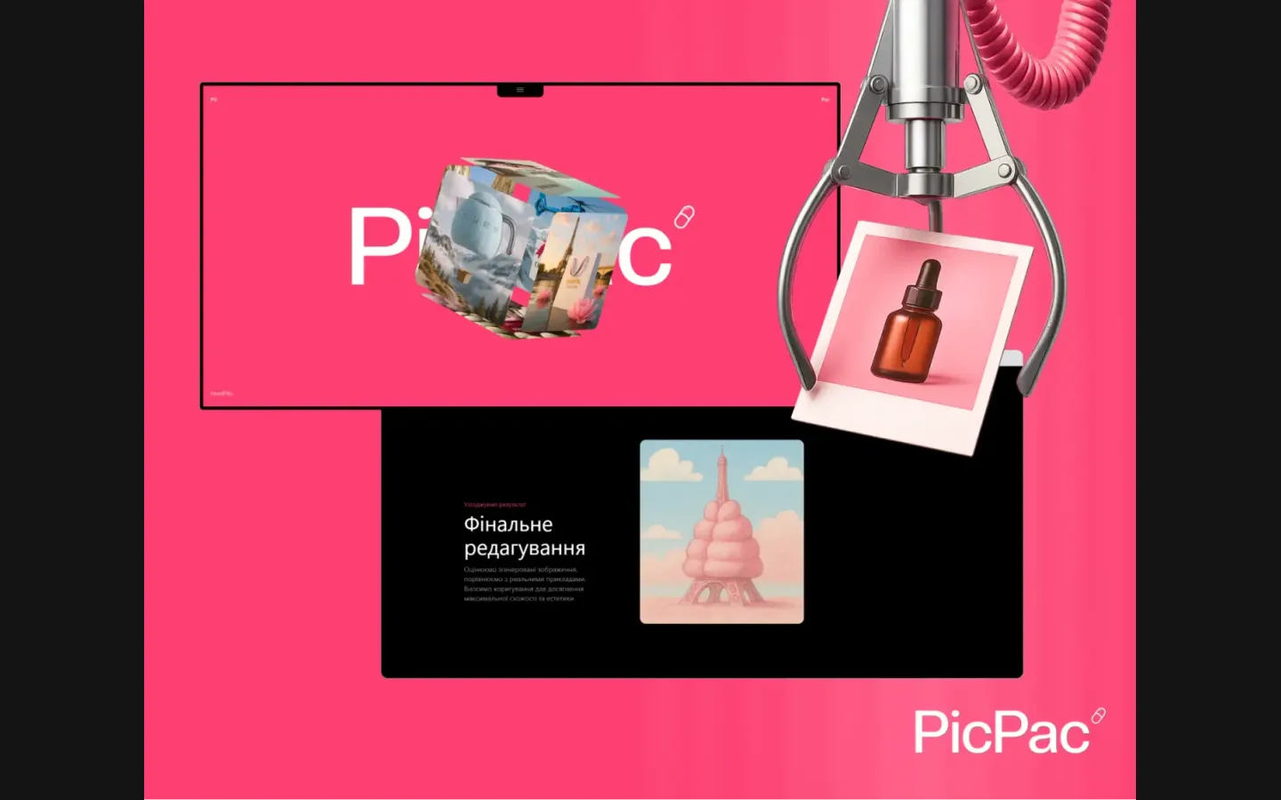
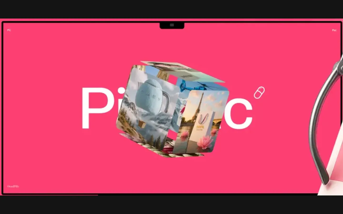
We built the identity on a single pink and a wordmark with a pill after the name, then designed the site’s first screen with a rotating cube of generated images so the product shows itself before any text.
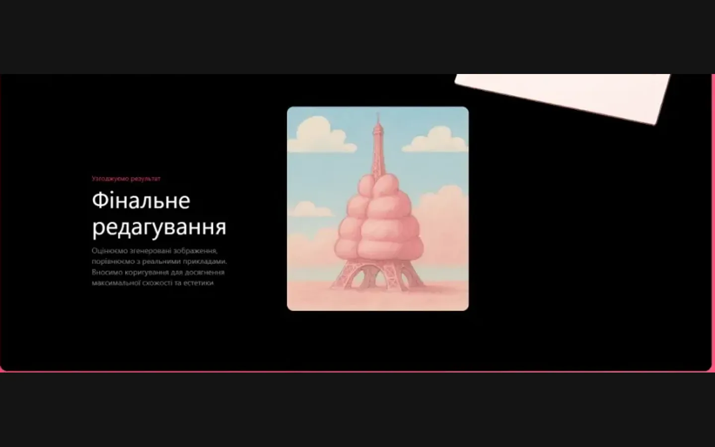
The process is explained in dark sections one step at a time, in Ukrainian; a claw machine pulling a polaroid became the key visual for the idea of picking the image you want.
What we delivered
A brand identity and a site design for PicPac: wordmark with the pill, palette, key visual and the page layouts, delivered as a presentation. Files and rights in the client’s name.